install.packages(c("sf")) #popular package for working with spatial dataAn Introduction to Exploratory Spatial Data Analysis
Mapping Environmental Justice in the Muhheakunnuk Valley
In this activity, you will explore environmental justice in Dutchess County, within the Muhheakunnuk or Hudson Valley region.
You will:
Load tabular and spatial data in R.
Plot data using tidyverse packages.
Use a spatial join to attach TRI facilities to tracts.
Create a simple exposure indicator. Compute:
- TRI facilities per tract
- TRI per square mile
Explore associations between TRI facility locations and neighborhood indicators such as asthma prevalence, unemployment, and the percentage of children in a neighborhood.
Create choropleth maps of Dutchess County, NY using
ggplotR packages.
Install packages
- You only need to do this step once.
Load the required packages
Note
Click the green arrow in the upper right corner to run your code.
library(tidyverse)
library(sf)
First, let’s use the read_sf function from the sf package to read in spatial data,.
Step 1: Load spatial data
We will work with two spatial datasets:
dutchess_indicators: Census tracts with demographic and socioeconomic indicators.tri_facilities: TRI facilities (point locations).
Download the data here (link).
Note
Adjust the relative file path to fit your working directory location. You should store the data you download this in your class activities folder
dutchess_indicators <- read_sf("data/dutchess_indicators.geojson")
tri_facilities <- read_sf("data/toxic_release_inventory_epa.shp")

# Make sure that both layers are projected on the earths
# surface correctly: they need to have the same projection
tri_facilities <- st_transform(tri_facilities, st_crs(dutchess_indicators))
Explore exposure to pollutants from toxic release facilities
Explore and compare the location of the U.S. Environmental Protection Agency’s list of facility location producing or working with toxic chemicals.
tri_facilitiescontains one row for each Toxic Release Inventory (TRI) facility in the Hudson Valley. We will work with those in Dutchess County, NY.
Dutchess County, NY Federal Data
For this activity we’ll use the Census Tract geography, which are roughly neighborhood-sized areal units.
Each observation represents a Census Tract “neighborhood” and contains various social, economic, and built environment attributes for that neighborhood.
Our data
Variables in dutchess_indicators:
Join identifier for each Census Tract:
join_IDCounty name:
countyState:
stateTotal population:
total_popArea in square miles:
area_sqmilesMedian Household Income:
median_hh_incomePercent of the population that is under age 18 (children):
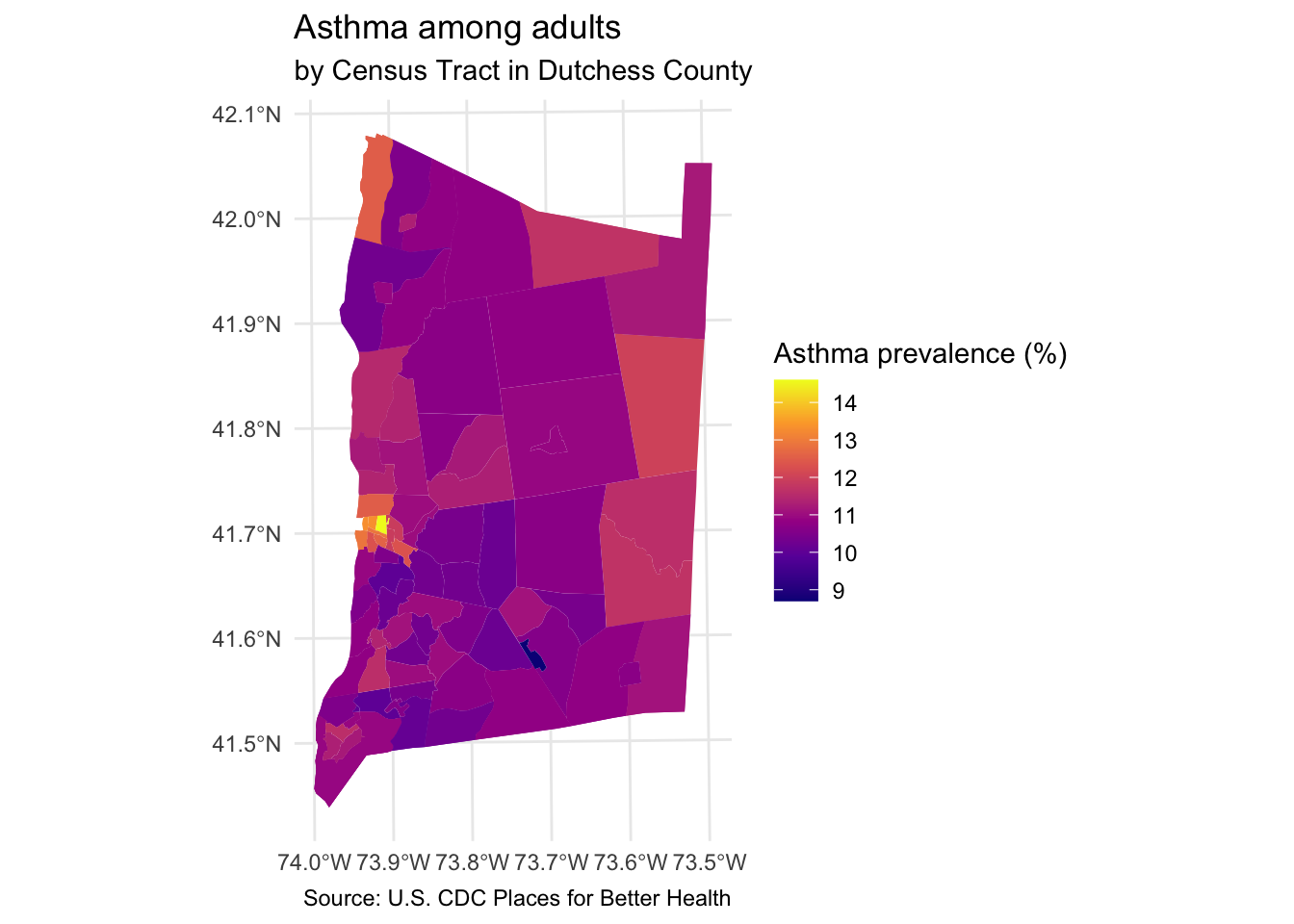
percent_childrenAsthma prevalence among adults:
asthma_rateUnemployment rate:
unemployment_rate
Other variables you can explore later:
Percent of the population that identifies as white alone (non-Hispanic):
percent_whitePercent of the population that identifies as Black or African American:
percent_blackPercent of the population that identifies as Hispanic/Latine:
percent_latineNumber of people with without access to healthy food within 1/2 mile (divide by total population to learn the percentage of the population with low access to healthy food):
low_food_accessTraffic proximity and volume proximity to traffic-related pollutants:
prox_traffic_pollution
Each row in tri_facilities represents the registration of a site that emits toxic material into the land, air, or water.
Display the names of the variables in the dutchess_indicators dataset.
# Your code hereStep 2: Get to know the data
Explore the variables
Create simple ggplot charts to summarize the data by running the code below.
First, let’s explore the numerical distribution of some of our numerical variables.
#Total population: Histogram
dutchess_indicators %>%
  ggplot(aes(x = median_hh_income)) +
geom_histogram(binwidth = 5000) # Specify the binwidth 
# Density plot
dutchess_indicators %>%
  ggplot(aes(x = asthma_rate)) +
  geom_density(fill="#7fc97f") +
  theme_bw() # Add a plot theme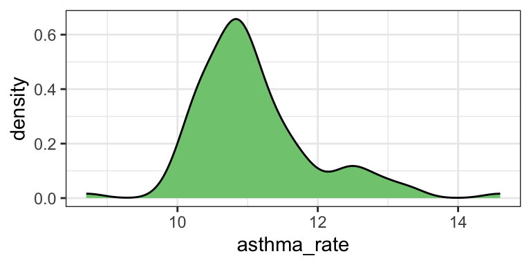
# Box plot
dutchess_indicators %>%
  ggplot(aes(x = unemployment_rate)) +
  geom_boxplot()  +
  theme_minimal()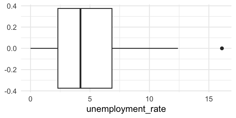
Try out some additional variables in the dutchess_indicators dataset.
Map the point locations of TRI sites
Add a base map annotation layer:
Add an
annotation_map_tile()layer after you call the ggplot function.Set the
zoom =argument to display a clear, readable base map underneath thegeom_sf()point layers.
tri_facilities %>%
  ggplot() +
  annotation_map_tile(zoom = 9, type = "cartolight") +  # add basemap (other type options include: "osm", "cartodark")
  geom_sf(color = "red") +
  labs(title="TRI Facilities Location", subtitle = "Muhheakunnuk Valley") +
  theme_minimal()
Loading required namespace: rasterZoom: 9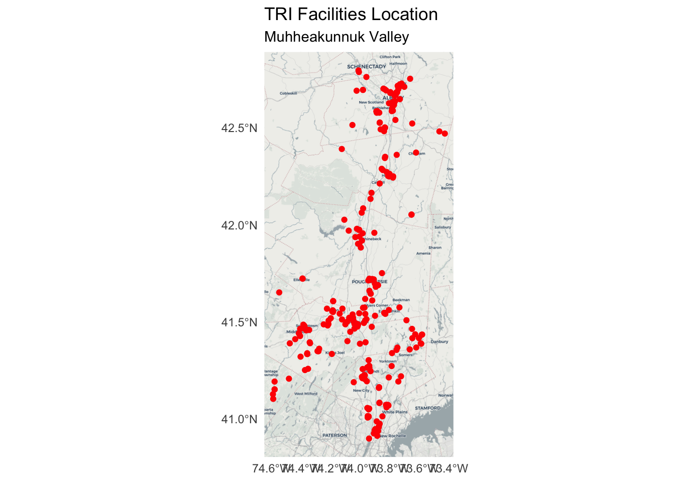
Step 3: Spatial join: attaching TRI facilities to tracts
We want to know which tracts contain TRI facilities, so you will run the code below to join the two layers.
We use
st_join()with ast_withinpredicate to attach tract attributes to each TRI point.
tri_in_tracts <- st_join(tri_facilities,
                         dutchess_indicators,
                         join = st_within)
Step 4: Counting TRI facilities per neighborhood
Now we aggregate to the tract level: how many TRI facilities are located in each tract?
# Your code heretri_counts <- tri_in_tracts %>%
st_drop_geometry() %>%
count(join_ID, name="tri_n")Step 5: Join and compute TRI facilities per square mile
Join the TRI per neighborhood counts back with the full dataset using a
left_joinby the unique join key in each data set:join_IDCreate the new variable
tri_per_sqmile.Store the result in a new sf object
dutchess_tri
geom_sf() maps in ggplot
Visualise spatial simple feature (sf) objects.
It will draw different geometric objects depending on what simple features are present in the data: you can get points, lines, or polygons.
Step 6: Map TRI facilities per square mile
Map the count of TRI facilities per square mile across each neighborhood using geom_sf:
- Use
caption = "Source: U.S. EPA"to add a source note to the bottom of the map extent.
dutchess_tri %>%
  ggplot() +
  geom_sf(aes(fill = tri_per_sqmile), color = NA) +
  scale_fill_viridis_c(option="C", name="TRI facilities\n(sq. mile)") +
  labs(title="TRI Facilities Concentration",
       subtitle="Dutchess County",
       caption = "Source: U.S. EPA") +
  theme_minimal()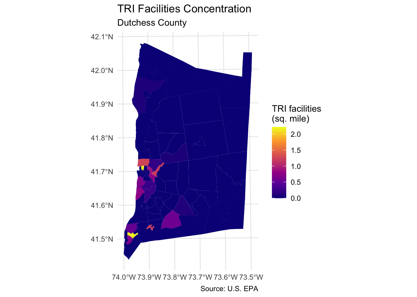
Step 7: Map other indicators of interest
Select another two or three variables from the dutchess_tri data frame to map. Change the fill = argument in the geom_sf() function to display the new indicator.
You will also need to change the fill legend title and title of the map.
# Your code hereStep 8: Explore associations with neighborhood indicators
We can now explore how the location of TRI facilities is associated with neighborhood-level indicators using ggplot scatterplots.
Scatter plot to explore correlation
Compare TRI facilities tri_per_sqmile with the prevalence of asthma among the population: asthma_rate
- Use
geom_smooth(method="lm") to add a linear regression line to your plot.
Note
Are neighborhoods with a higher concentration of TRI facilities m
`geom_smooth()` using formula = 'y ~ x'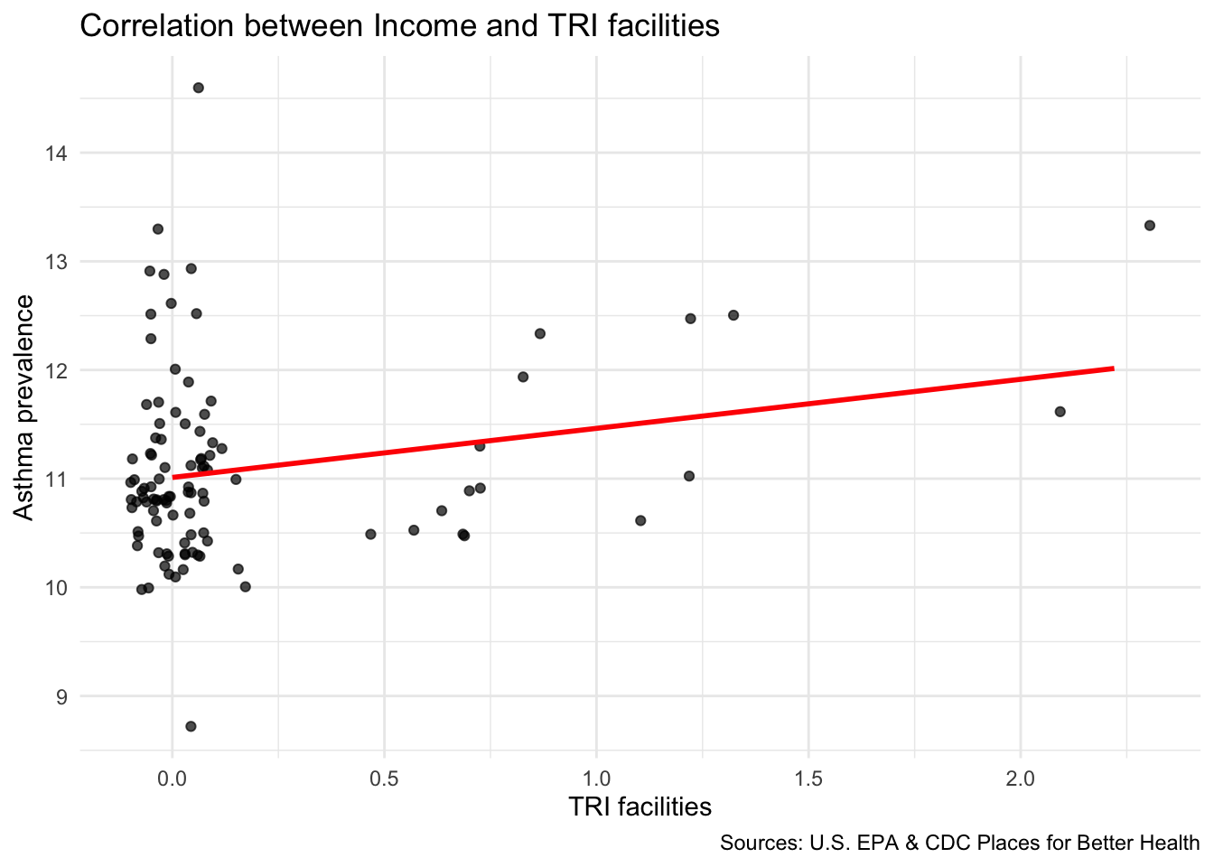
Compare TRI facilities tri_per_sqmile with the median household income in the neighborhood median_hh_income
# Your code here
Note
Are neighborhoods with a higher concentration of TRI facilities more likely to have higher or lower median income?
`geom_smooth()` using formula = 'y ~ x'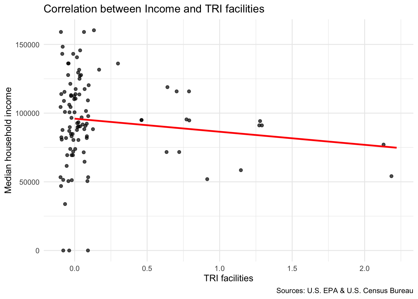
Try out a few more associations using scatter plot
Step 9: Map TRI facility points with median household income
In order to show two layers on the same ggplot map, you will need to use the data = argument inside your geom_sf. For example: geom_sf(data = sf_dataset).
- NOTE: there are two TRI facilities that appear outside of Dutchess County due errors in the EPA database.
# Insert your code here