
Misrepresentation

1
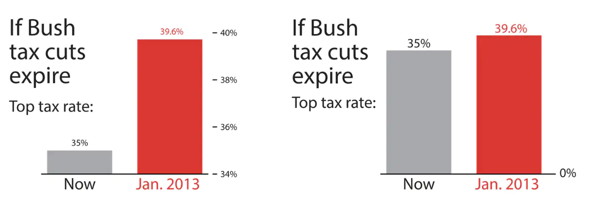
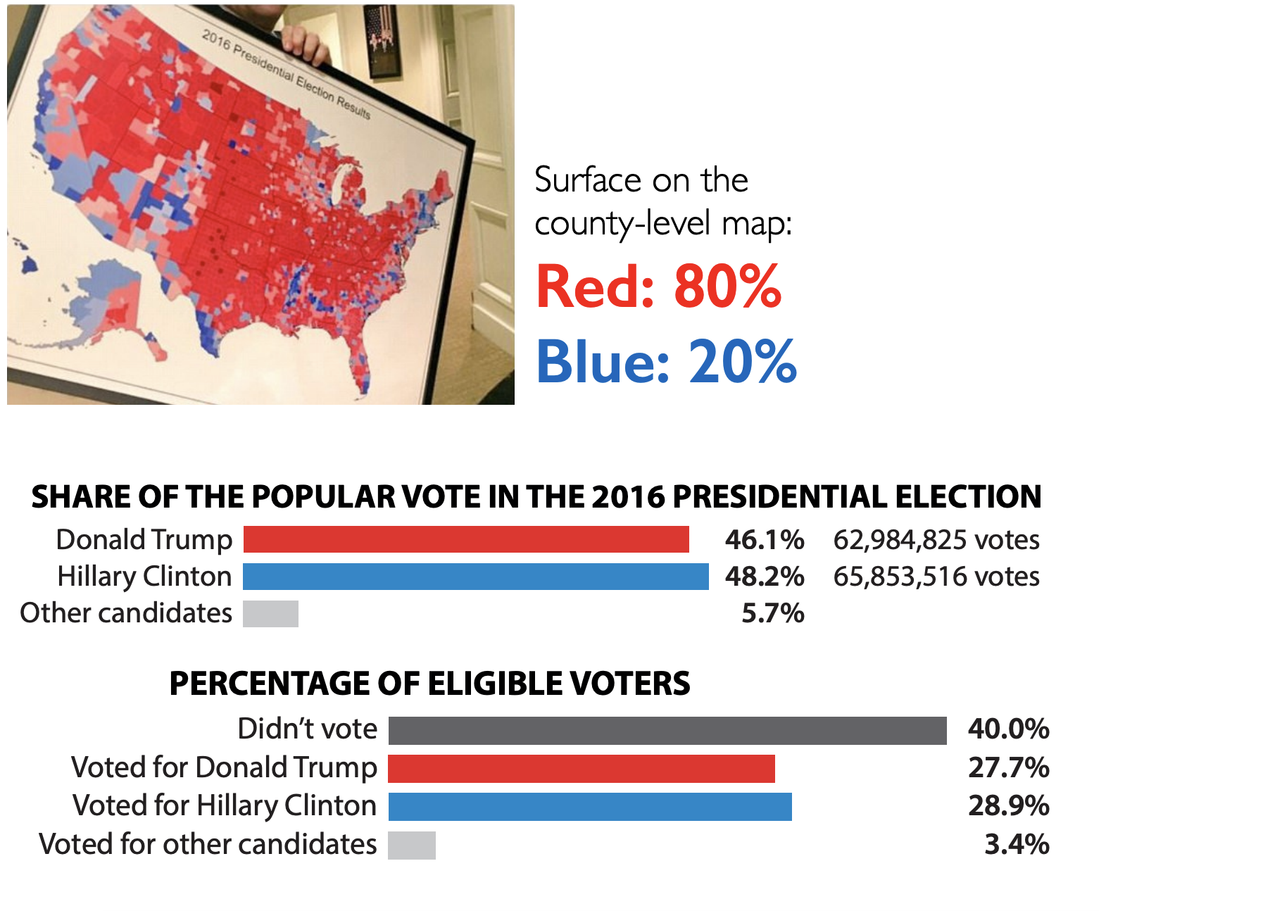
What is the difference between these two pictures? Which presents a better way to represent these data?
1
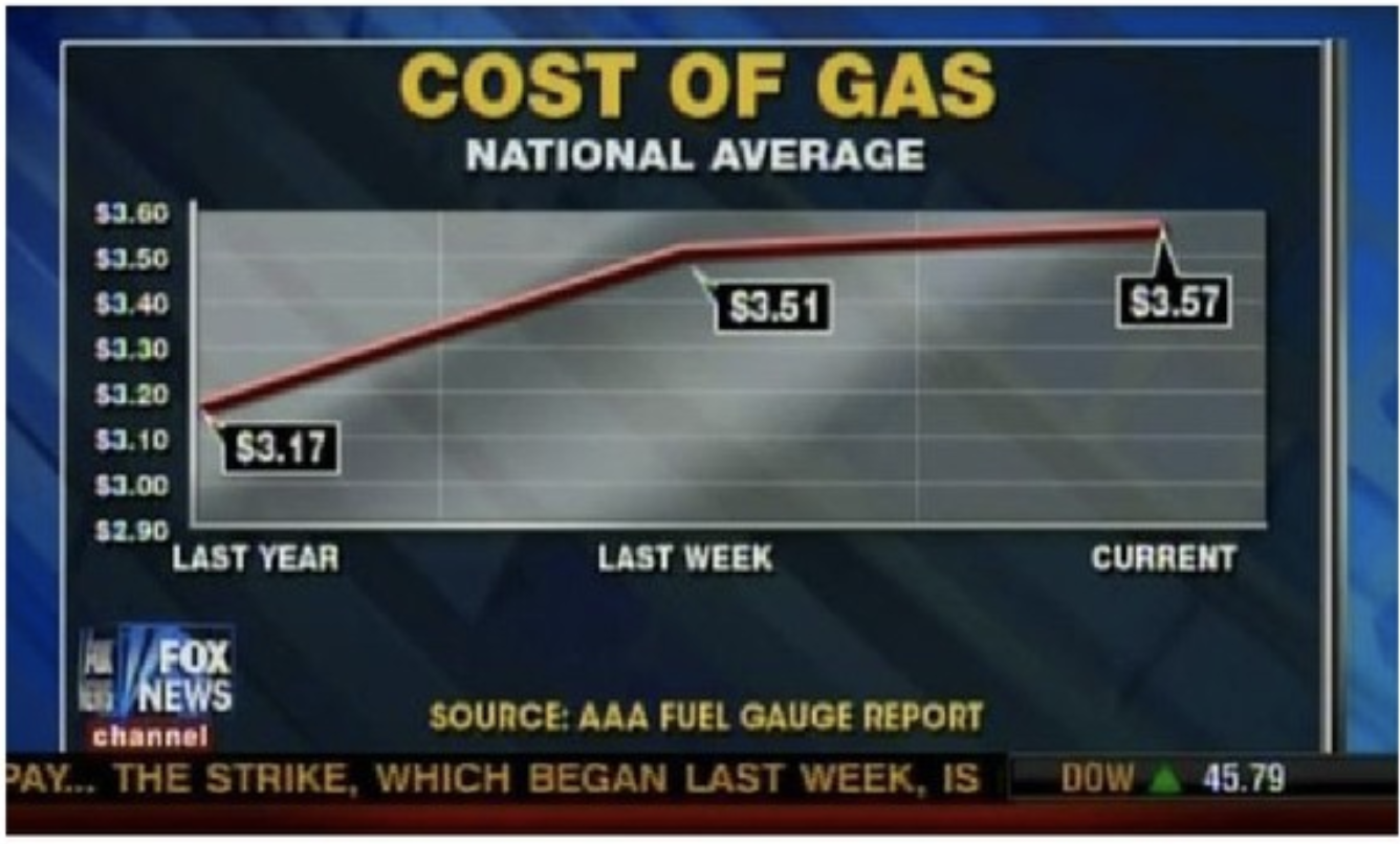
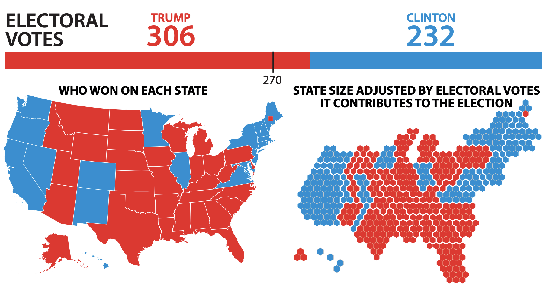
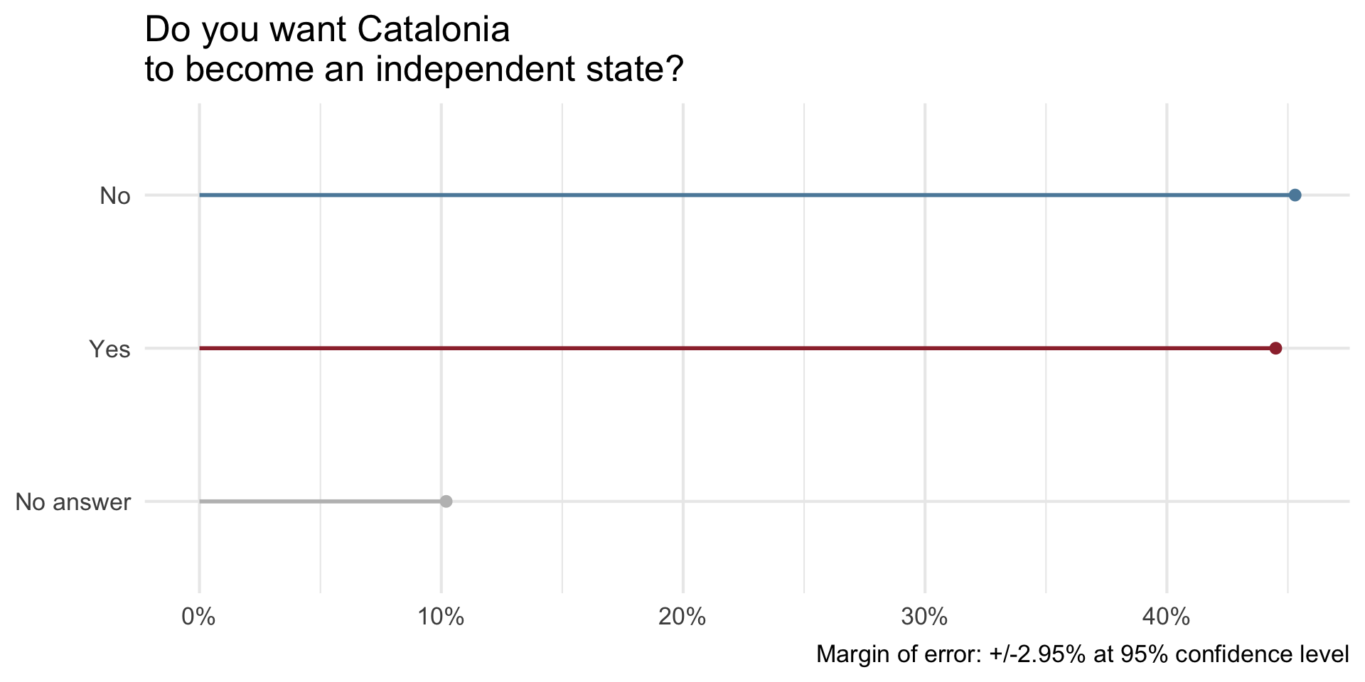
What is wrong with this picture? How would you correct it?
:::
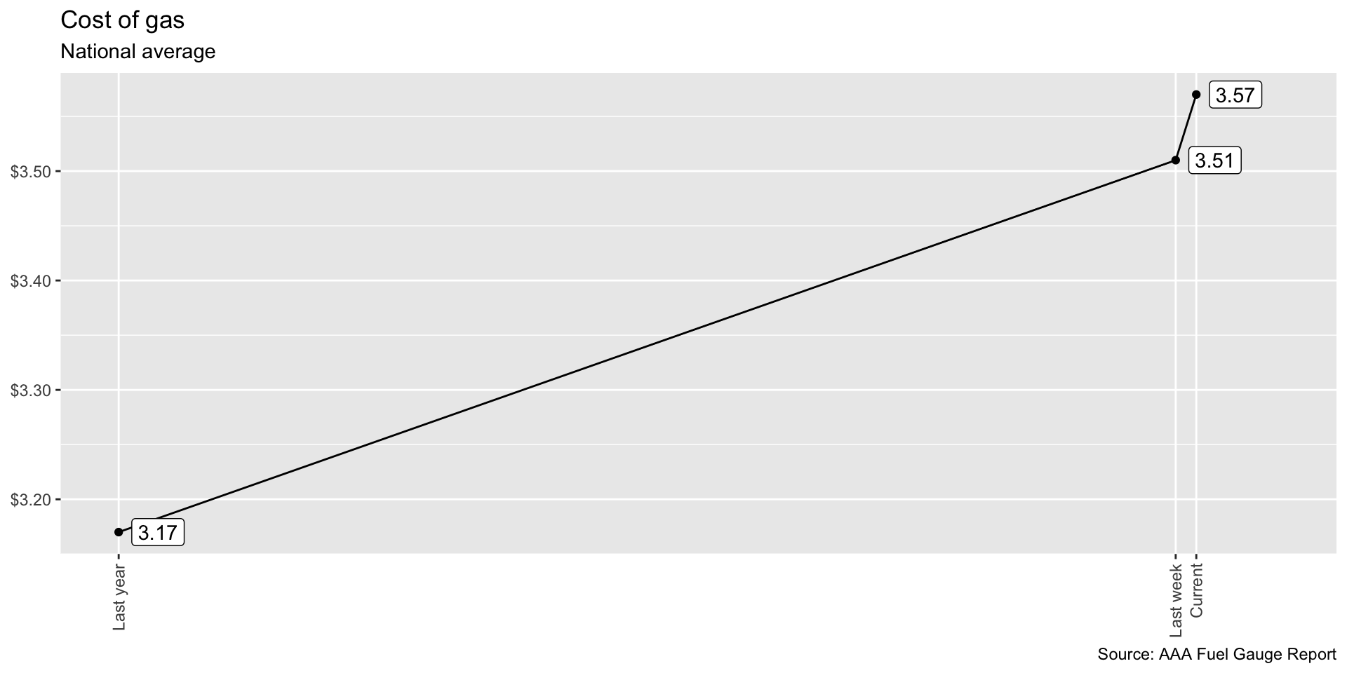
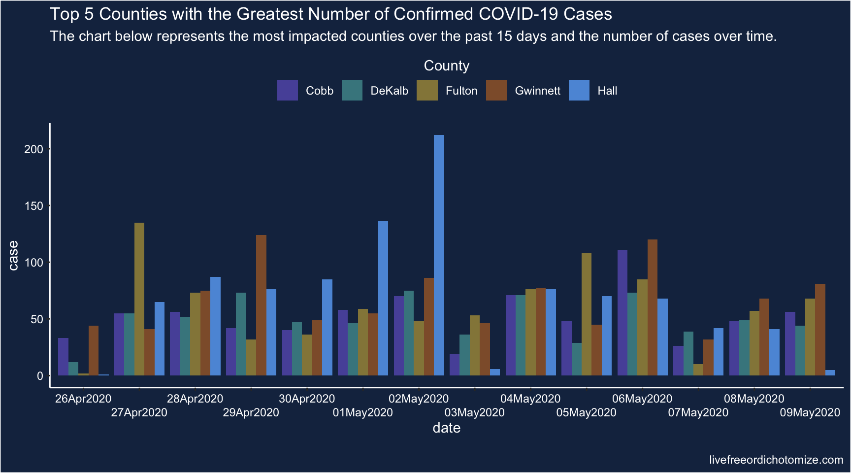
What is wrong with this picture? How would you correct it?
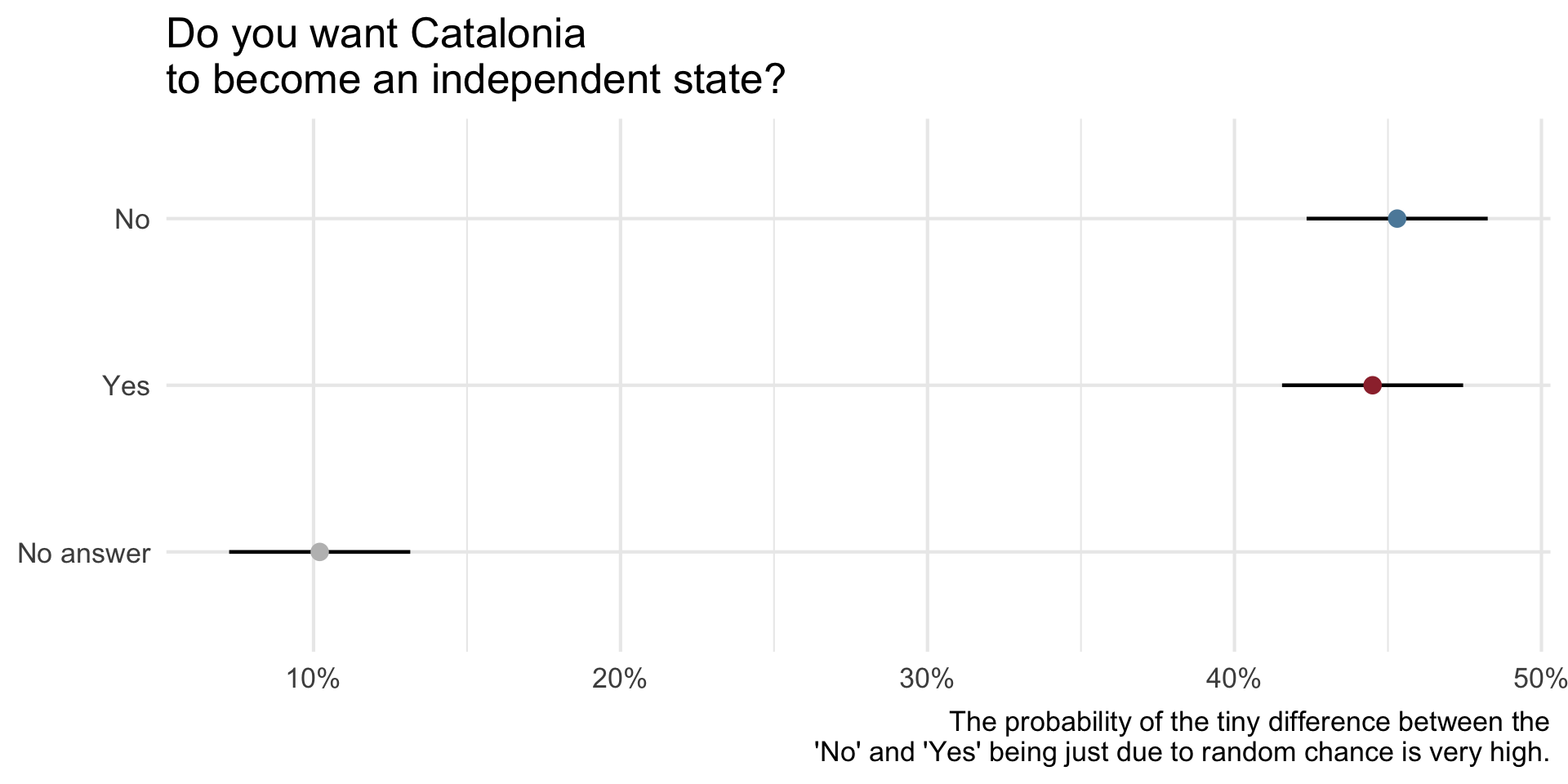
Another try, still some work to do…
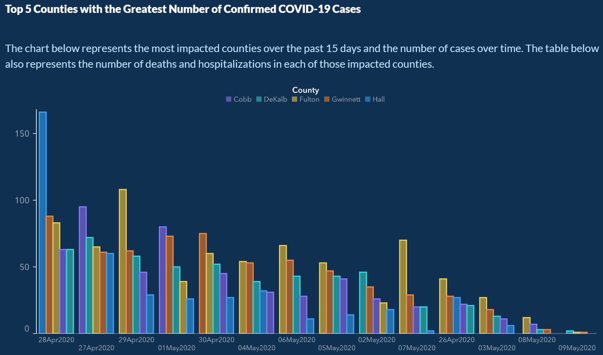
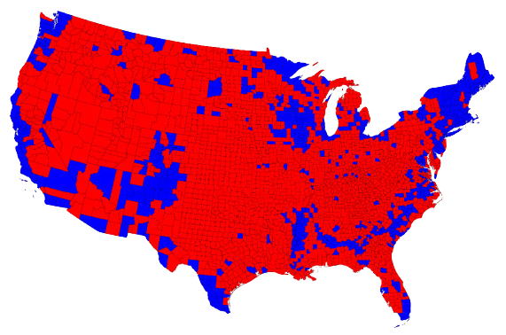
Do you recognize this map? What does it show?
1


1
1
1
On December 19, 2014, the front page of Spanish national newspaper El País read “Catalan public opinion swings toward ‘no’ for independence, says survey”.

1
How Charts Lie
Getting Smarter about Visual Information
by Alberto Cairo

Calling Bullshit
The Art of Skepticism in a
Data-Driven World
by Carl Bergstrom and Jevin West