Exploratory data analysis and visualization
Intro to Data Analytics
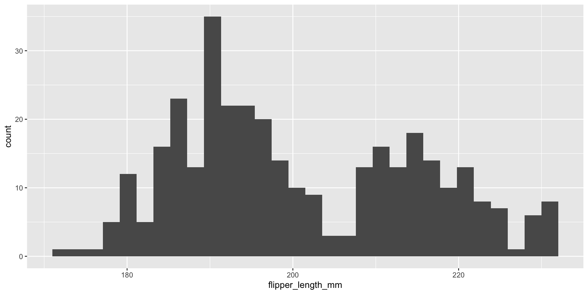
Histogram plot
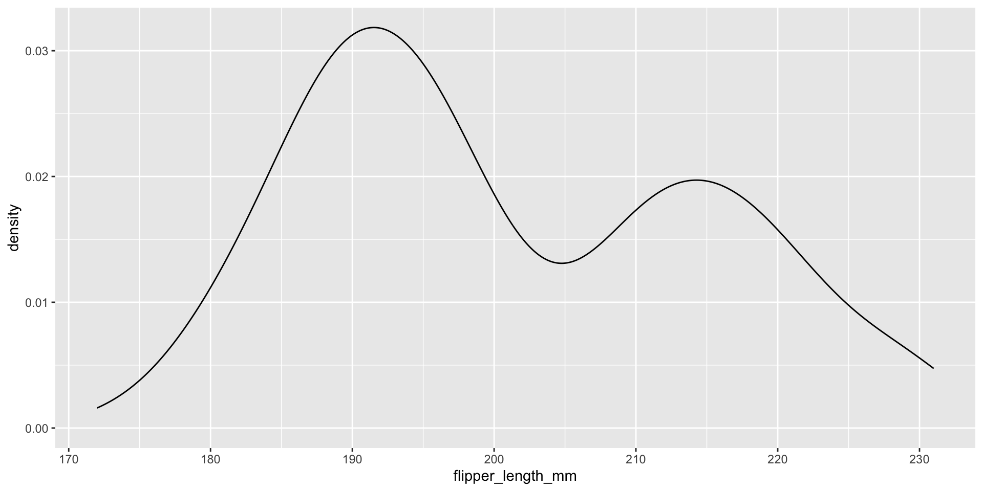
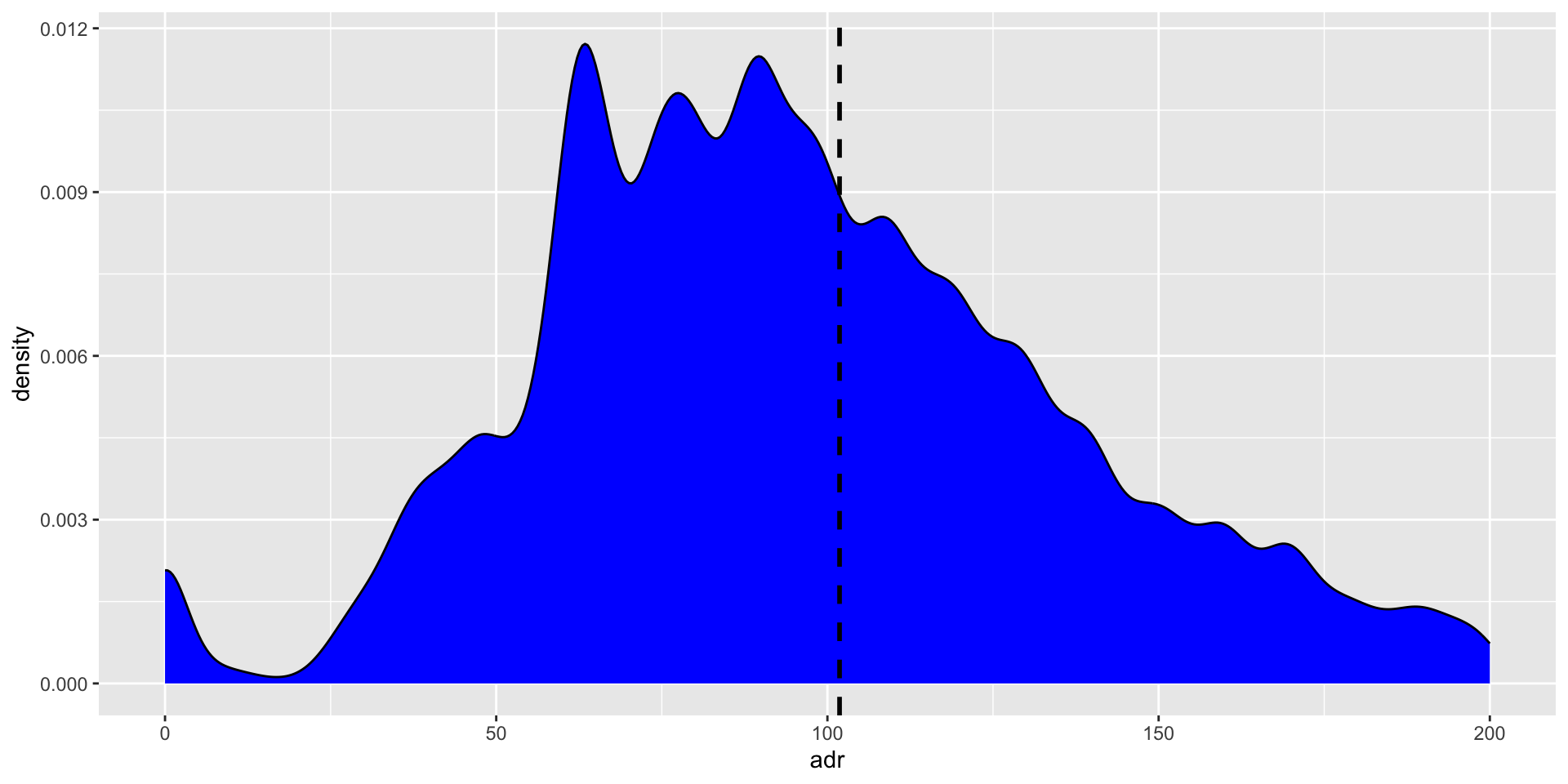
Density plot
-
Smooth density plot: numeric data, x-axis is numbers, y-axis is proportion of the whole.
A density plot is a smooth curve that shows the proportion of data in each range. The height of the curve indicates the proportion of data in that range, not how many times a value appears.
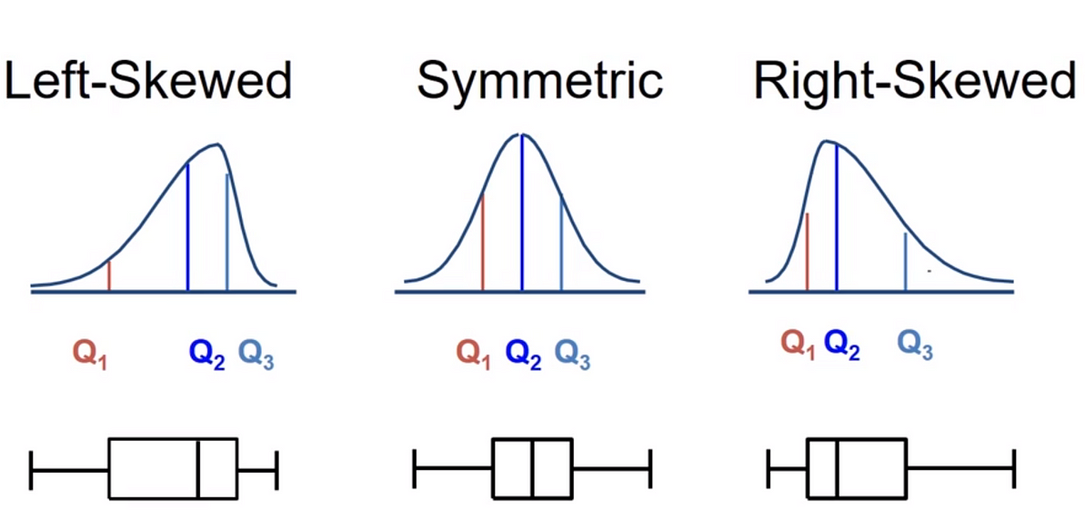
Describing shapes of numerical distributions
Hotels
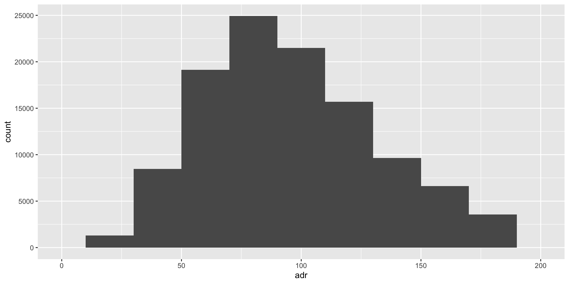
Hotels

Hotels
Add a marker at the mean with geom_vline

Hotels
Add a marker at the mean
The mean is the most frequently used measure of central tendency because it uses all values in the data set to give you an average.
Try adding a marker at the median
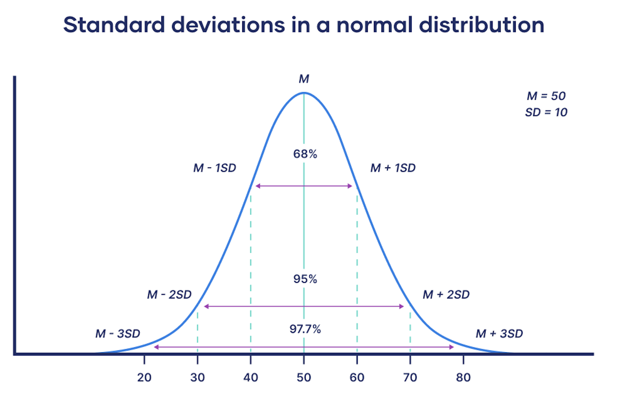
Standard deviation