More aesthetics and facets
Intro to Data Analytics
Plot

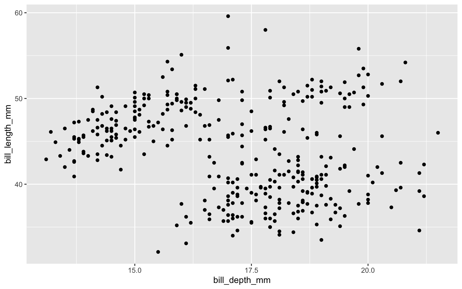
Start with the
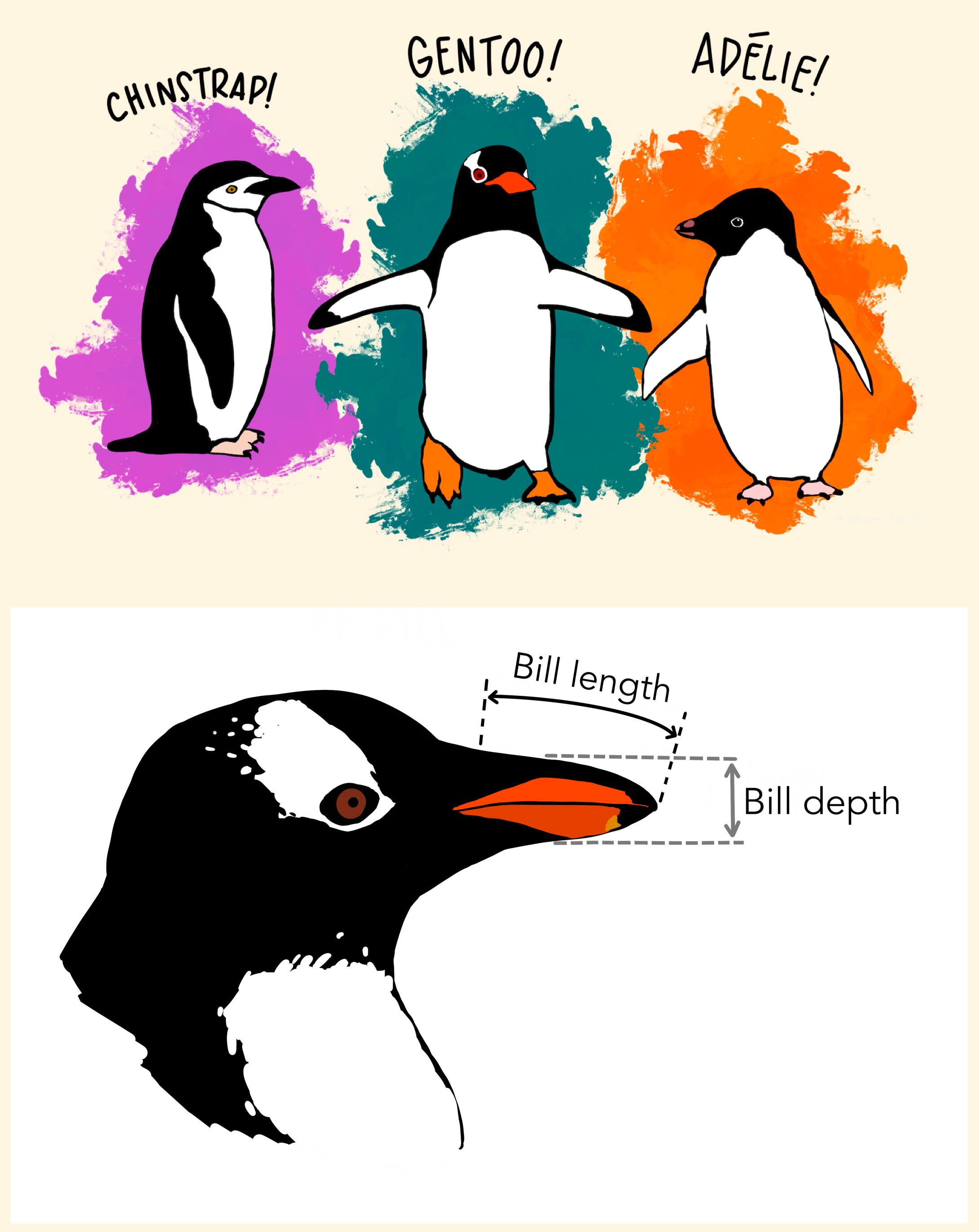
penguinsdata frame

Start with the
penguinsdata frame, map bill depth to the x-axis
Start with the
penguinsdata frame, map bill depth to the x-axis, bill length to the y-axis.
Add scatter plot
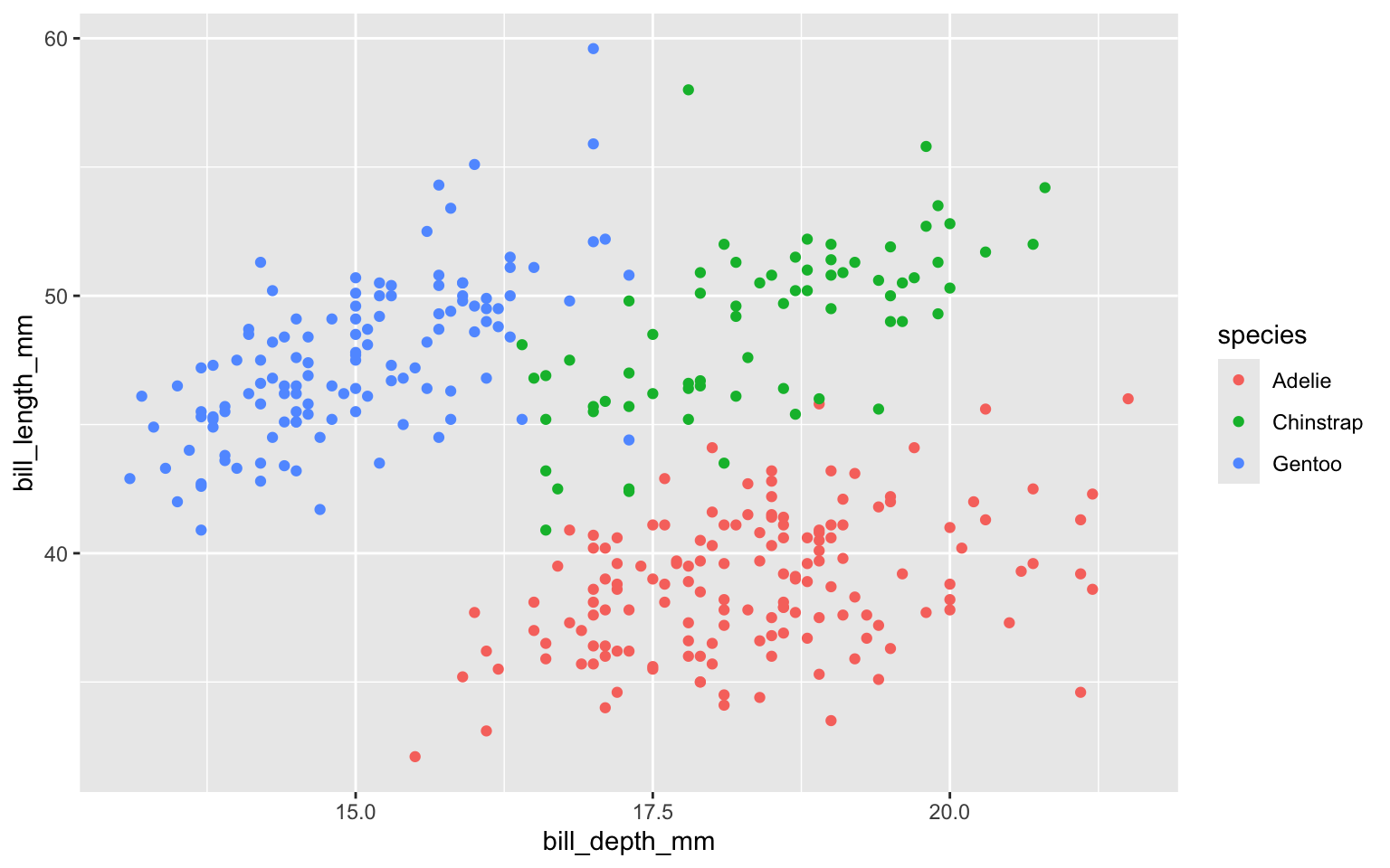
Color based on species (map species to the color of each point).
Title the plot
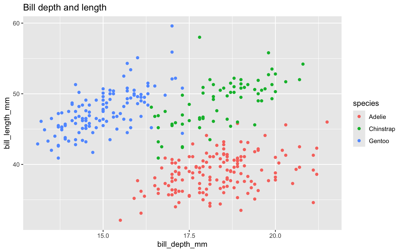
Add the subtitle

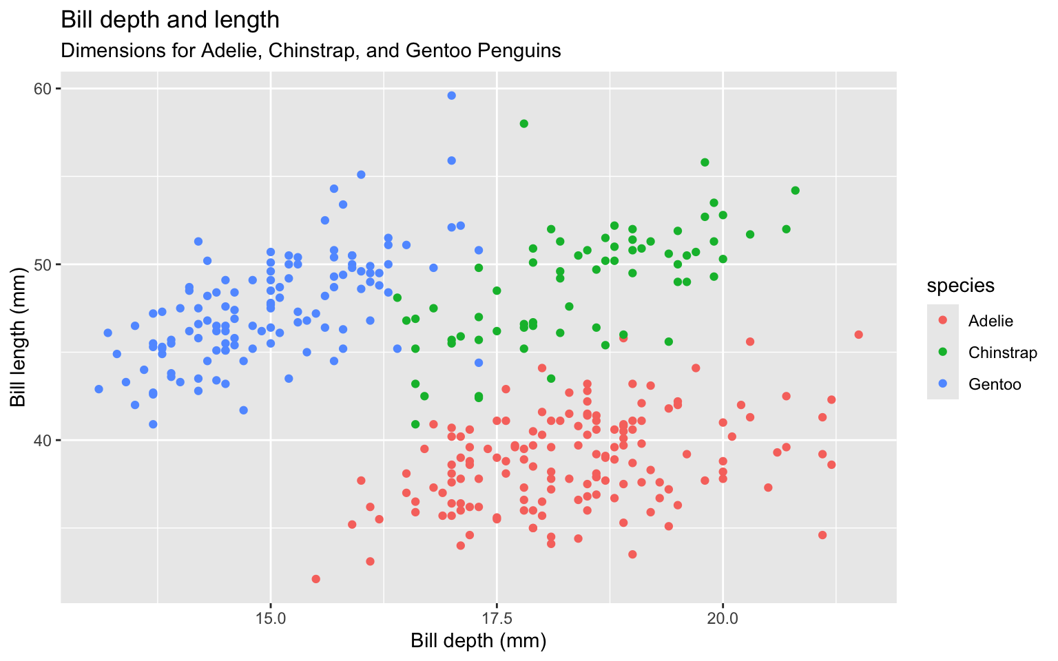
Clarify the graphic by labeling the x and y axes
Label legend “Species” instead of using column name

Add a caption for the data source.
ggplot(data = penguins,
mapping = aes(x = bill_depth_mm,
y = bill_length_mm,
colour = species)) +
geom_point() +
labs(title = "Bill depth and length",
subtitle = "Dimensions for Adelie, Chinstrap, and Gentoo Penguins",
x = "Bill depth (mm)", y = "Bill length (mm)",
colour = "Species",
caption = "Source: Palmer Station LTER / palmerpenguins package") 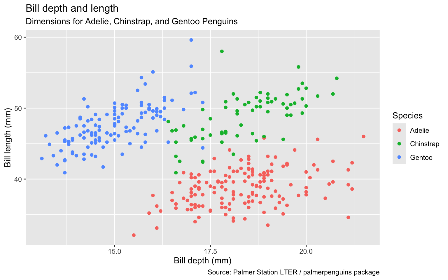
Use color scale designed to be perceived by viewers with common forms of color blindness.
ggplot(data = penguins,
       mapping = aes(x = bill_depth_mm,
                     y = bill_length_mm,
                     color = species)) +
geom_point() +
labs(title = "Bill depth and length",
subtitle = "Dimensions for Adelie, Chinstrap, and Gentoo Penguins",
x = "Bill depth (mm)", y = "Bill length (mm)",
color = "Species",
caption = "Source: Palmer Station LTER / palmerpenguins package") +
scale_colour_viridis_d() 
Remove argument names
ggplot(penguins,
       aes(x = bill_depth_mm,
                     y = bill_length_mm,
                     color = species)) +
  geom_point() +
  labs(title = "Bill depth and length",
       subtitle = "Dimensions for Adelie, Chinstrap, and Gentoo Penguins",
       x = "Bill depth (mm)", y = "Bill length (mm)",
       color = "Species",
       caption = "Source: Palmer Station LTER / palmerpenguins package") +
scale_colour_viridis_d() 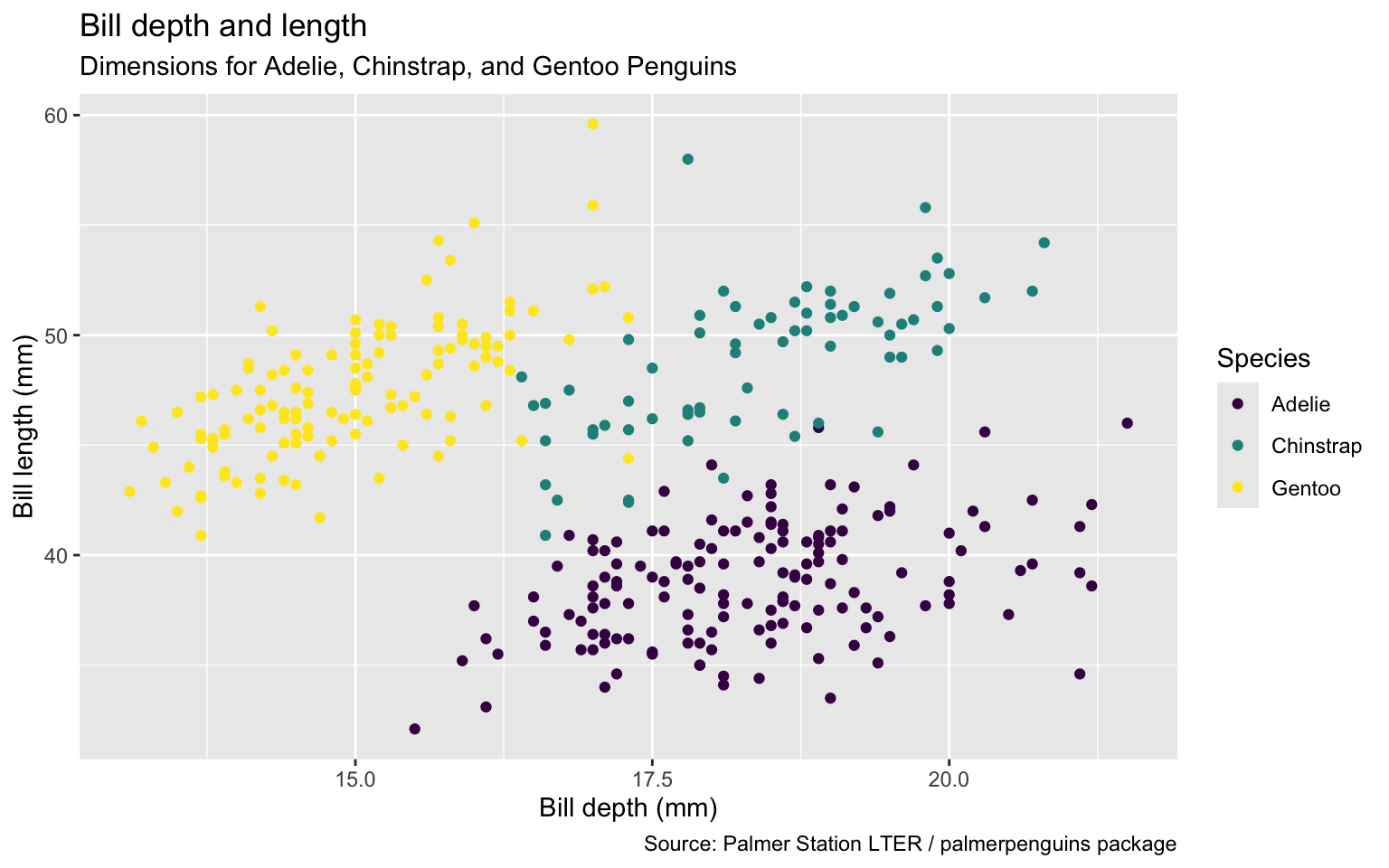
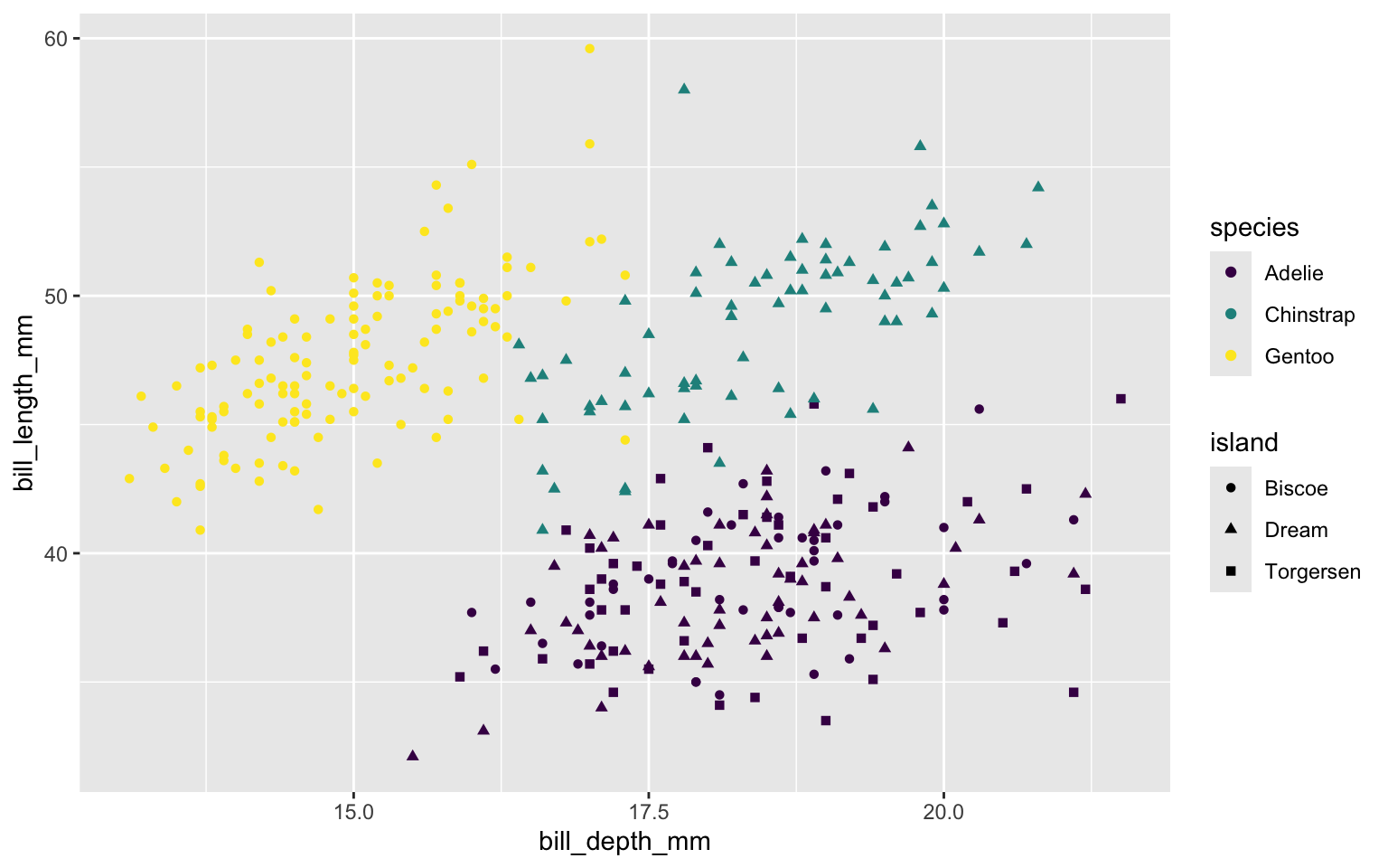
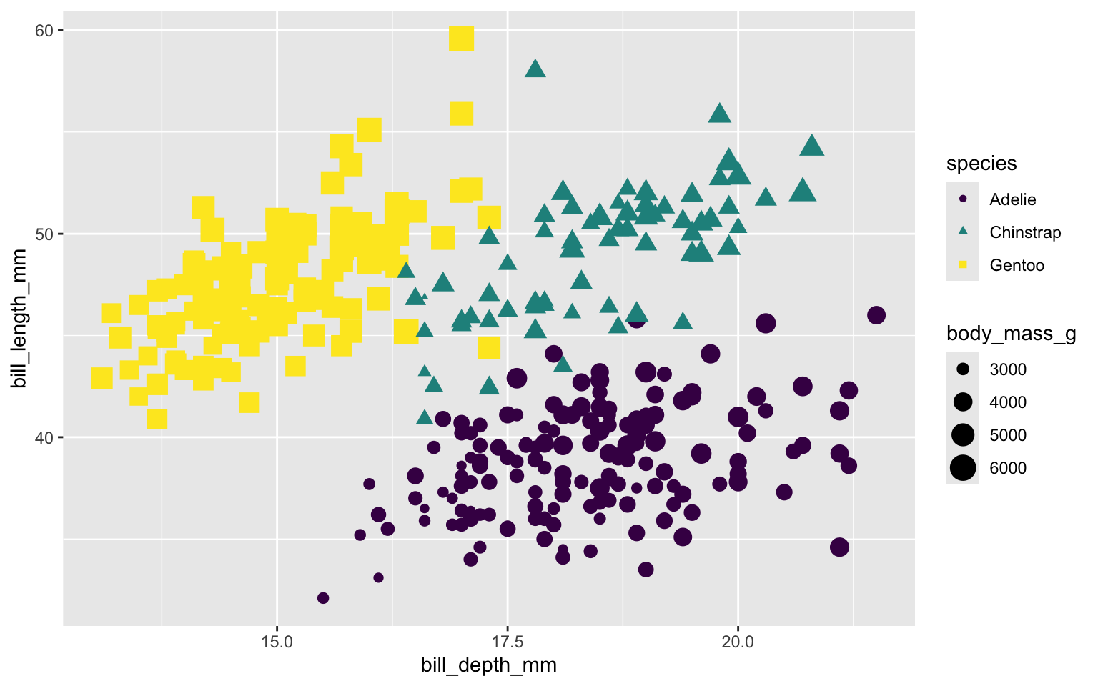
Map shapes to a different variable than we map color to. Two legends for color setting and shape setting.
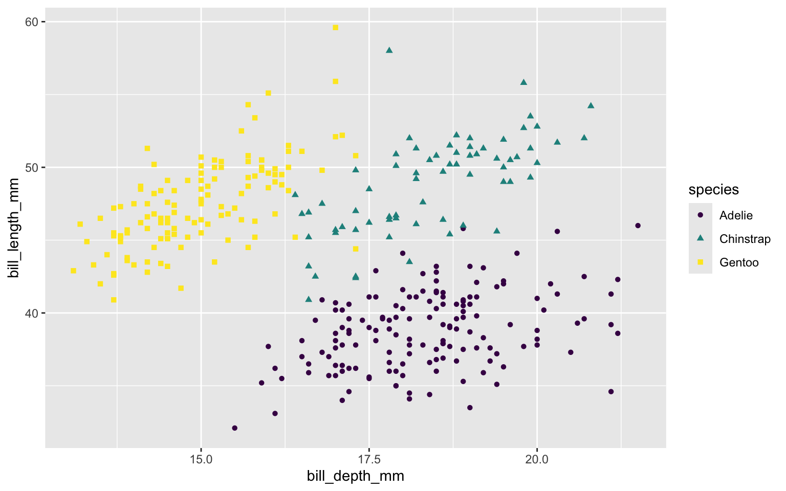
Map shape to same variable as color. Only one legend.
Scale size of marker based on body mass of each penguin.
Use flipper length to control transparency of each marker – longer flipper length => darker marker
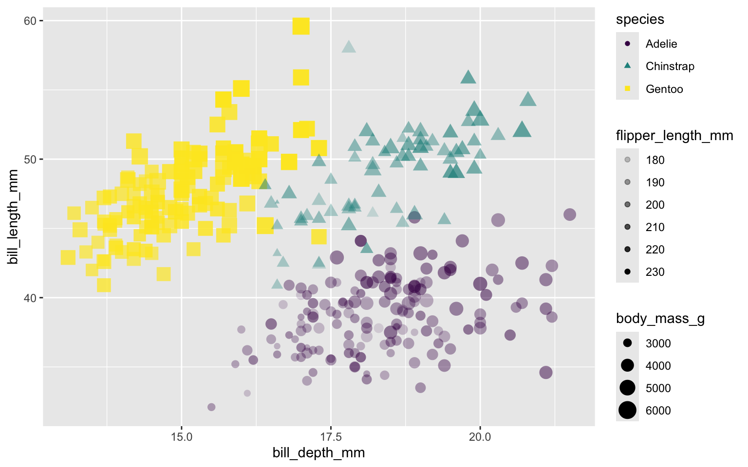
Put size and alpha in Mapping, make them dependent on two variables in the data set.
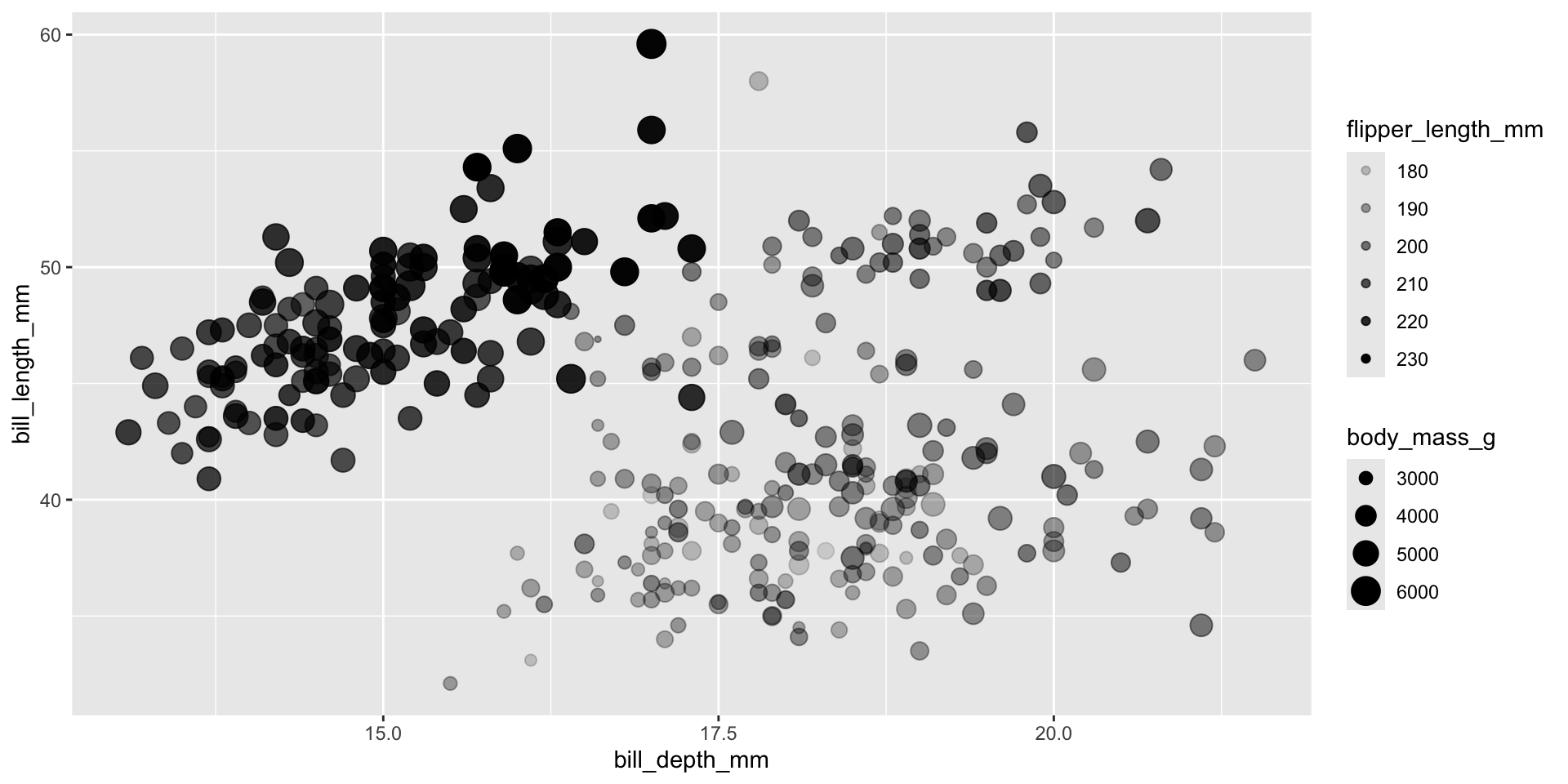
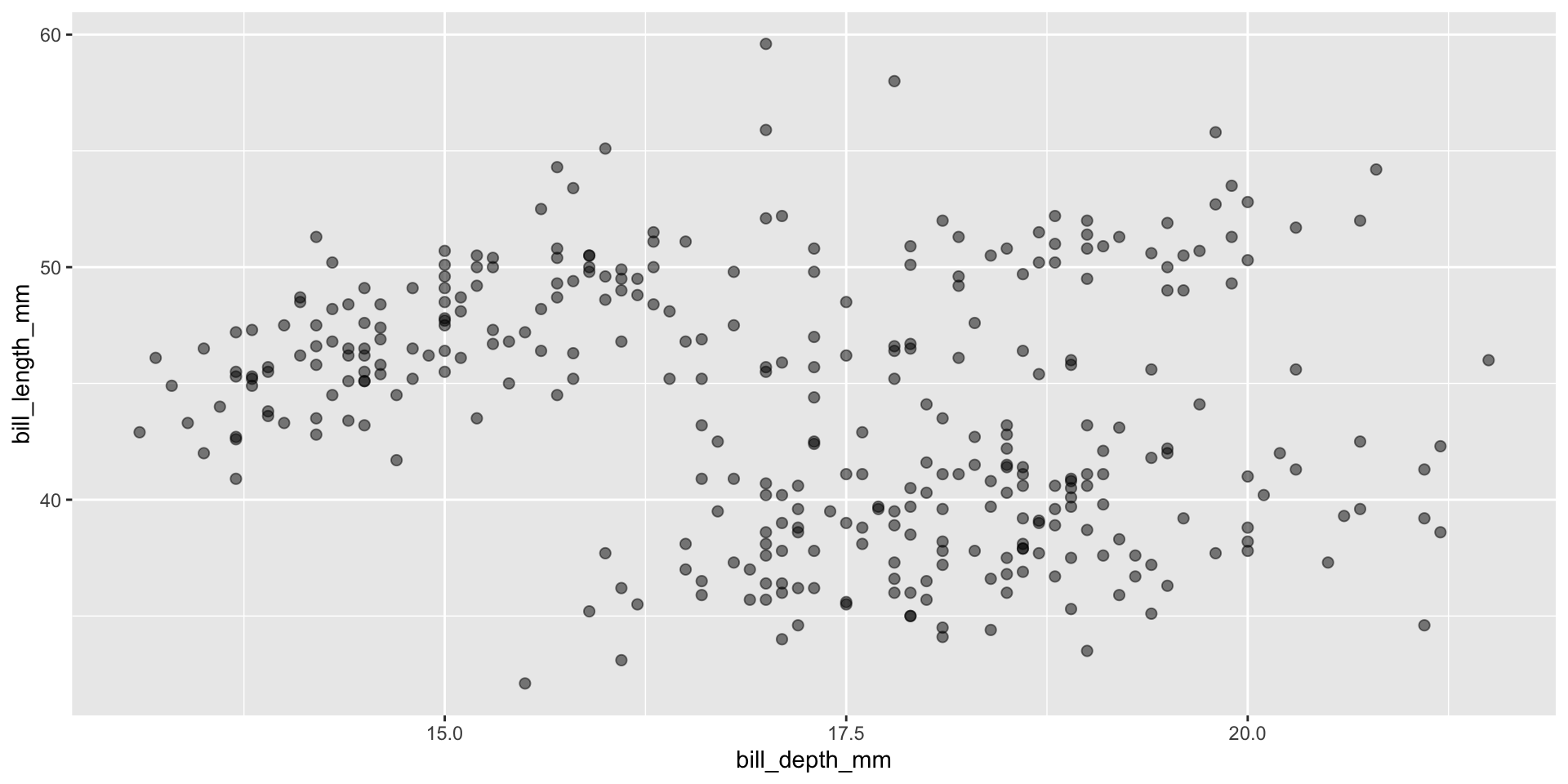
Put size and alpha into a setting instead of in the mapping
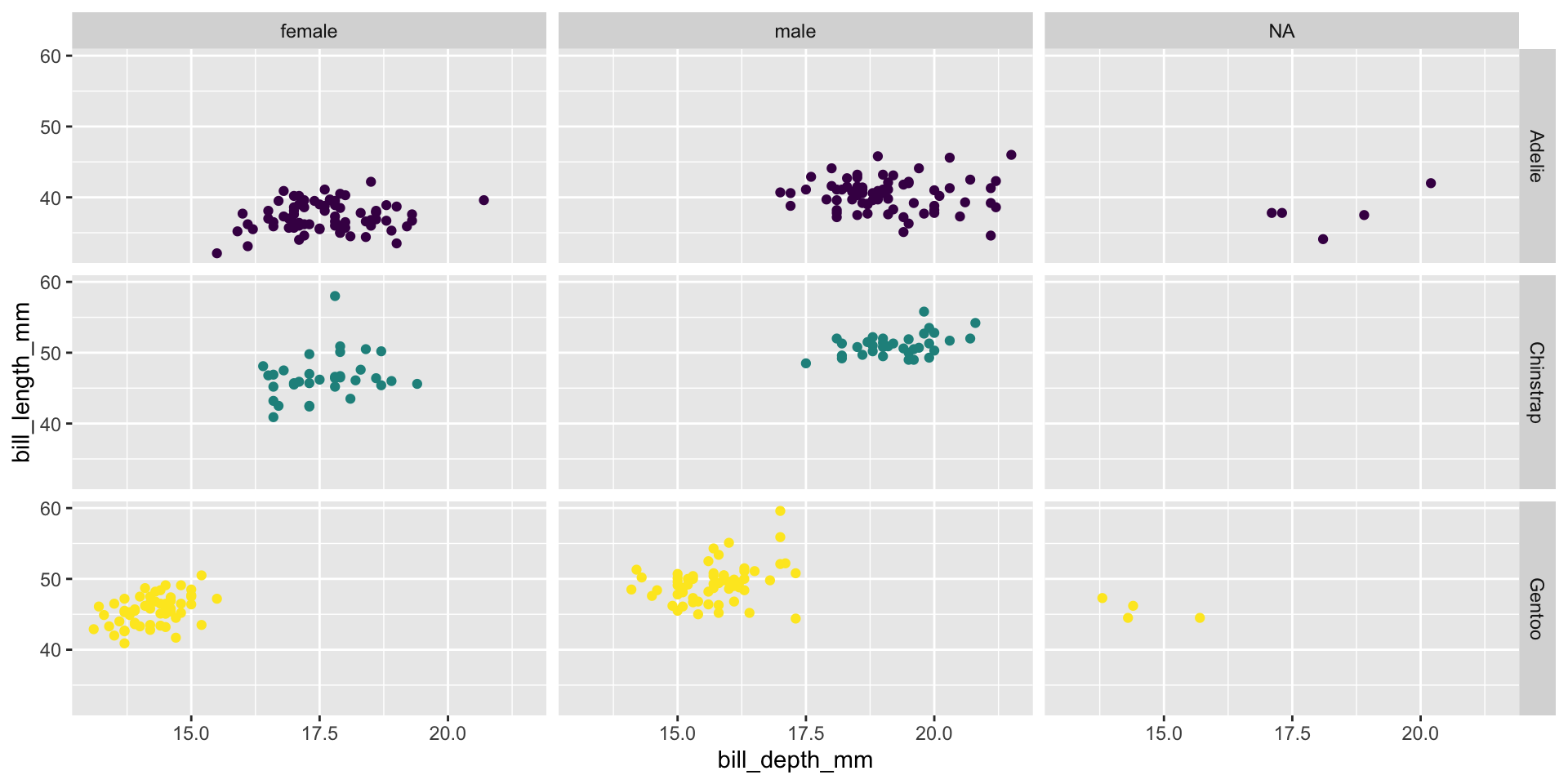
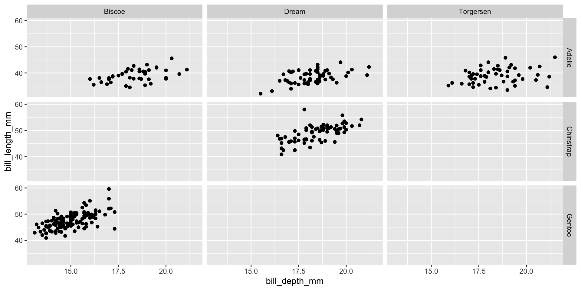
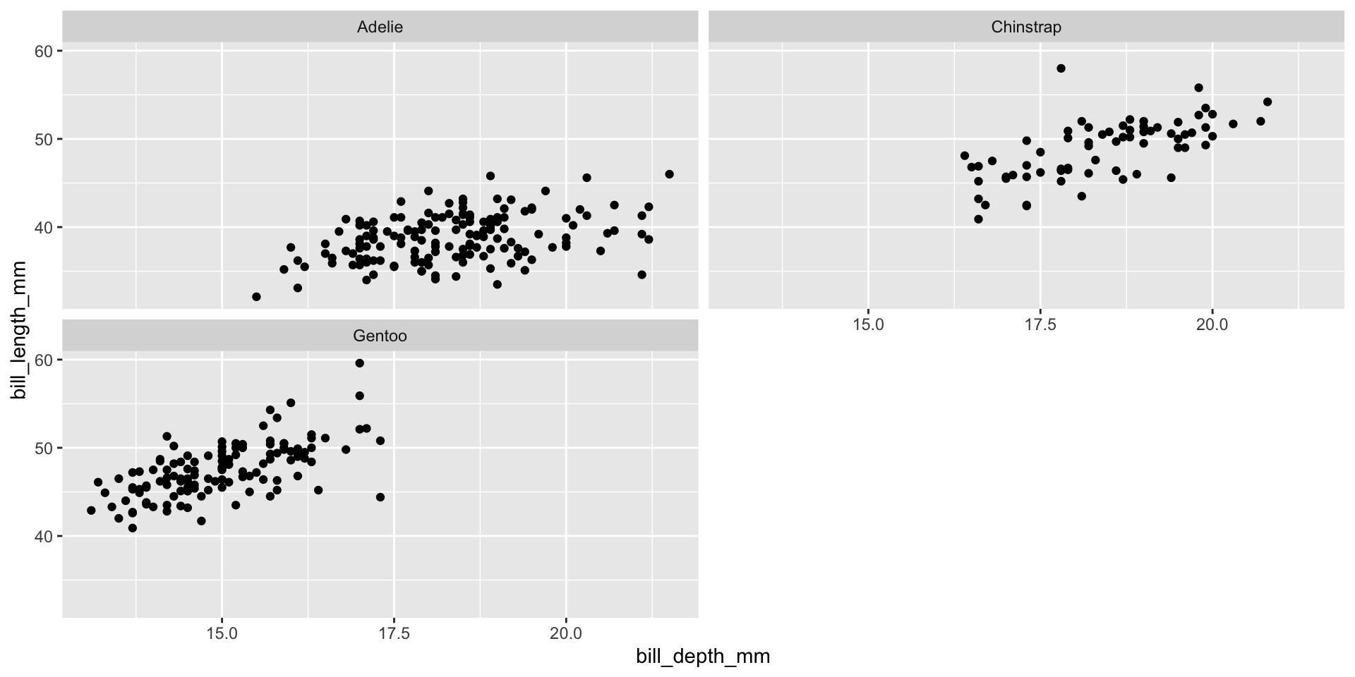
Facet example 1
Facet the plot into a grid organized by species versus island
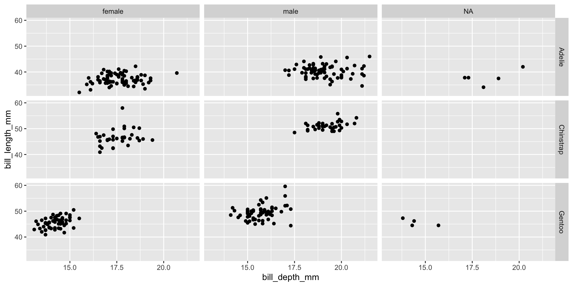
Facet example 2
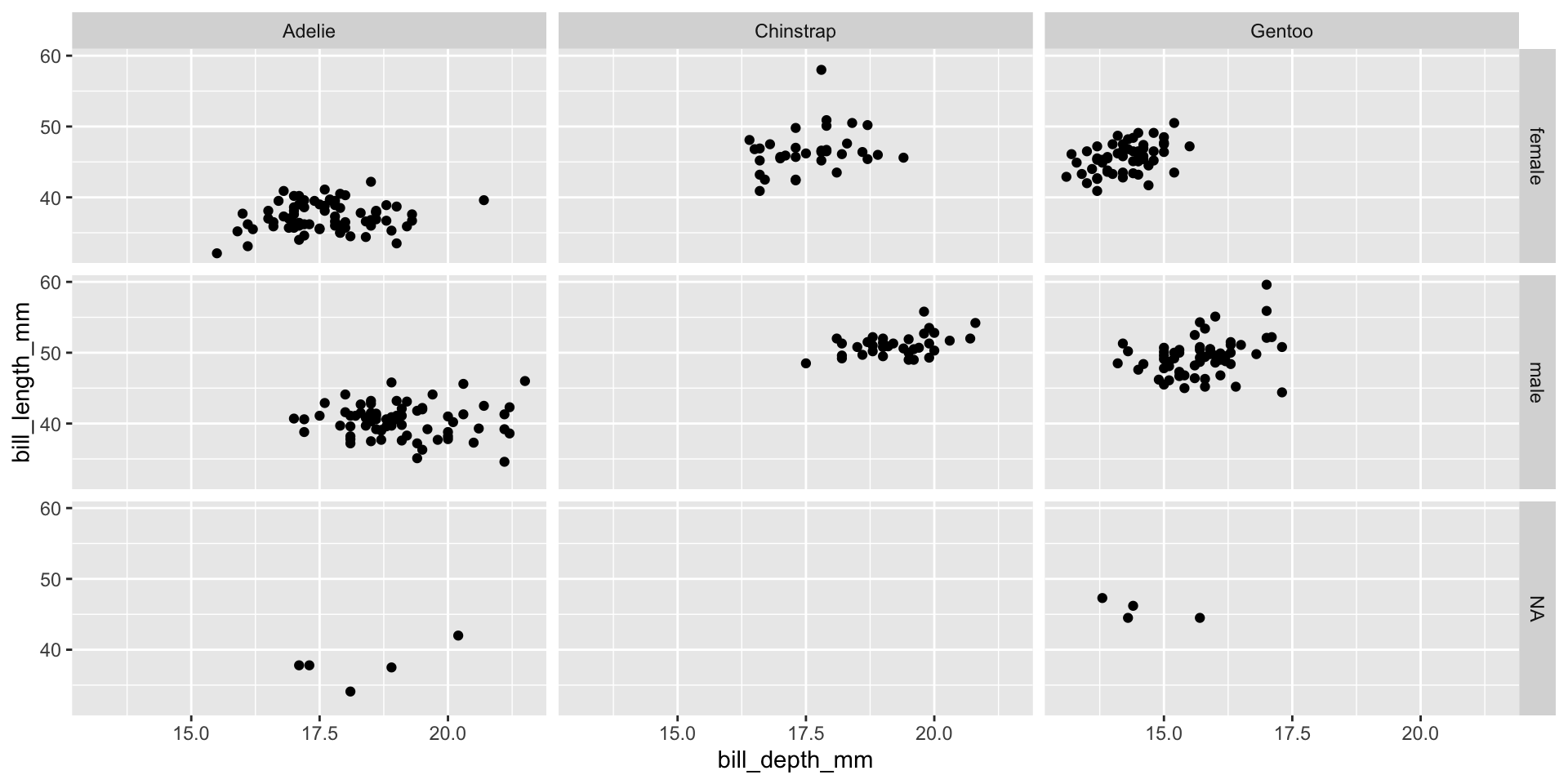
Facet example 3
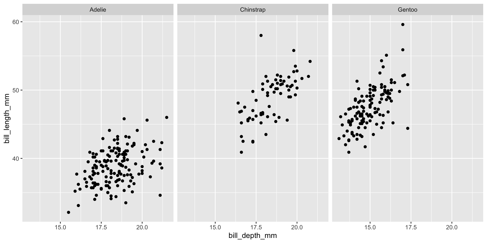
Facet example 4

Facet example 5
Facet example 6
Facet and color
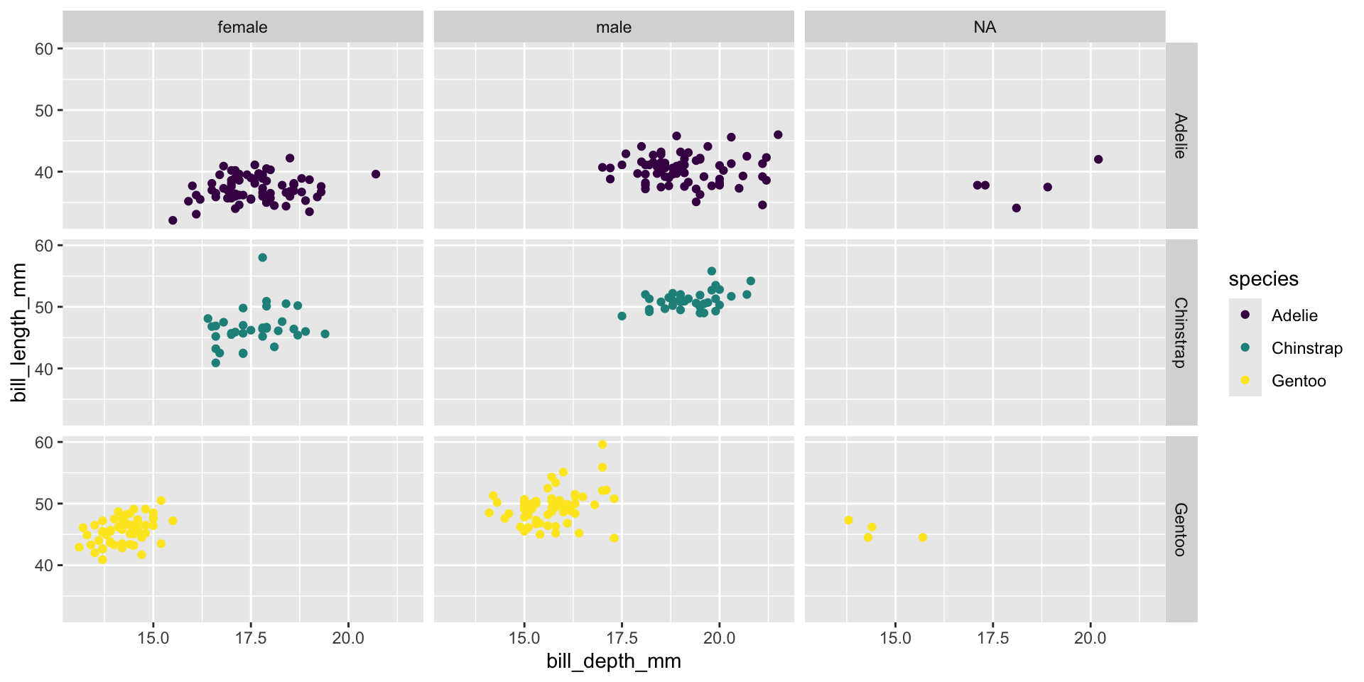
Facet and color, no legend