Modeling non-linear relationships
Intro to Data Analytics
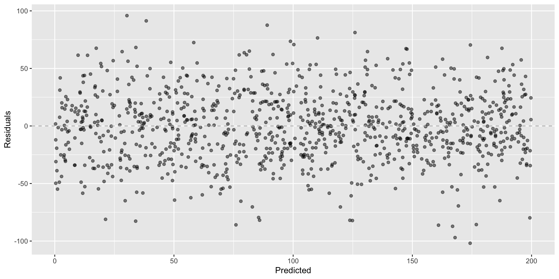
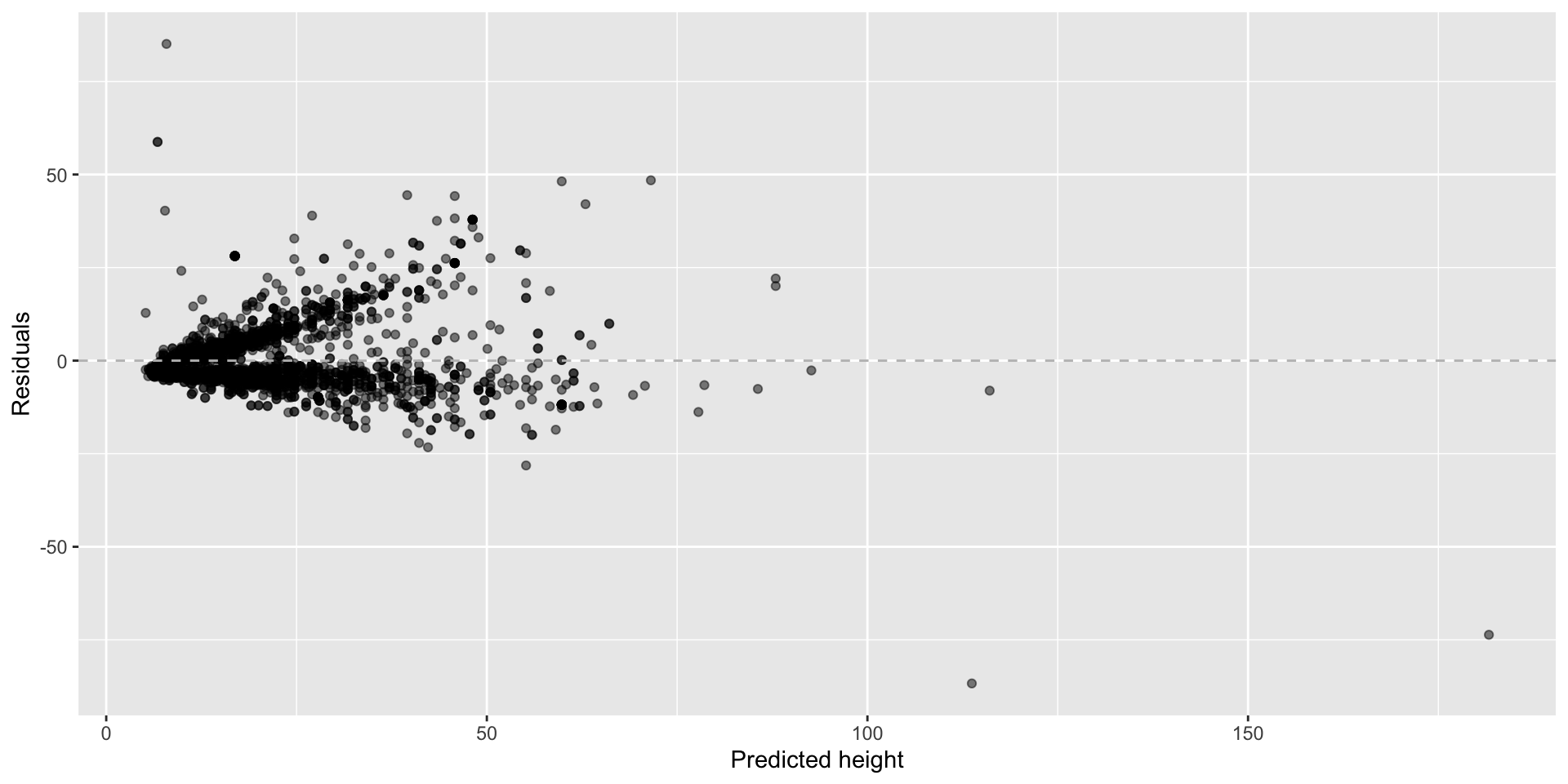
Looking for…
- Residuals distributed randomly around 0
- With no visible pattern along the x or y axes
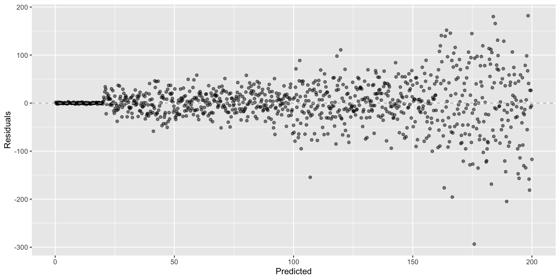
Not looking for…
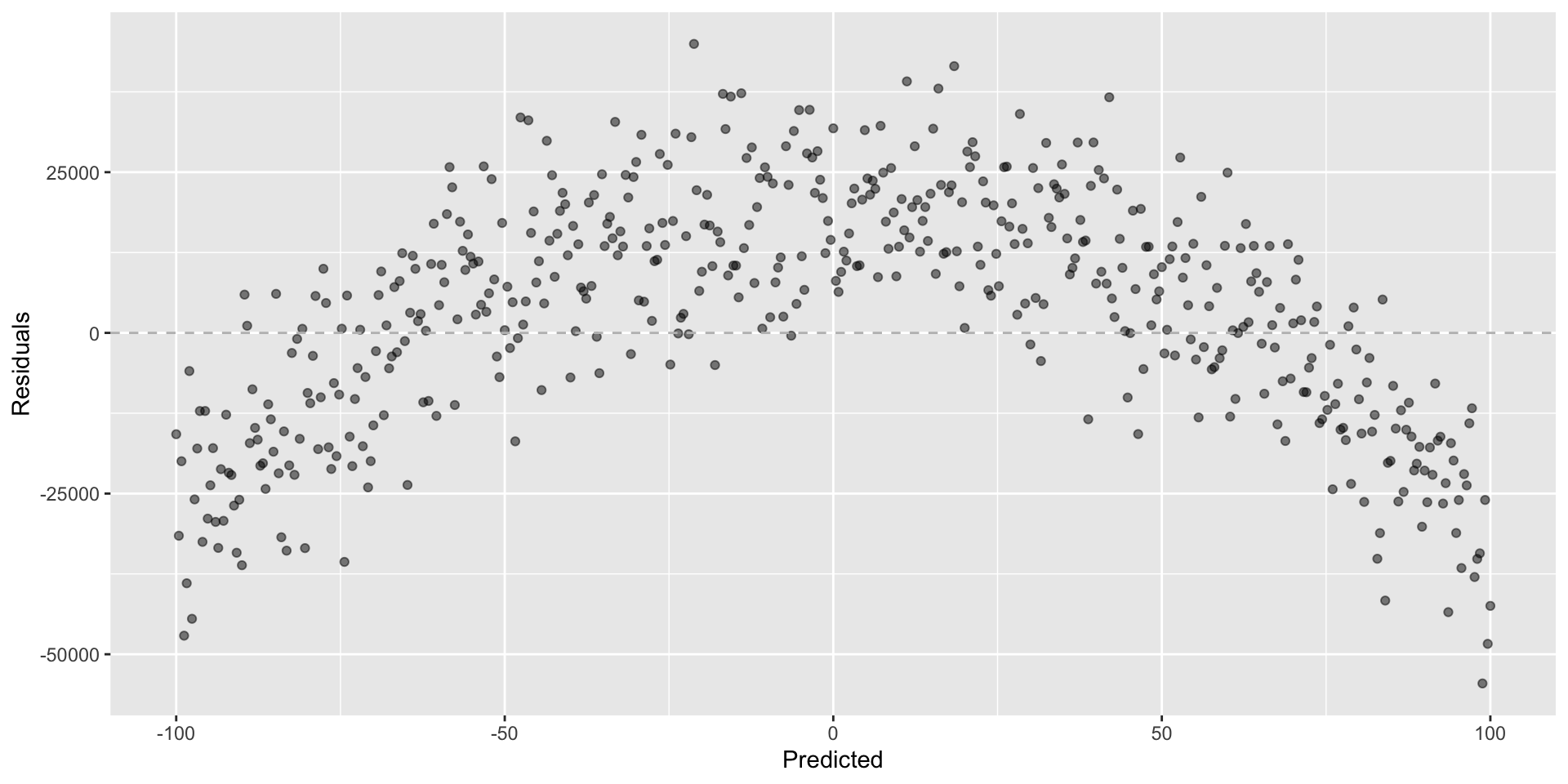
Fan shapes
Not looking for…
Groups of patterns
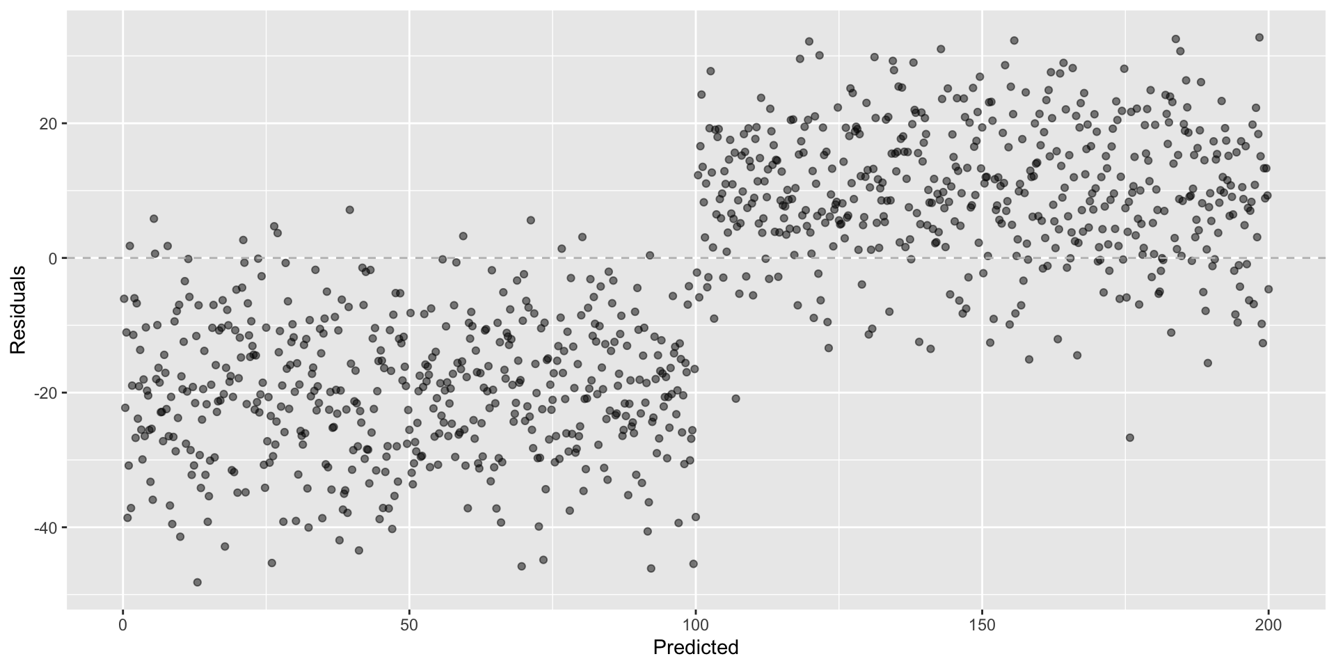
Not looking for…
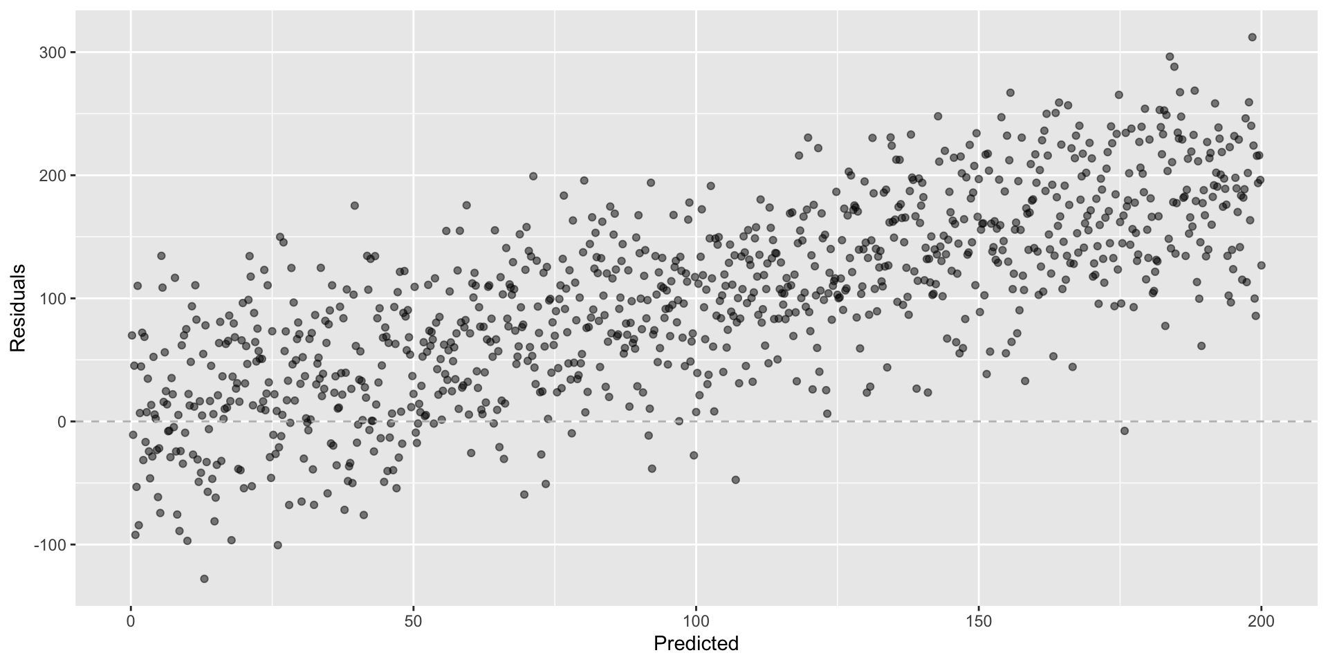
Residuals correlated with predicted values
Not looking for…
Any patterns!
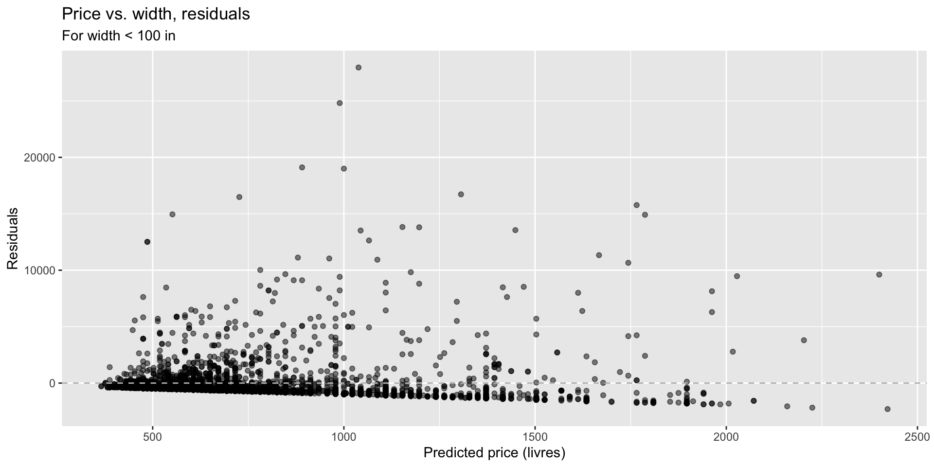
What patterns does the residuals plot reveal that should make us question whether a linear model is a good fit for modelling the relationship between height and width of paintings?
- Variability of residuals increases as predicted values increase.
Data: Paris Paintings
- Skew?
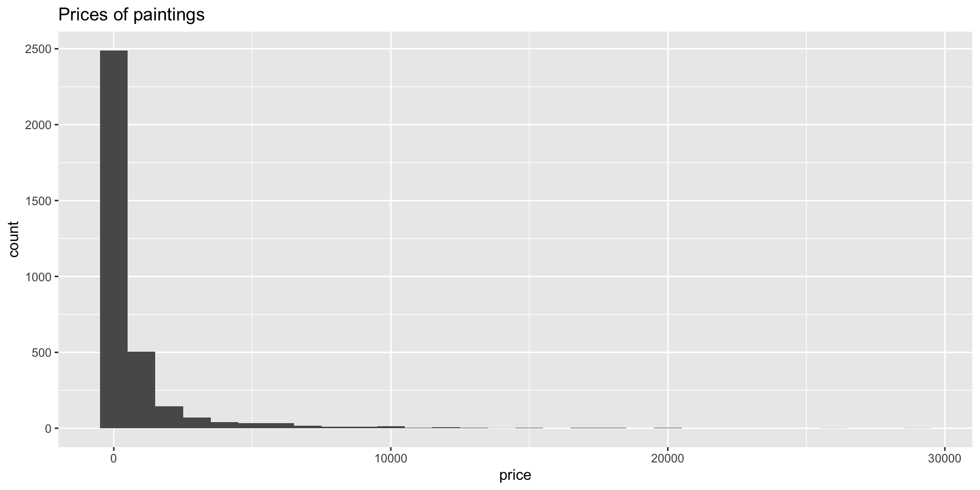
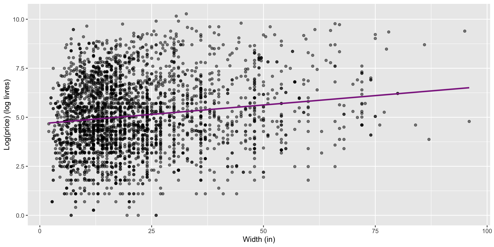
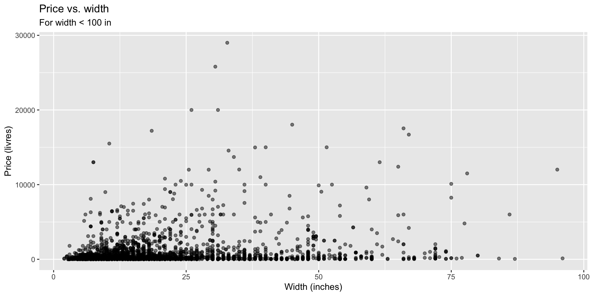
Price vs. width
- V-shape —> not linear
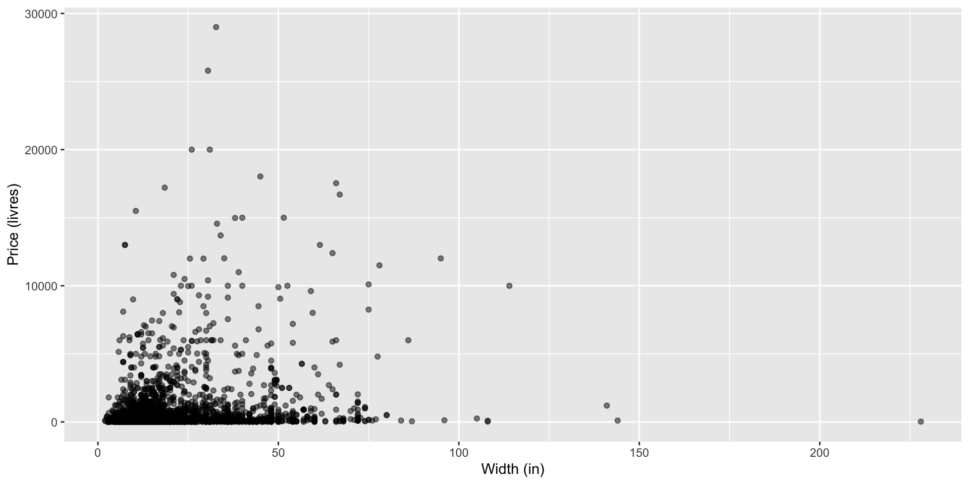
Price vs. width
Which plot shows a more linear relationship? Scatter, but…is it clearly linear or not? Do we see a band of data?
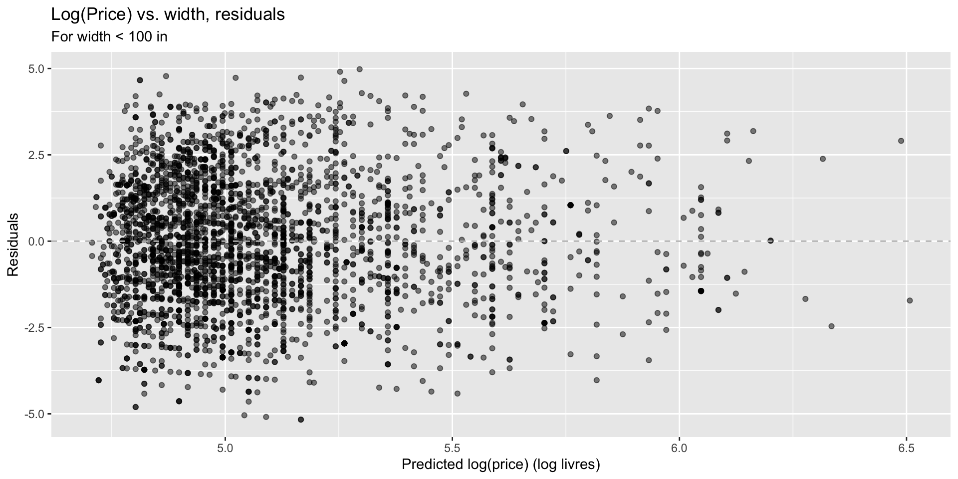
Price vs. width, residuals
Which plot shows residuals that are uncorrelated with predicted values from the model? Also, what is the unit of the residuals? Were w able to capture linear relationship?
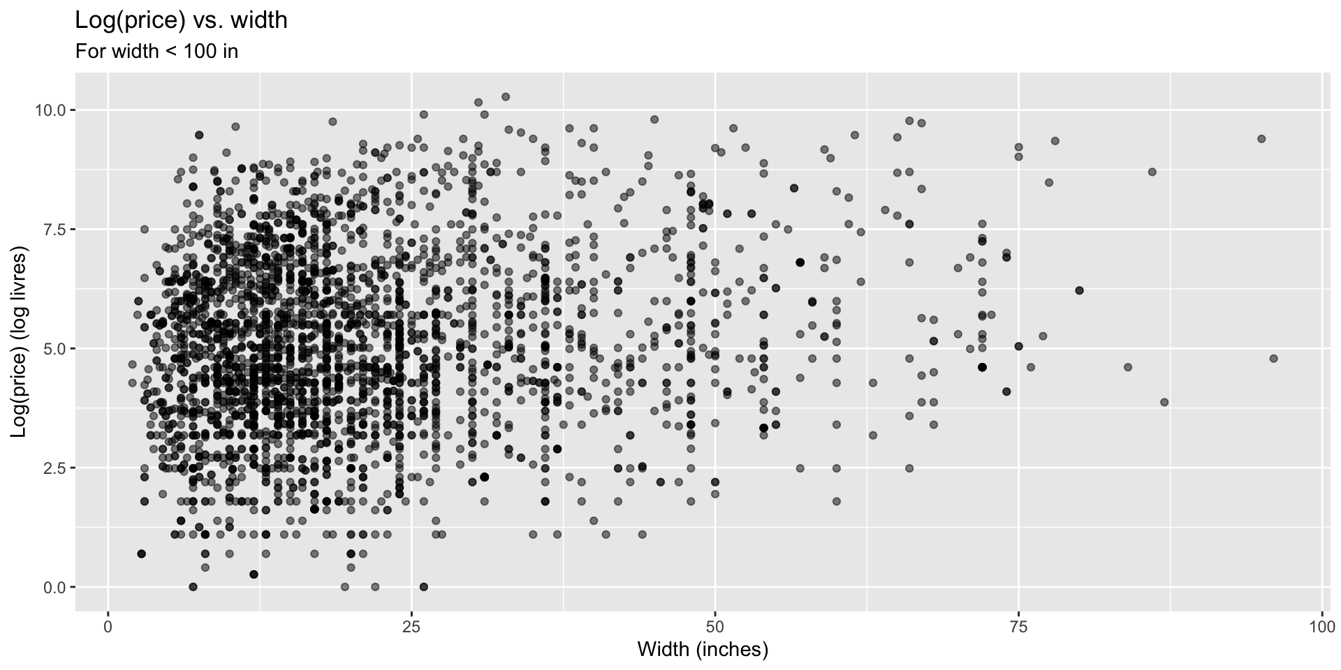
Logged price vs. width
How do we interpret the slope of this model?