Mapping Environmental Justice in the Muhheakunnuk Valley
We’ll explore environmental justice in Dutchess County, within the Muhheakunnuk or Hudson Valley region.
Purpose
You will:
Load tabular and spatial data in R.
Plot data using ggplot geoms.
Use a spatial join to attach Toxic Release Inventory (TRI) facilities to neighborhoods (tracts).
Create a simple exposure indicator. Compute:
TRI facilities per tract
TRI per square mile
Explore associations between TRI facility locations and neighborhood indicators such as asthma prevalence, unemployment, and the percentage of children in a neighborhood.
Create choropleth maps of Dutchess County, NY using ggplot.
Install packages
You only need to do this step once.
install.packages("sf"))#popular package for working with spatial data
Load the required packages
library(tidyverse)library(sf)
First, let’s use the read_sf function from the sf package to read in spatial data…
Step 1: Load spatial data
We will work with two spatial datasets:
dutchess_indicators: Census tracts with demographic and socioeconomic indicators.
tri_facilities: TRI facilities (point locations).
# County variables (e.g., median household income)#dutchess_indicators <- read_sf("data/dutchess_indicators.geojson")# Point locations of TRI facilities for the Hudson Valley#tri_facilities <- read_sf("data/toxic_release_inventory_epa.shp")# Make sure that both layers are projected on the earths surface # correctly: they need to have the same projectiontri_facilities <-st_transform(tri_facilities, st_crs(dutchess_indicators))
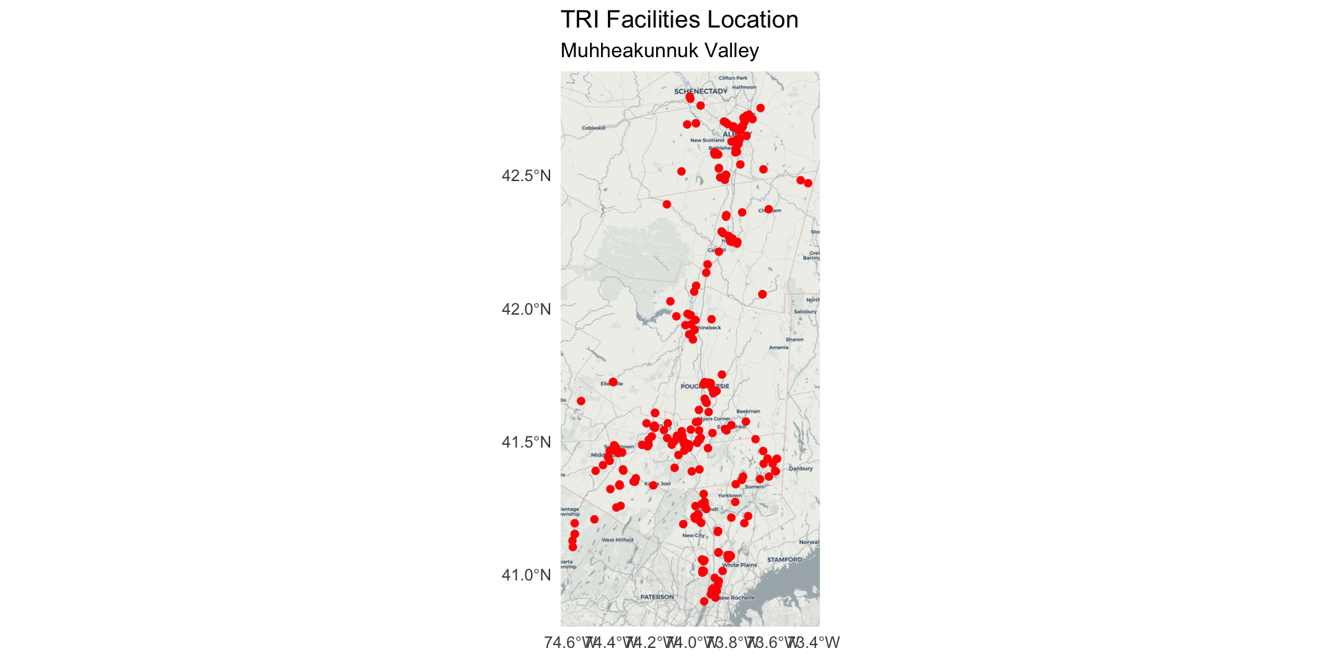
Explore exposure to pollutants from toxic release facilities
Explore and compare the location of the U.S. Environmental Protection Agency’s list of facility location producing or working with toxic chemicals.
tri_facilities contains one row for each Toxic Release Inventory (TRI) facility in the Hudson Valley. We will work with those in Dutchess County, NY.
Dutchess County, NY Federal Data
For this activity we’ll use the Census Tract geography, which are roughly neighborhood-sized areal units.
Each observation represents a Census Tract “neighborhood” and contains various social, economic, and built environment attributes for that neighborhood.
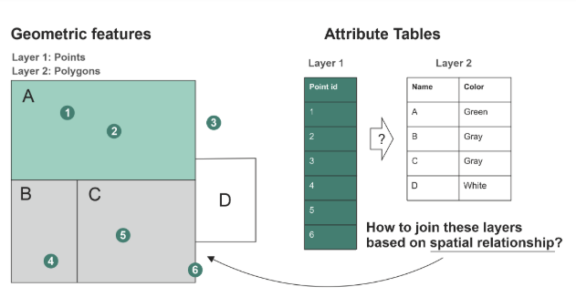
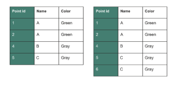
st_join() adds the columns from one spatial dataset to another based on how their shapes overlap or relate in space.
Use ?st_join to learn more.
Examples of spatial join relationships
One point falls inside a polygon
Two polygons touch each other
A line crosses a boundary
One feature is the nearest to another
Spatial join
It uses intersects, meaning if shapes touch or overlap, they get joined.
It does not require a matching column
It does not change the shapes
Imagine placing transparent paper maps on top of each other. Where features line up, st_join() copies the information from one map onto the other.
Spatial join
st_within and st_intersects argument inside st_join (Hint: use ?function_name to learn more.)
Summary of a spatial join
st_join() is a join by location, not by column.
It adds attributes from one spatial layer to another.
It uses spatial relationships like intersects, within, contains, or nearest.
Used for the task of transferring attributes across overlapping layers:
Assigning census data to point locations (e.g., TRI sites)
Matching point data attributes to neighborhoods
Use the same coordinate system
In order to conduct any spatial operations like st_join both layers need to be projected onto the earth surface in the same way.
We do this using a coordinate reference system or crs
k12_points <-st_as_sf(k12_df, coords =c("x", "y"), crs =4326) %>%# Always load new data using the default crs 4326st_transform(3626) # transform the coordinate reference system to be the same as dutchess_indicators and dutchess_tri # Alternative approachk12_points <-st_as_sf(k12_df, coords =c("x", "y"), crs =4326) %>%st_transform(st_crs(dutchess_indicators))
Step 3: Spatial join
Purpose: We want to know which neighborhoods contain TRI facilities. So, we attach each tract join_ID to the TRI facilities observations.
It tells which neighborhood (aka census tract) each TRI observation is within.
We use st_join() with a st_within predicate to attach tract attributes to each TRI point.
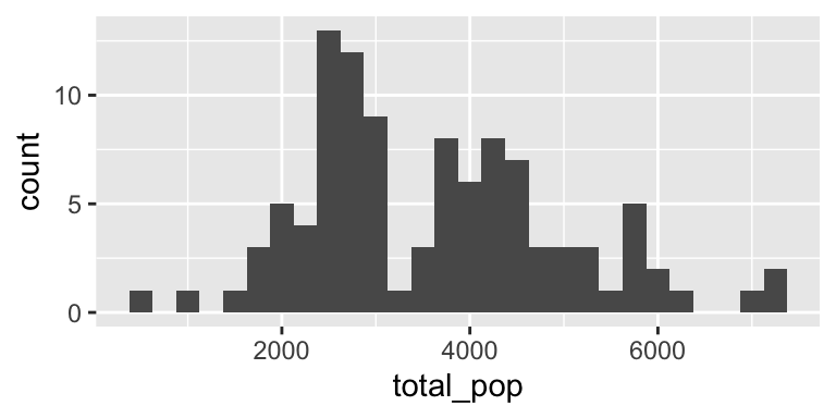
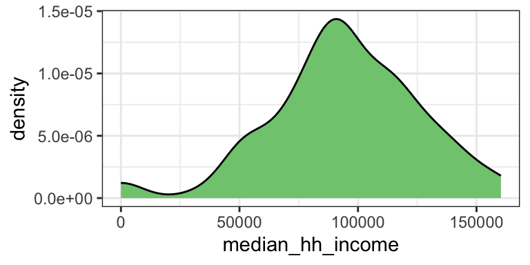
total_pop area_sqmiles median_hh_income percent_children
Min. : 536 Min. : 0.1256 Min. : 0 Min. : 0.00
1st Qu.:2616 1st Qu.: 2.6370 1st Qu.: 78770 1st Qu.:15.20
Median :3502 Median : 5.5814 Median : 93278 Median :18.00
Mean :3609 Mean :11.0726 Mean : 94374 Mean :17.73
3rd Qu.:4522 3rd Qu.:14.3142 3rd Qu.:114663 3rd Qu.:21.50
Max. :7137 Max. :56.9210 Max. :160294 Max. :28.20
percent_white percent_black percent_latine unemployment_rate
Min. :11.20 Min. : 0.40 Min. : 1.70 Min. : 0.000
1st Qu.:64.40 1st Qu.: 2.70 1st Qu.: 7.90 1st Qu.: 2.300
Median :73.40 Median : 5.20 Median :11.50 Median : 4.200
Mean :68.98 Mean :10.28 Mean :13.02 Mean : 4.773
3rd Qu.:79.00 3rd Qu.:10.40 3rd Qu.:16.90 3rd Qu.: 6.850
Max. :89.50 Max. :60.80 Max. :30.90 Max. :16.100
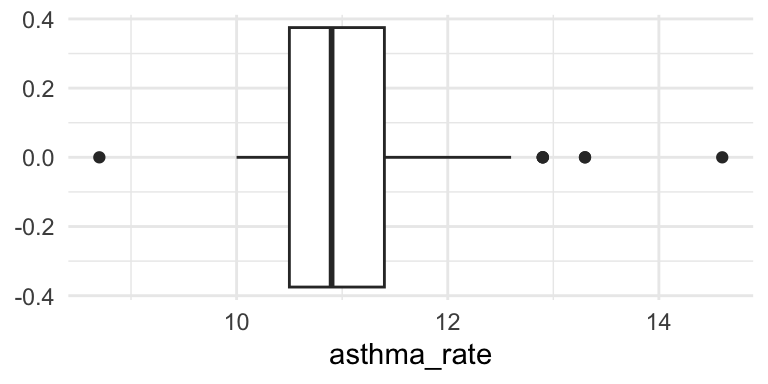
asthma_rate low_food_access prox_traffic_pollution tri_n
Min. : 8.70 Min. : 0 Min. : 0.0 Min. :0.0000
1st Qu.:10.50 1st Qu.:2055 1st Qu.: 23.2 1st Qu.:0.0000
Median :10.90 Median :2964 Median : 79.8 Median :0.0000
Mean :11.09 Mean :3034 Mean : 183.9 Mean :0.4369
3rd Qu.:11.40 3rd Qu.:4074 3rd Qu.: 200.0 3rd Qu.:0.0000
Max. :14.60 Max. :6245 Max. :1719.9 Max. :6.0000
tri_per_sqmile geometry
Min. :0.0000 POLYGON :103
1st Qu.:0.0000 epsg:3626 : 0
Median :0.0000 +proj=tmer...: 0
Mean :0.1665
3rd Qu.:0.0000
Max. :2.2206
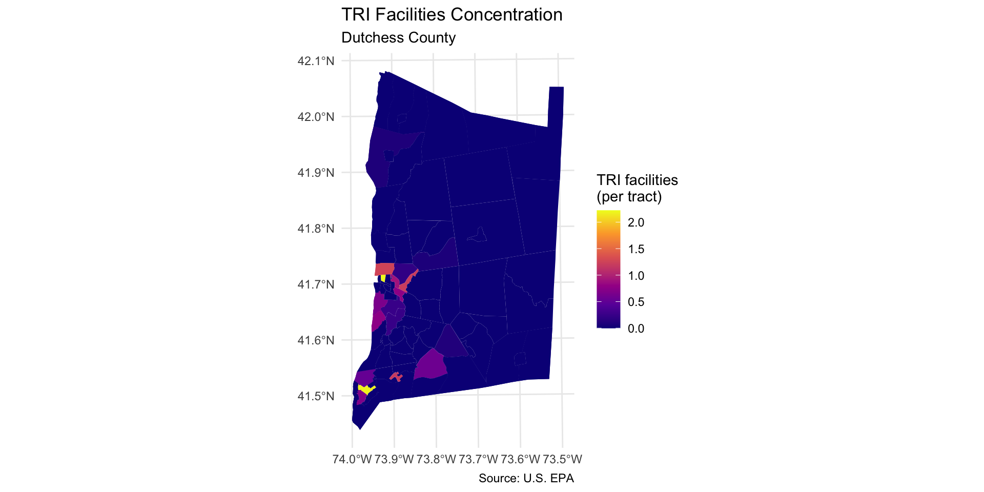
Step 6: Map TRI facilities per square mile
Step 6: Map TRI facilities per square mile
Map the count of TRI facilities per square mile across each neighborhood using geom_sf:
Use caption = "Source: U.S. EPA" to add a source note to the bottom of the map extent.
dutchess_tri %>%ggplot() +geom_sf(aes(fill = tri_per_sqmile), color =NA) +scale_fill_viridis_c(option="C", name="TRI facilities\n(per tract)") +labs(title="TRI Facilities Concentration", subtitle="Dutchess County",caption ="Source: U.S. EPA") +theme_minimal()
Step 7: Map other indicators of interest
Select another two or three variables from the dutchess_tri data frame to map. Change the fill = argument in the geom_sf() function to display the new indicator.
You will also need to change the fill legend title and title of the map.
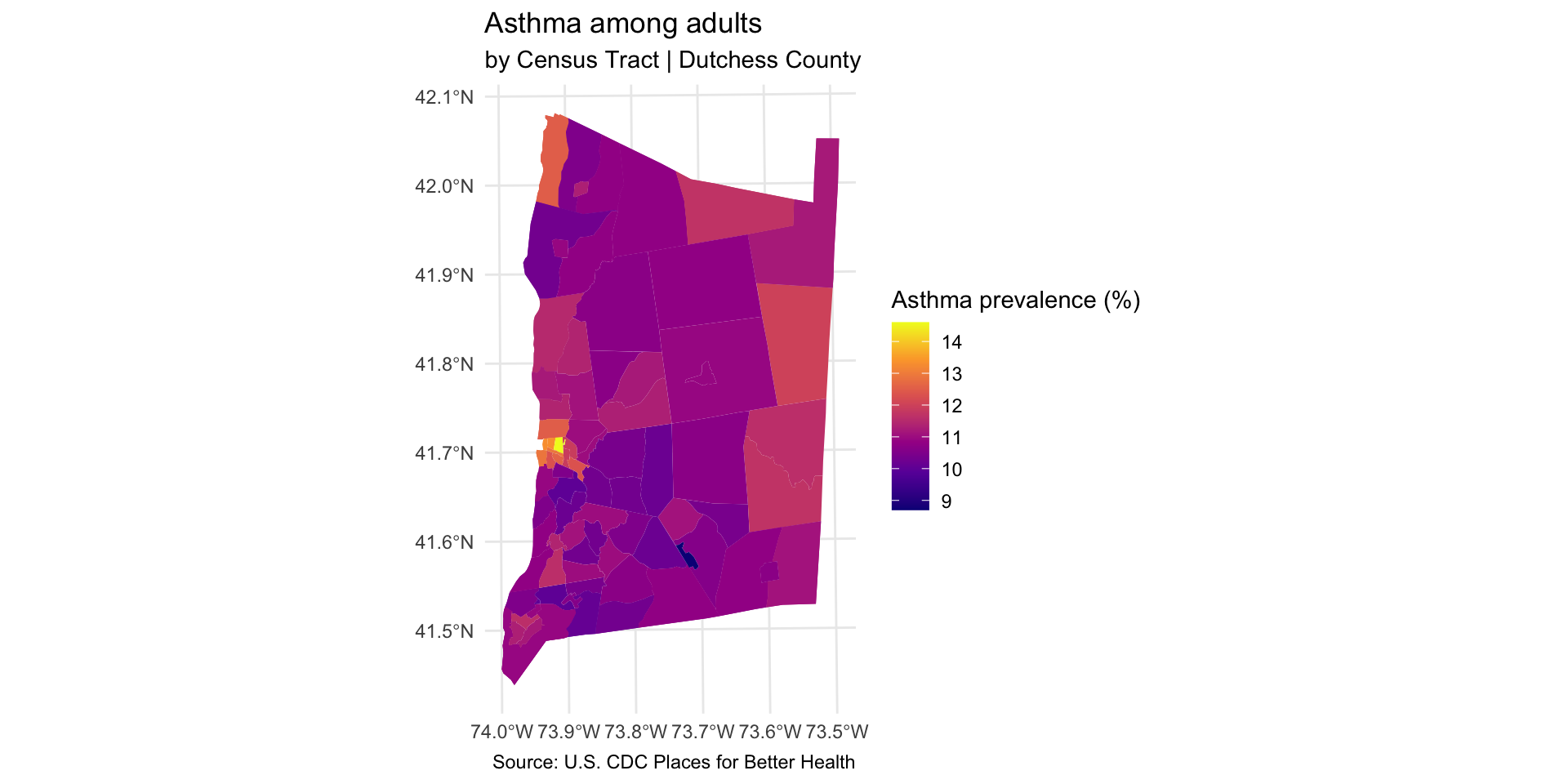
dutchess_tri %>%ggplot() +geom_sf(aes(fill = asthma_rate), color =NA) +scale_fill_viridis_c(option="C", name="Asthma prevalence (%)") +labs(title="Asthma among adults", subtitle="by Census Tract | Dutchess County",caption ="Source: U.S. CDC Places for Better Health") +theme_minimal()
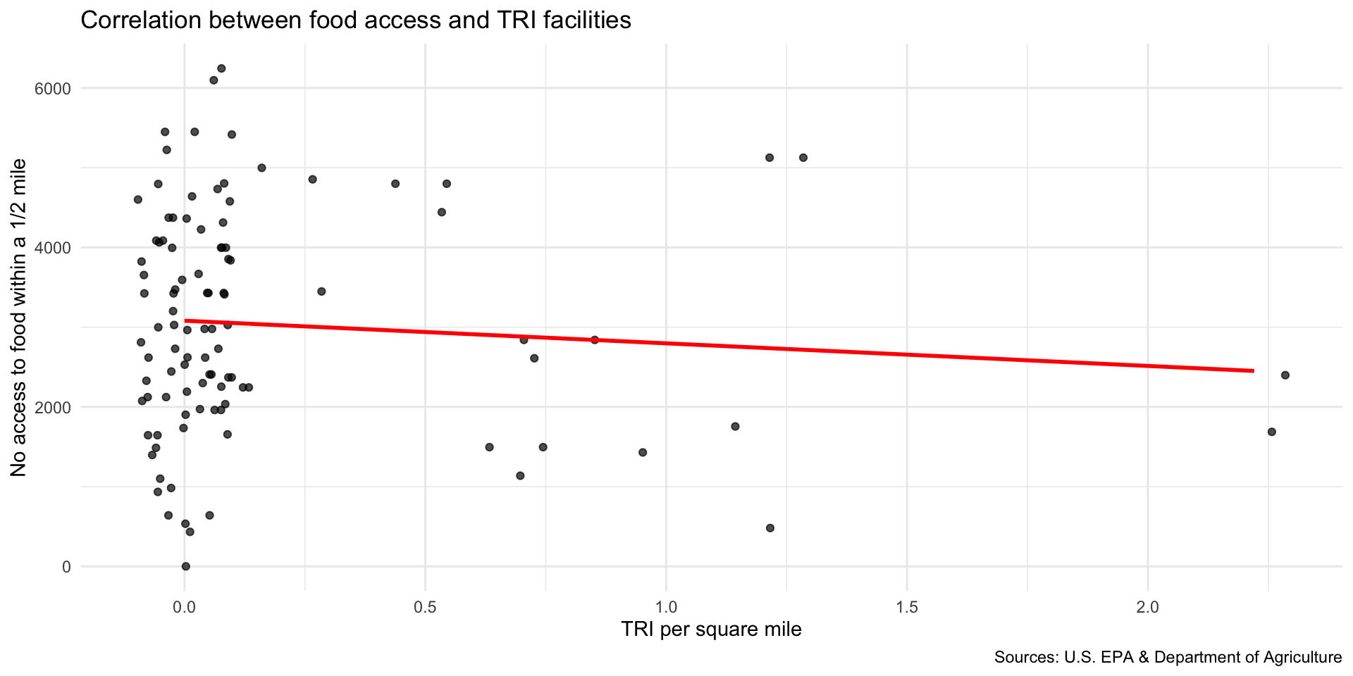
Step 8: Explore associations with neighborhood indicators
We can now explore how the location of TRI facilities is associated with neighborhood-level indicators.
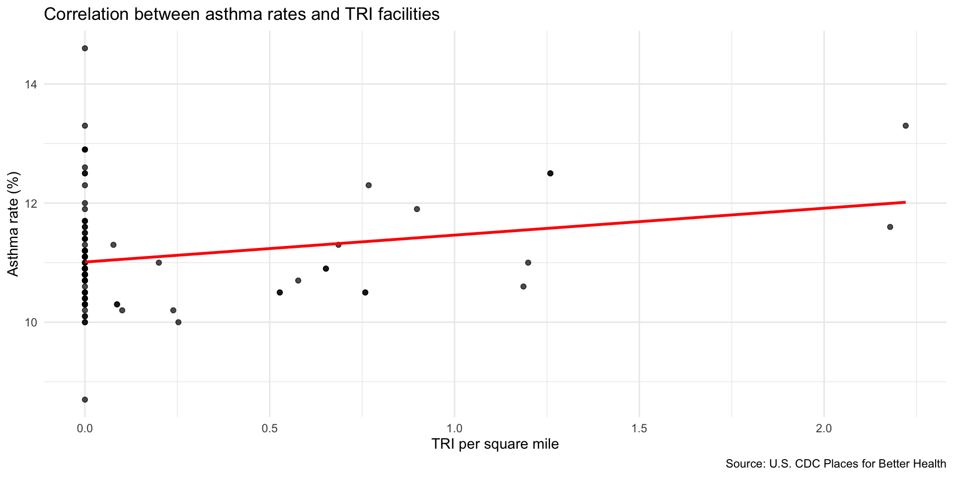
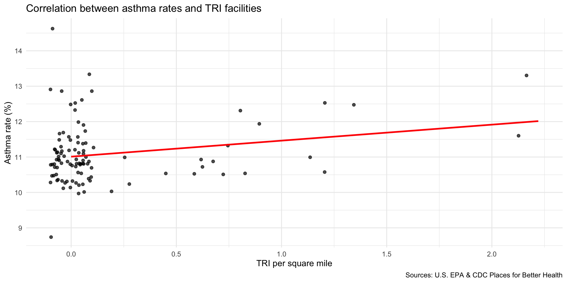
Scatter plot to explore correlation
Compare TRI facilities tri_per_sqmile with the prevalence of asthma among the population: asthma_rate
Are neighborhoods with a higher concentration of TRI facilities near adults correlated with higher rates of asthma?
Use geom_smooth(method="lm") to add a linear regression line to your plot.
Use geom_jitter() to better observe the clustering of observations
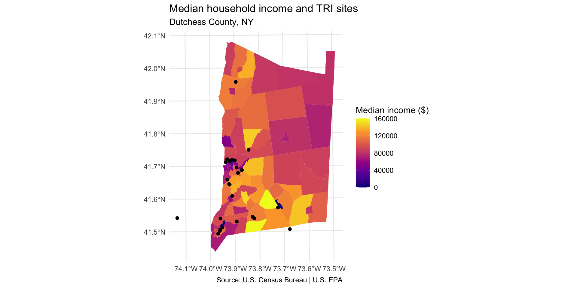
Step 9: Map TRI facility points with median household income
Compare TRI facility locations with the median household income in the neighborhood median_hh_income.
Step 9: Map TRI facility points with median household income
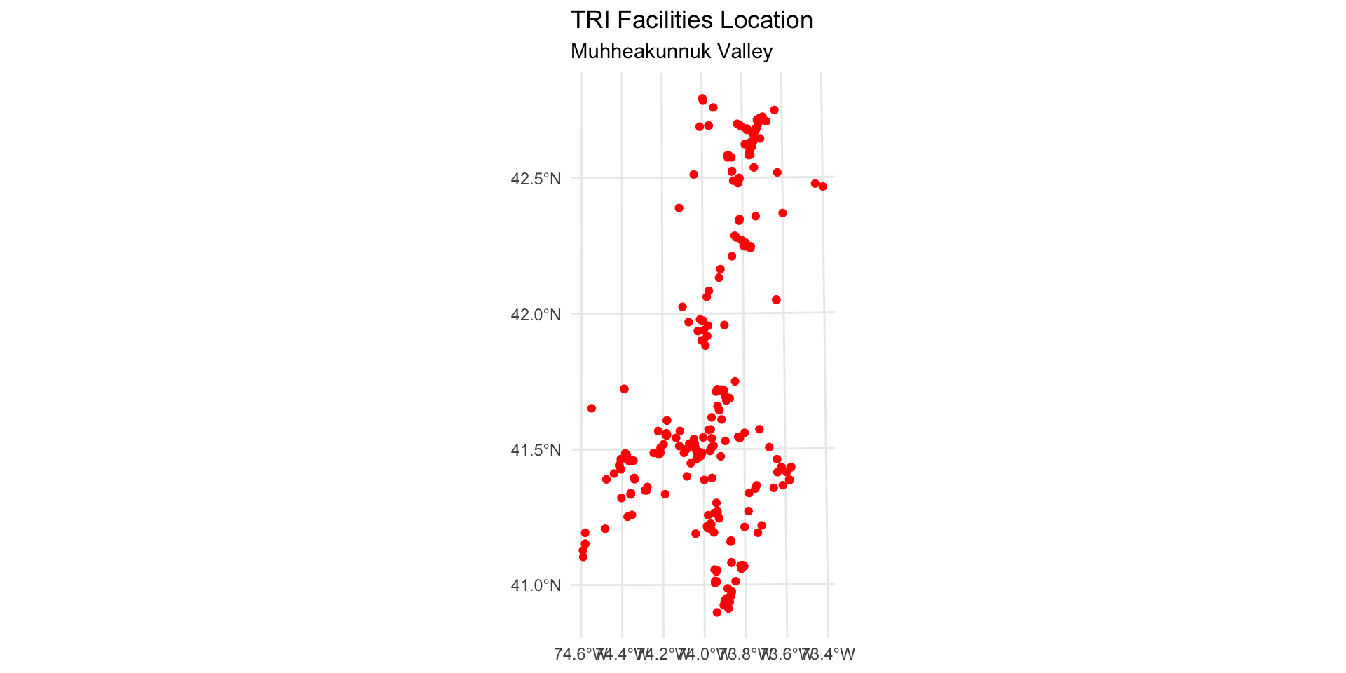
First, create a TRI layer that only includes facilities within Dutchess County.
Use the COUNTY_NAM variable to identify sites in Dutchess County.
Use distinct to identify how the Dutchess County entry is formatted in this dataset.
NOTE: there is at least one TRI facility that appears outside of Dutchess County due to errors in the EPA database.
Create a TRI layer that only includes facilities within Dutchess County
distinct(tri_facilities, COUNTY_NAM)
        COUNTY_NAM
1           ORANGE
2           ULSTER
3         COLUMBIA
4           GREENE
5         DUTCHESS
6    ORANGE COUNTY
7  COLUMBIA COUNTY
8    ULSTER COUNTY
9  SULLIVAN COUNTY
10   GREENE COUNTY
11 DUTCHESS COUNTY
12          PUTNAM
13     WESTCHESTER
14          ALBANY
15        ROCKLAND
16          BERGEN
17      RENSSELAER
18     SCHENECTADY
19          SUSSEX
20   ALBANY COUNTY
21   SUSSEX COUNTY
#install.packages("tmap") library(tmap)tmap_mode("view") # set tmap to interactive map modetm_shape(tri_dutchess) +tm_symbols(col ="red", size =0.2)
Note: you could use this interactive to identify the point(s) outside of Dutchess County (on the west of the estuary), then filter them out for the final map. For example, use `filter(REGISTRY_I != 110070690536)
Step 9: Map TRI facility points with median household income
In order to show two layers on the same ggplot map, you will need to use the data = argument inside your geom_sf. For example: geom_sf(data = sf_dataset).
Are neighborhoods with a higher concentration of TRI facilities more likely to have higher or lower median income?
Note: you will see that one TRI facility location showing up on the west side of estuary has an incorrect entry in the COUNTY_NAM variable. Ideally, we would remove this observation, but we can keep it in there for now.
dutchess_tri %>%ggplot() +geom_sf(aes(fill = median_hh_income), color =NA) +scale_fill_viridis_c(option="C", name="Median income ($)") +geom_sf(data = tri_dutchess) +labs(title="Median household income and TRI sites", subtitle="Dutchess County, NY",caption ="Source: U.S. Census Bureau | U.S. EPA" ) +theme_minimal()
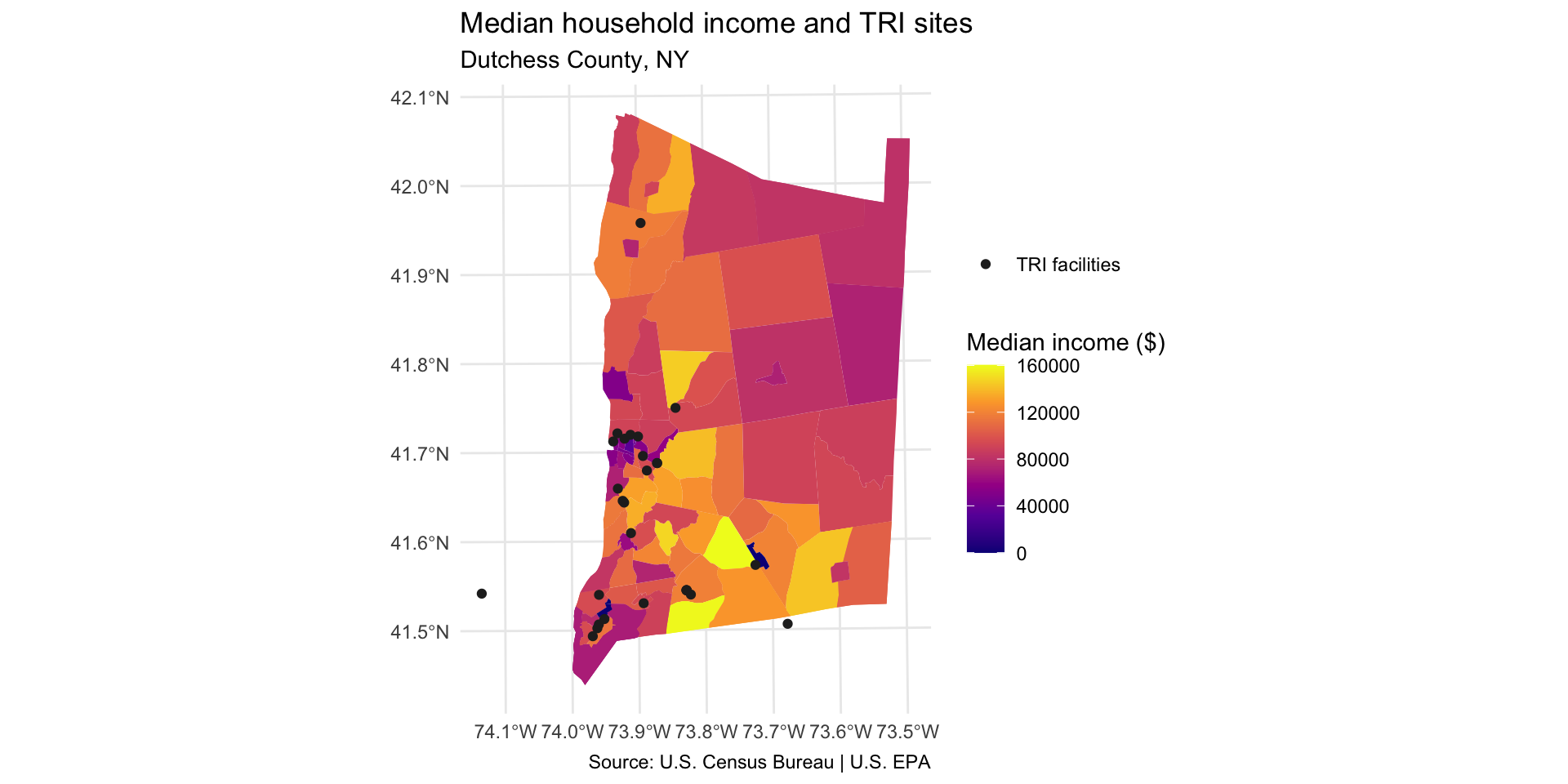
Add legend item for TRI facility points
Add the following to generate a legend item for the point layer:
aes(color = "TRI facilities") mapping function generates a legend item
Set color aesthetic in scale_color_manual()
dutchess_tri %>%ggplot() +geom_sf(aes(fill = median_hh_income), color =NA) +scale_fill_viridis_c(option="C", name="Median income ($)") +geom_sf(data = tri_dutchess,aes(color ="TRI facilities"), # mapped aesthetic makes legend item appearsize =1.5 ) +scale_color_manual(name =NULL, # no legend titlevalues =c("TRI facilities"="#252525") ) +labs(title="Median household income and TRI sites", subtitle="Dutchess County, NY",caption ="Source: U.S. Census Bureau | U.S. EPA" ) +theme_minimal()
Discussion
Identify and describe which parts of the county have higher TRI density. Use cardinal directions (north, south, east, west).
Describe one pattern in terms of: income, asthma, or an indicator you choose.
Why do you think we observe these relationships? Come up with one hypothesis that explains the pattern you observe.