Data Visualization
Introduction to ggplot
Why do data viz?
- part of EDA
- to convey information to others
Types of data
Numeric data
Categorical data
ggplot2
- Tidyverse’s data visualizaton package
- ggplot() is main function in the package
- gg stands for Grammar of Graphics
- inspired by book Grammar of Graphics - Wilkinson
- Plots are built up in layers
- Concisely describe components of a graphic
- Easy to do incremental development and check your work!
ggplot2
Lets us control:
- functions used for plotting
- dataset being plotted
- mapping of variables to plot features (aesthetics)
- ggplot2.tidyverse.org
Components of a data graphic
Every data graphic that you make with ggplot2 will contain at least the following elements:
-
a call to the ggplot() function that contains:
a data argument that specifies the name of the object containing the data to be plotted
a mapping argument that specifies one (or more) connections between variables in the data frame and elements on the plot
a + operator that adds a new layer to a plot
a call to a geom_*() function that specifies what you actually want to draw
ggplot2
- ggplot() – main function
- Plot code structure:
ggplot(data = [dataset], #where to find the data
mapping = aes(x = [x-var], y = [y-var])) +
geom_type() +
other options
Our data
#Install and load the readxl package to load Excel files
#install.packages("readxl")
library(readxl)
df_ab <- readxl::read_excel("ab_data.xlsx")
# A tibble: 6 × 3
      a     b c
  <dbl> <dbl> <chr>
1  -2    -0.2 inside
2  -1.9  -1.8 outside
3  -1.8  -3.1 inside
4  -1.5  -3.2 inside
5  -1.4   1.2 outside
6  -1.3  -1.2 inside
ggplot2
Define dataset
# scatterplot of a and b
ggplot(data = df_ab)
![]()
ggplot2
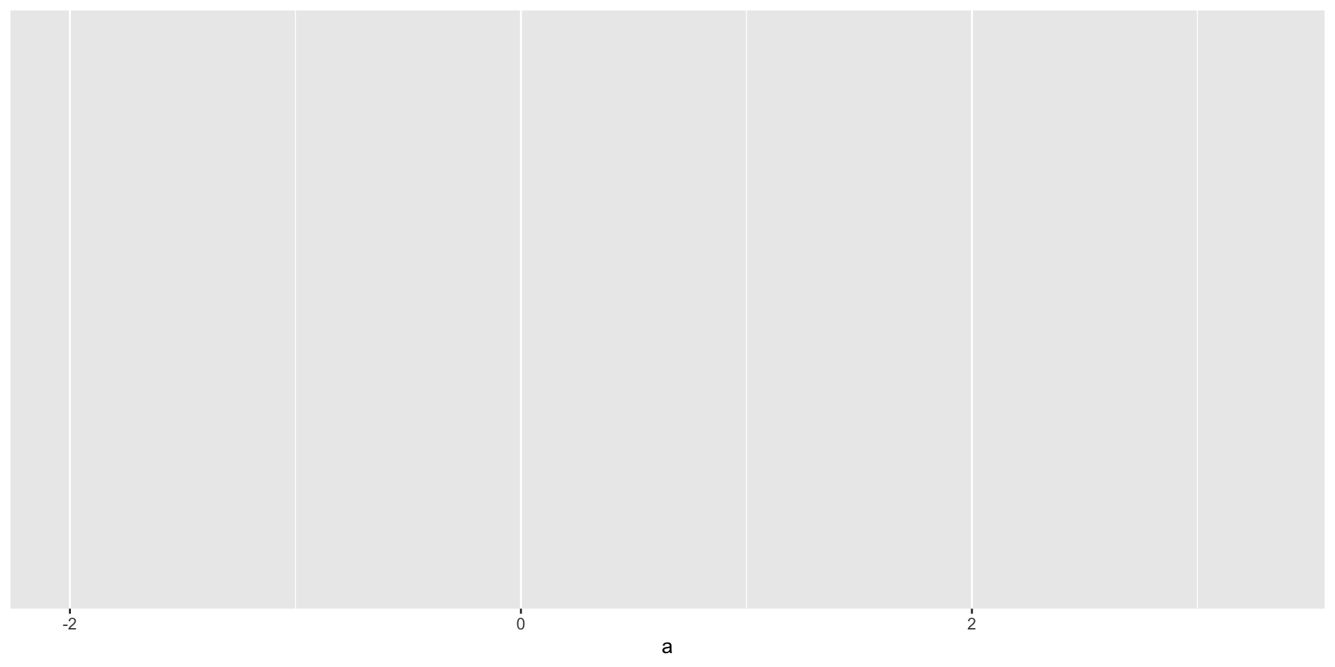
Set up variable mapping of one variable on the x-axis of the plot space
# scatterplot of a and b
ggplot(data = df_ab,
       mapping = aes(x = a))
![]()
ggplot2
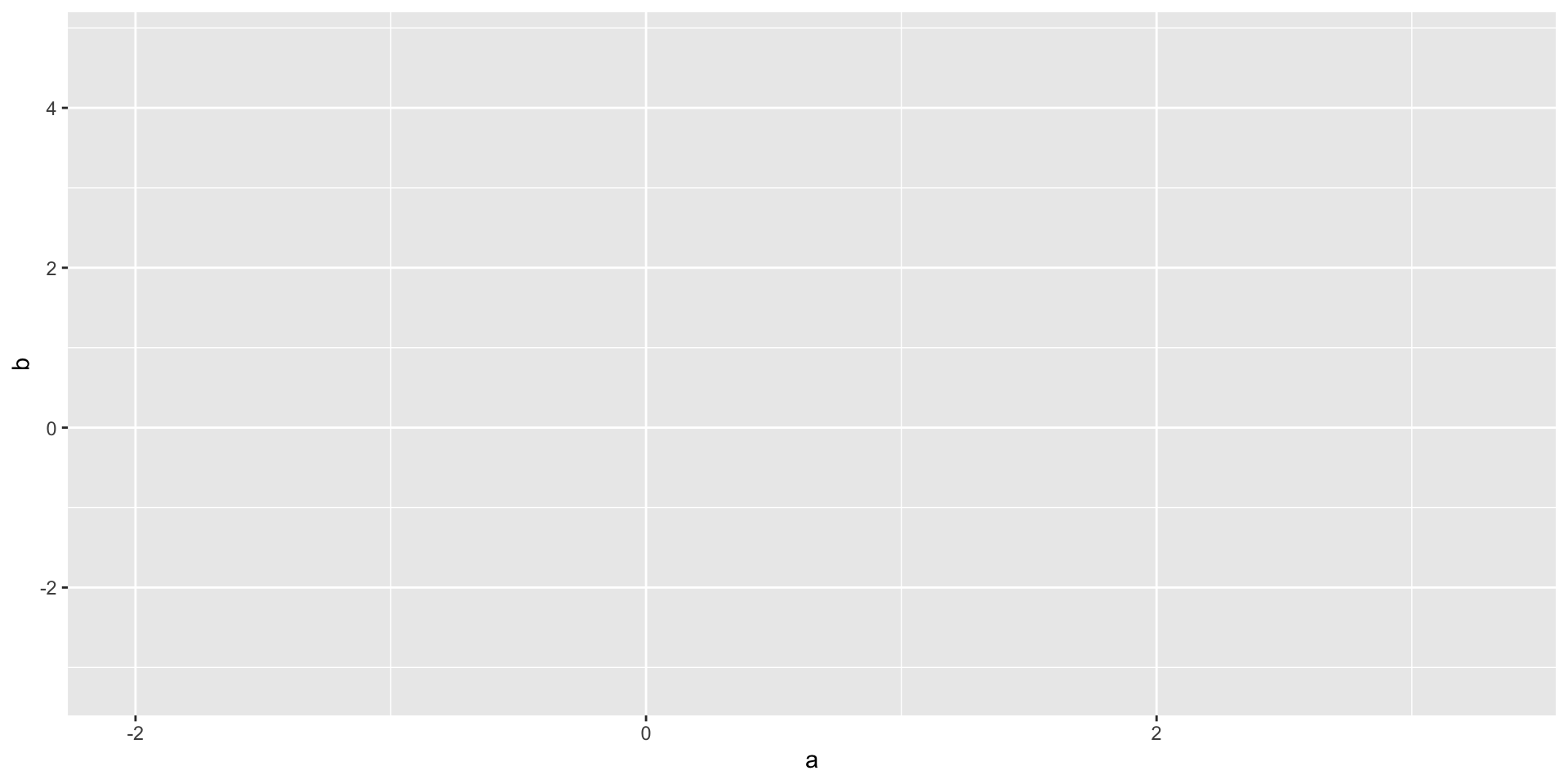
Set up variable mapping for two variables, x and y axis of the plot space
# scatterplot of a and b
ggplot(data = df_ab,
       mapping = aes(x = a, y = b))
![]()
ggplot2
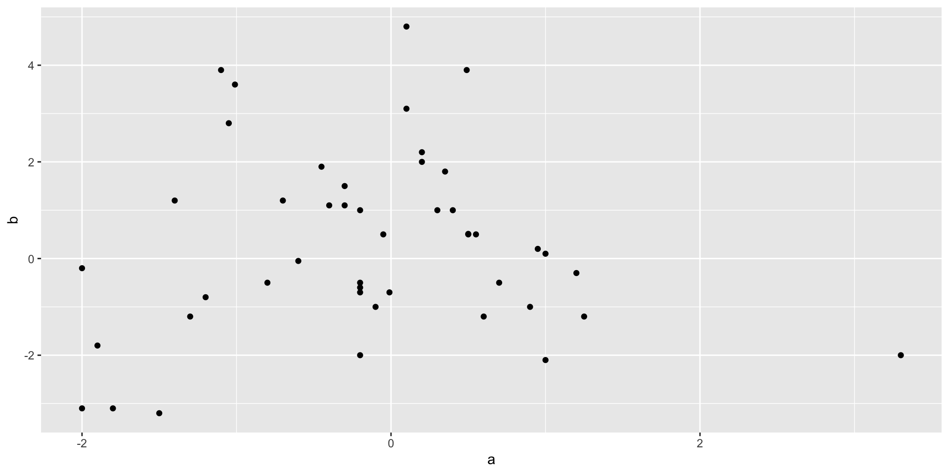
Specify the geom type
# scatterplot of a and b
ggplot(data = df_ab,
       mapping = aes(x = a, y = b)) +
  geom_point()
![]()
ggplot2
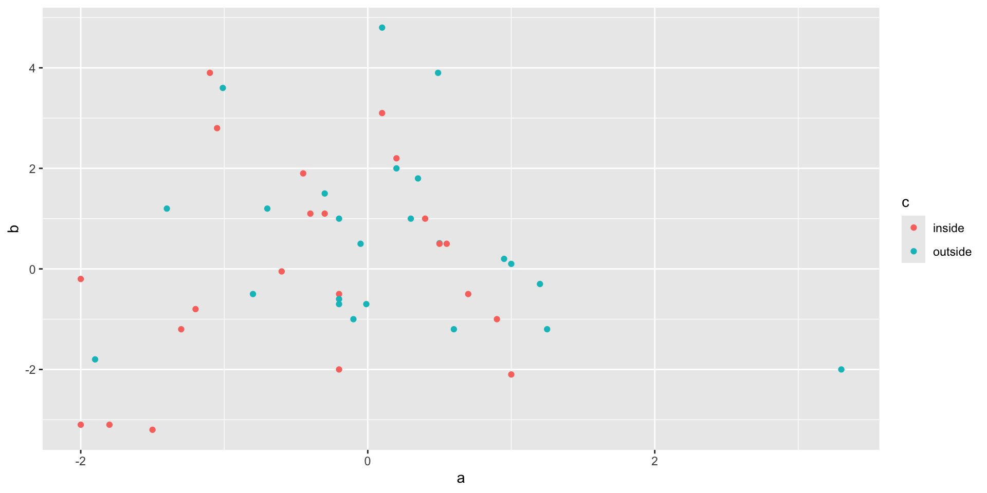
Color points based on variable in dataset
# scatterplot of a and b
ggplot(data = df_ab,
       mapping = aes(x = a, y = b, color = c)) +
  geom_point()
![]()
ggplot2
Color all points the same color
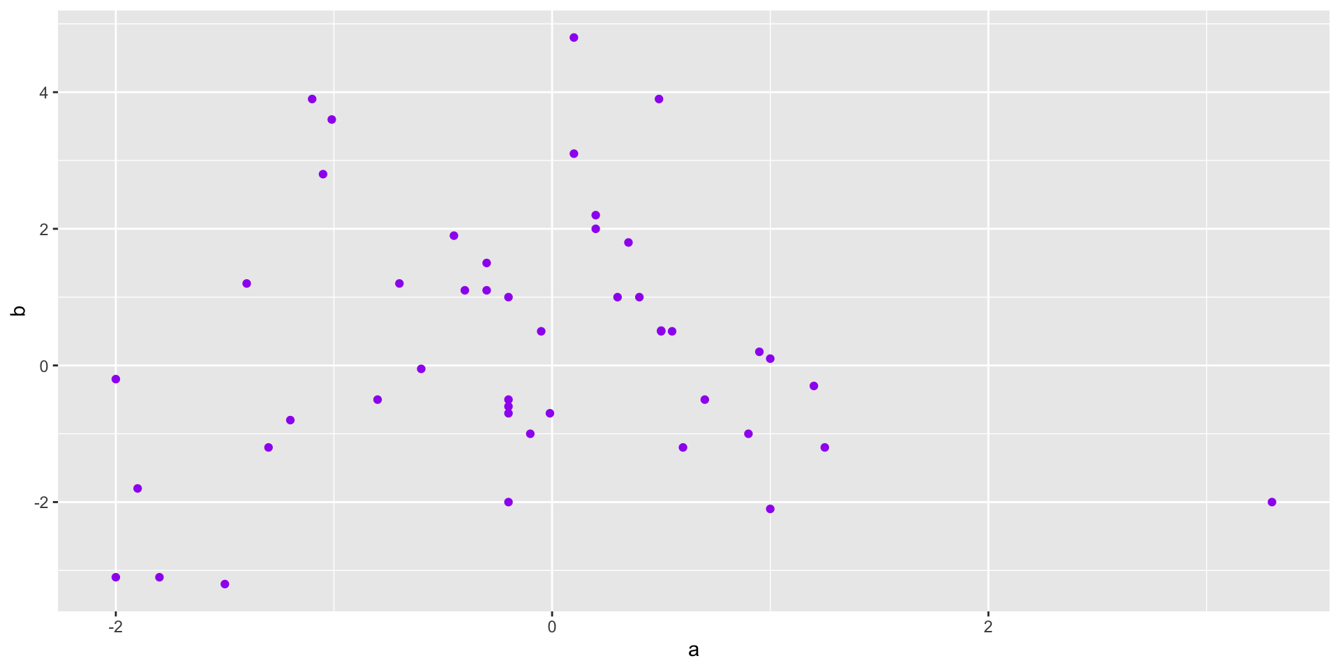
# scatterplot of a and b
ggplot(data = df_ab,
       mapping = aes(x = a, y = b)) +
  geom_point(color = "purple")
![]()
ggplot2
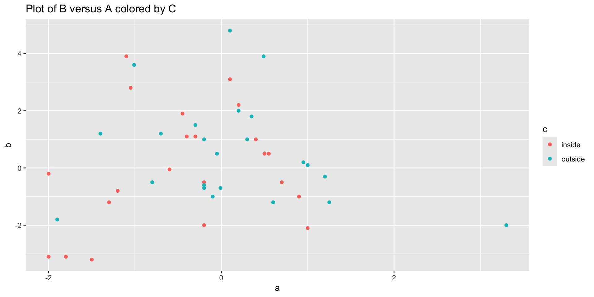
Add a plot title
# scatterplot of a and b
ggplot(data = df_ab,
       mapping = aes(x = a, y = b, color = c)) +
  geom_point() +
  labs(title = "Plot of B versus A colored by C")
![]()
ggplot2
# scatterplot of a and b
ggplot(df_ab,
       aes(x = a, y = b, color = c)) +
  geom_point() +
  labs(title = "Plot of B versus A colored by C")
![]()
Basic plot types
- Distribution
- Histogram (distribution across buckets or bins)
- Smooth density plot (pretty histogram)
- Box plot (distribution with key summary statistics)
- Relationships
- Scatter plot (relationship between x and y)
- Summarizing categories
- Bar chart (distribution or frequency across categories)
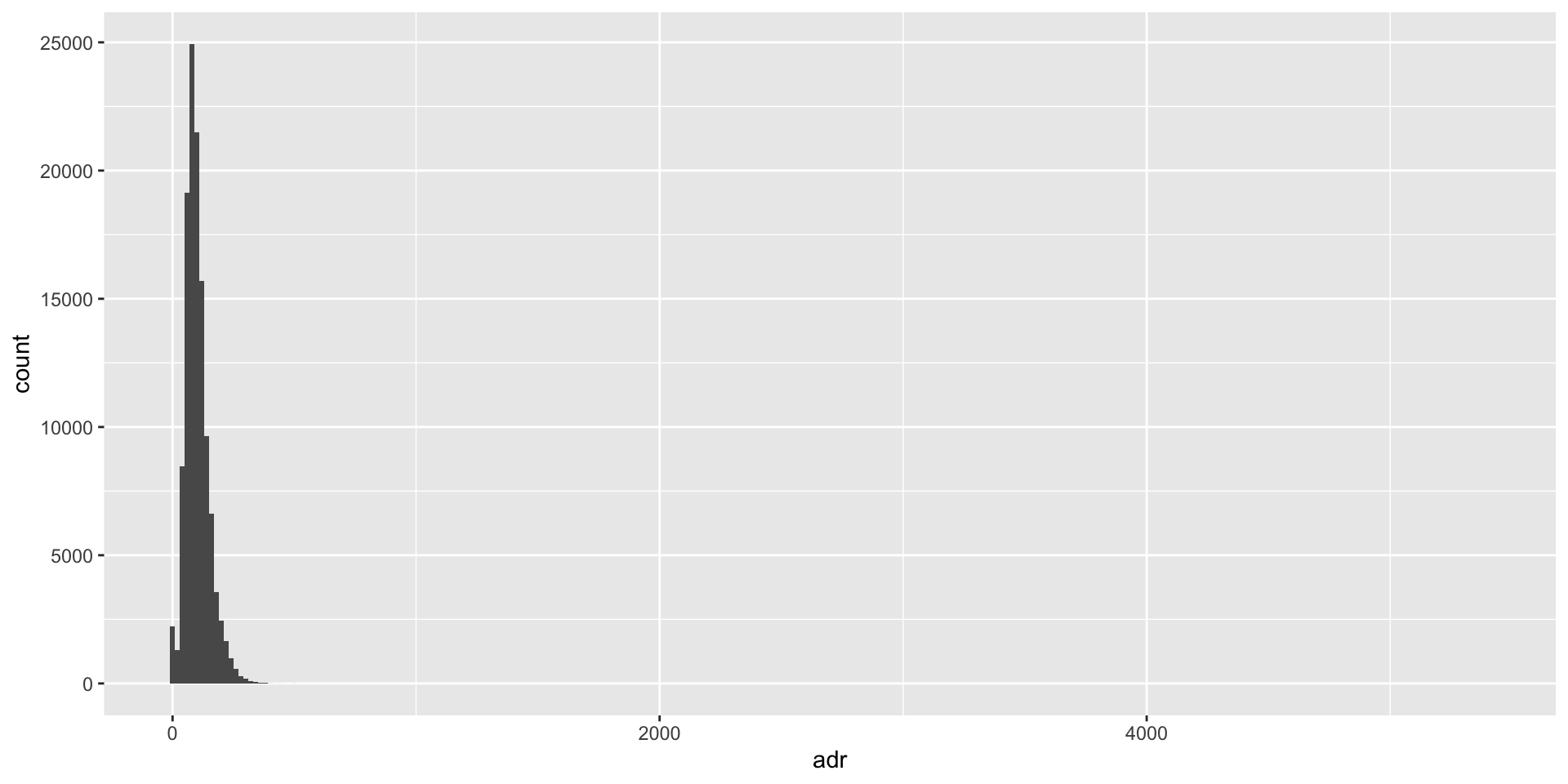
Distribution: Histogram
hotels <- read_csv("data/hotels.csv")

ggplot(hotels, aes(x = adr)) +
  geom_histogram(binwidth = 20) # Specify size of buckets
![]()
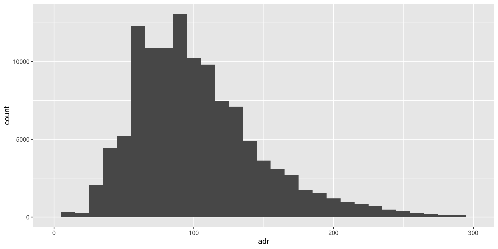
Distribution: Histogram
ggplot(hotels, aes(x = adr)) +
  geom_histogram(binwidth = 10) +
  xlim(0,300) # Specify range shown on x-axis
![]()
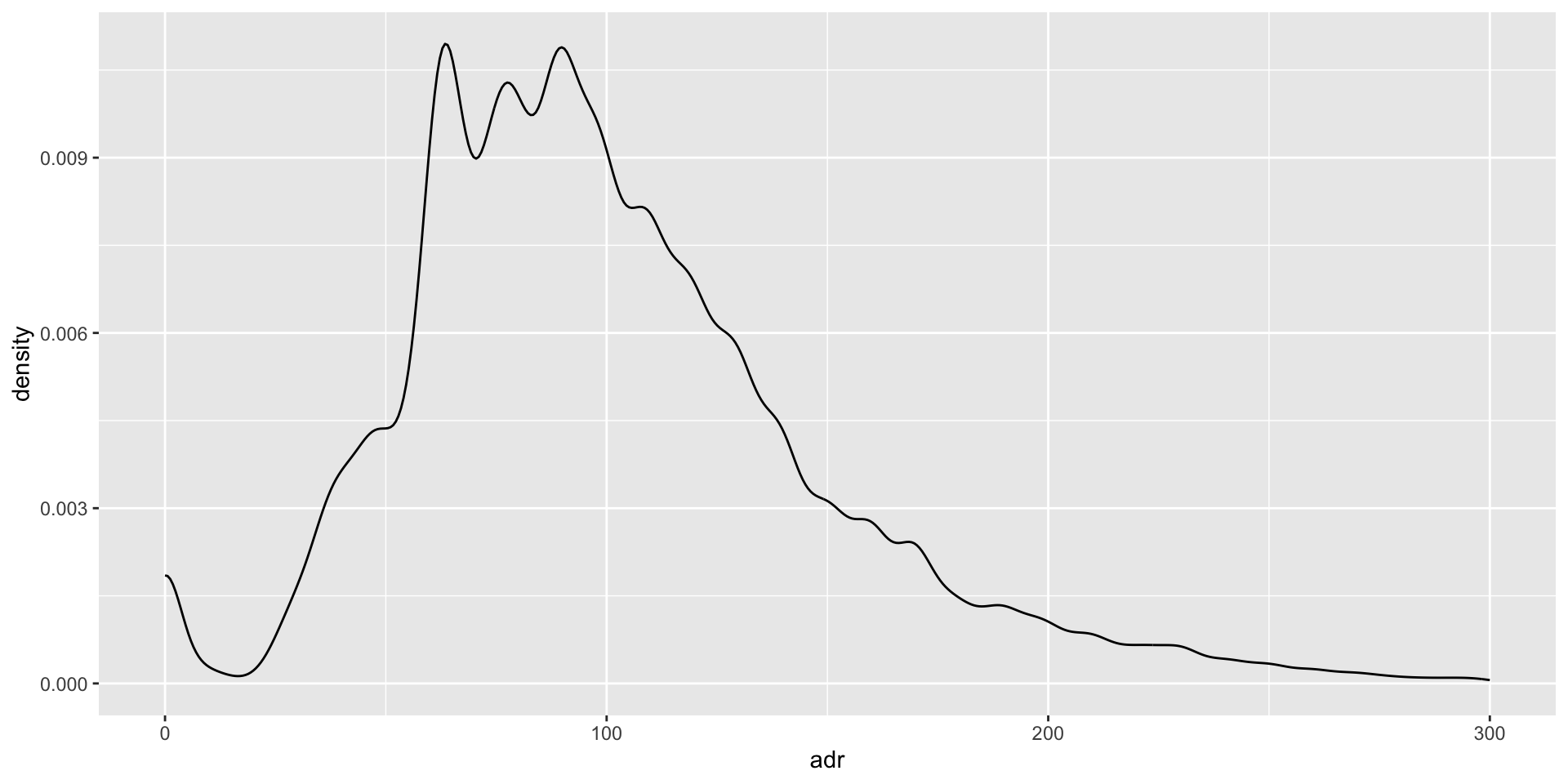
Distribution: Density plot
ggplot(hotels, aes(x = adr)) +
  geom_density() +
  xlim(0,300)
![]()
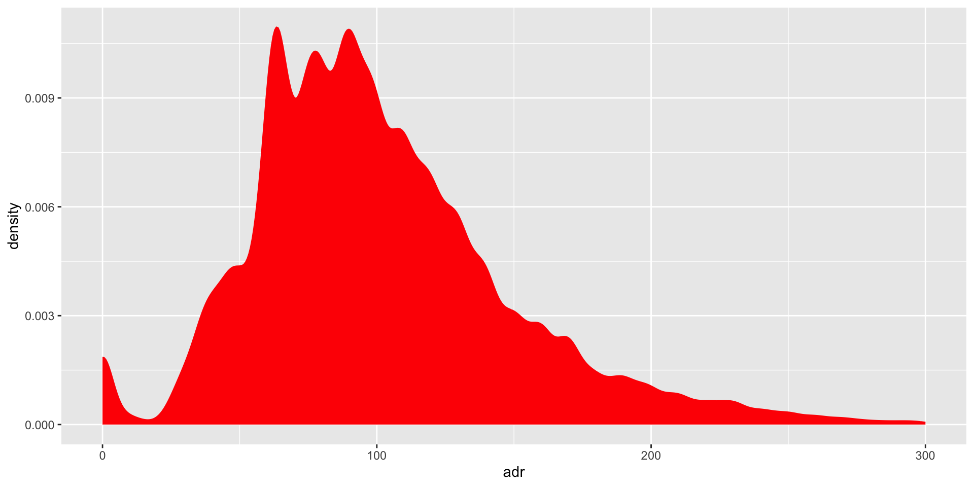
Distribution: Density plot
ggplot(hotels, aes(x = adr)) +
  geom_density(color = "red", fill = "red") + # add fill color, change line color
  xlim(0,300)
![]()
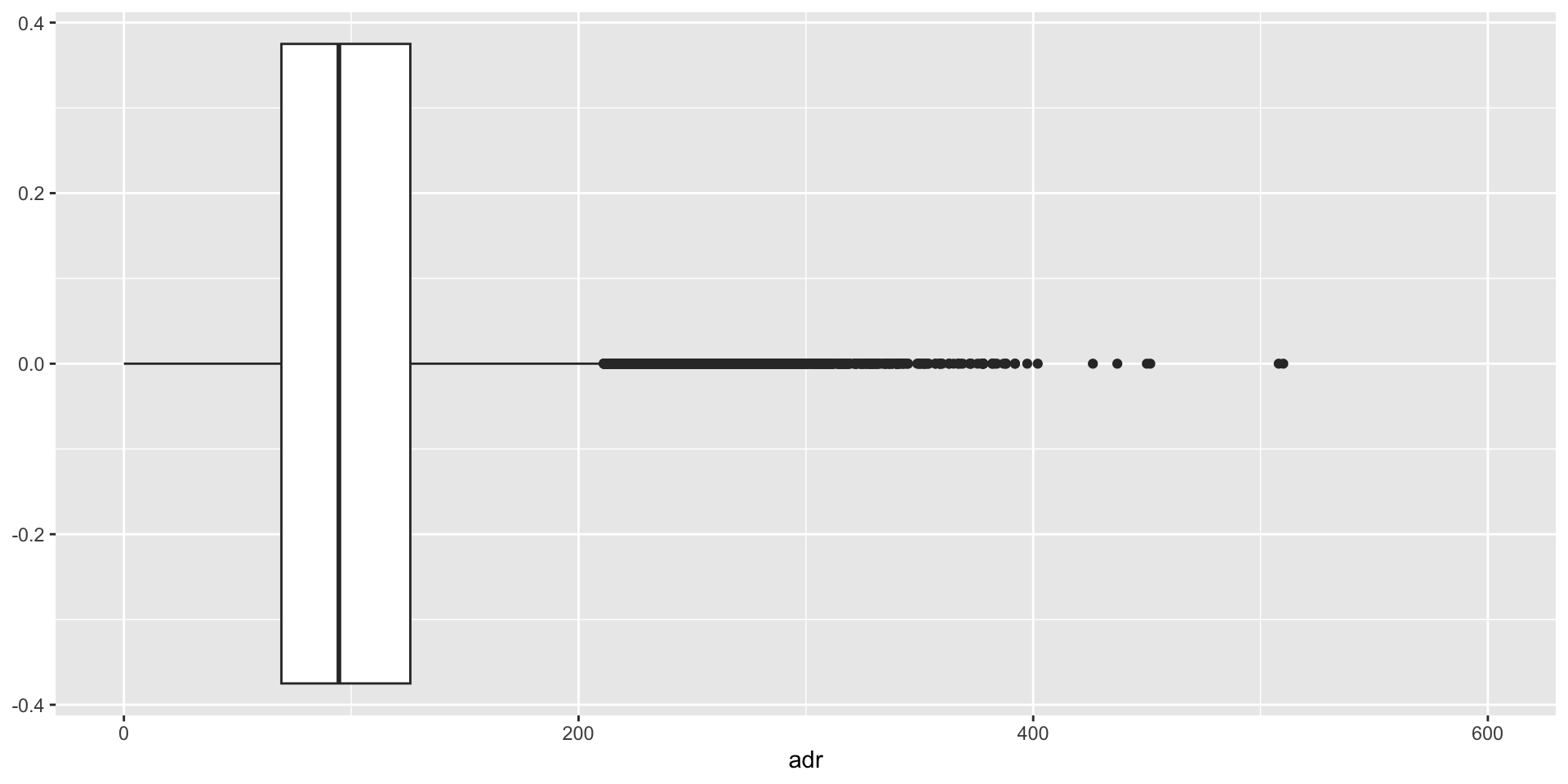
Distribution: Box plot
ggplot(hotels, aes(x = adr)) +
  geom_boxplot() +
  xlim(0,600)
![]()
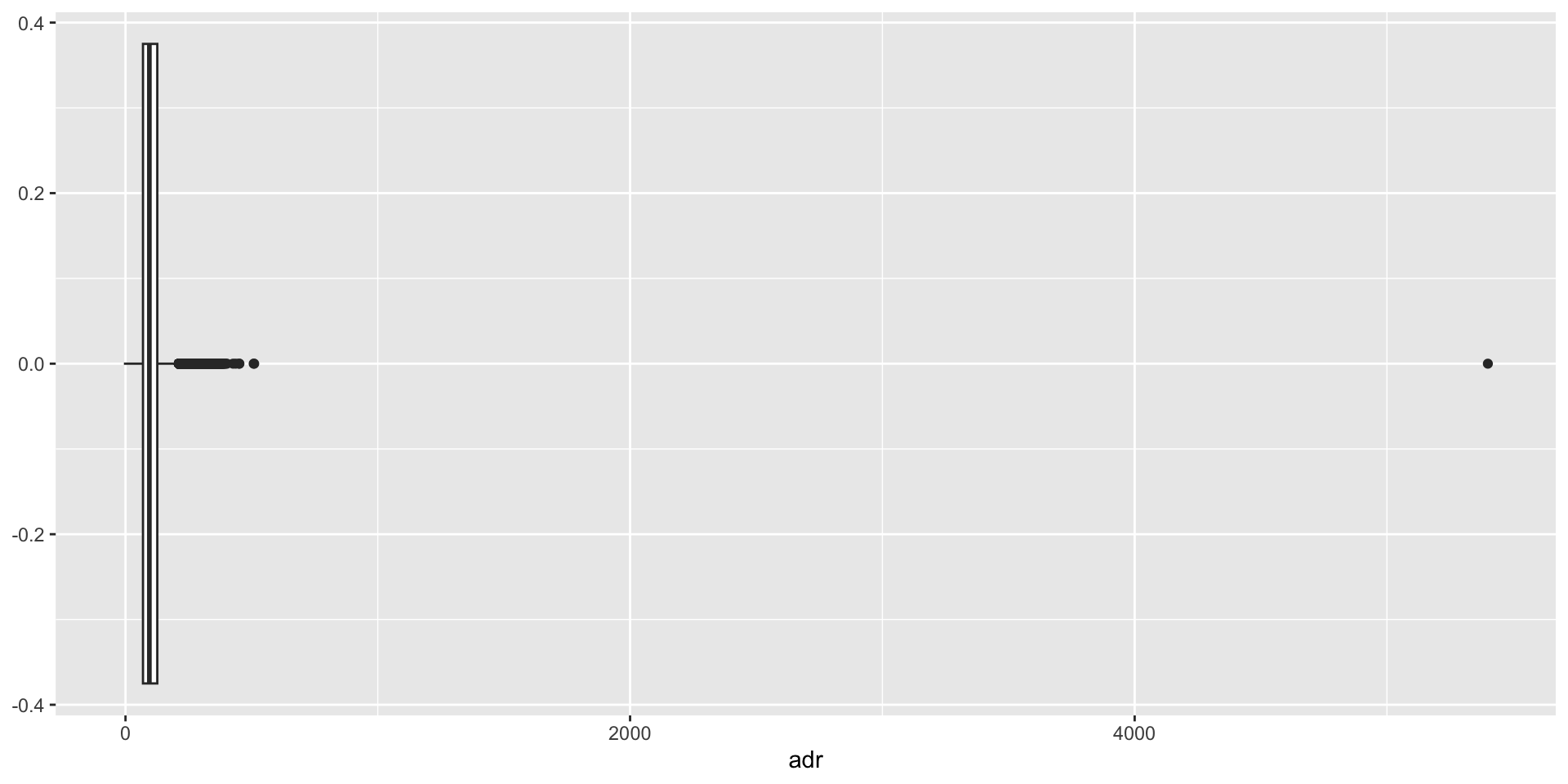
Distribution: Box plot
ggplot(hotels, aes(x = adr)) +
  geom_boxplot()
![]()
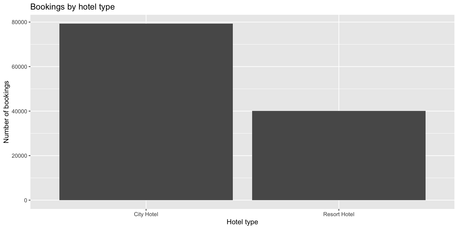
Categorical: Bar plot
ggplot(hotels, aes(x = hotel)) +
  geom_bar() +
  labs(title = "Bookings by hotel type",
       x = "Hotel type",
       y = "Number of bookings")
![]()
Some more practice
- ggplot_examples_1.R (handout)
- Download ab_data.xlsx data set