# A tibble: 3,998 × 4
   `politician/institution` date       Approve Disapprove
   <chr>                    <date>       <dbl>      <dbl>
 1 Congress                 2024-10-30    21.3       62.4
 2 Congress                 2024-10-29    21.3       62.4
 3 Congress                 2024-10-28    20.9       63.0
 4 Congress                 2024-10-27    20.9       63.0
 5 Congress                 2024-10-26    20.8       63.0
 6 Congress                 2024-10-25    21.2       62.9
 7 Congress                 2024-10-24    21.2       62.9
 8 Congress                 2024-10-23    21.3       62.9
 9 Congress                 2024-10-22    21.4       62.4
10 Congress                 2024-10-21    21.9       62.9
# ℹ 3,988 more rowsData Wrangling with Polling Data
Goal

Aesthetic mappings:
🟩 x = date
🟥 y = rating_value
🟥 color = rating_type
Facet:
🟩 politician/institution (Congress, Biden, Supreme Court)
Goal

- On the x axis is the date which is already in the dataset
- y axis has approval rating, but it is spread across two columns
- faceted by the institution or politician
Goal
- We’ll need to create a column to hold the rating value for both, and one to indicate rating type: whether the rating was approval or disaproval
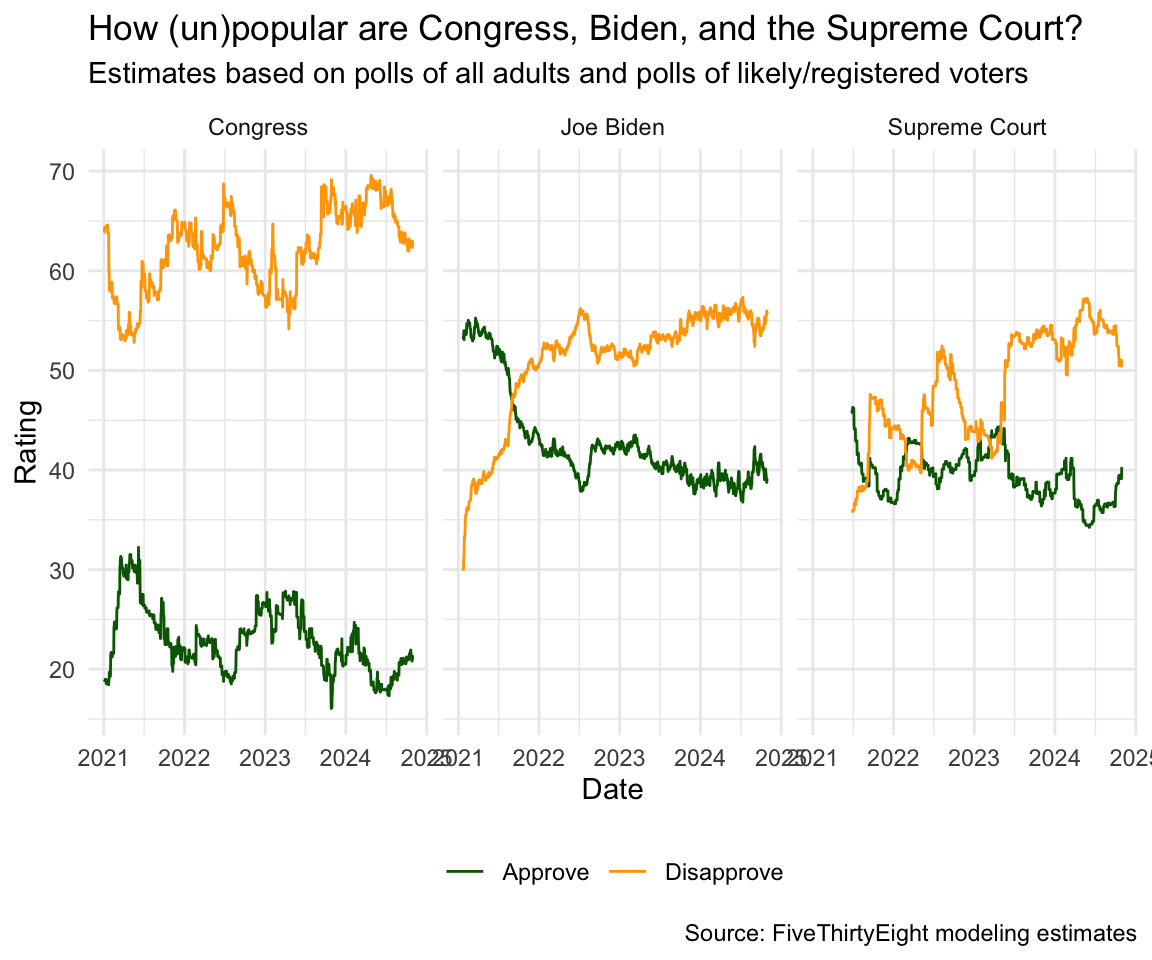
Plot
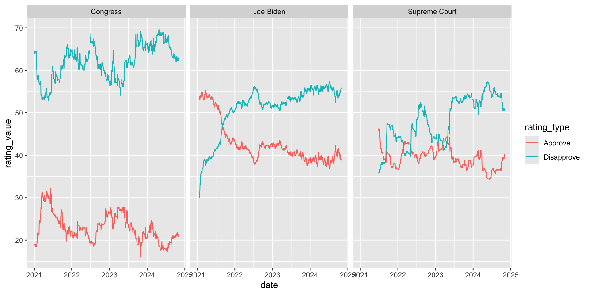
ggplot(approval_longer,
       aes(x = date, y = rating_value, color = rating_type, group = rating_type)) +
  geom_line() +
facet_wrap(~ `politician/institution`) +
scale_color_manual(values = c("darkgreen", "orange")) +
labs(
x = "Date", y = "Rating",
color = NULL,
title = "How (un)popular are Congress, Biden, and the Supreme Court?",
subtitle = "Estimates based on polls of all adults and polls of likely/registered voters",
caption = "Source: FiveThirtyEight modeling estimates"
) 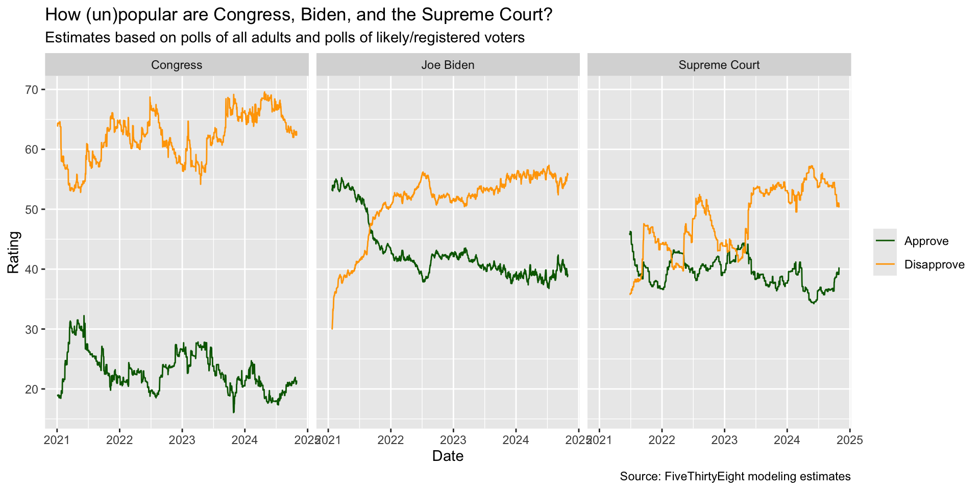
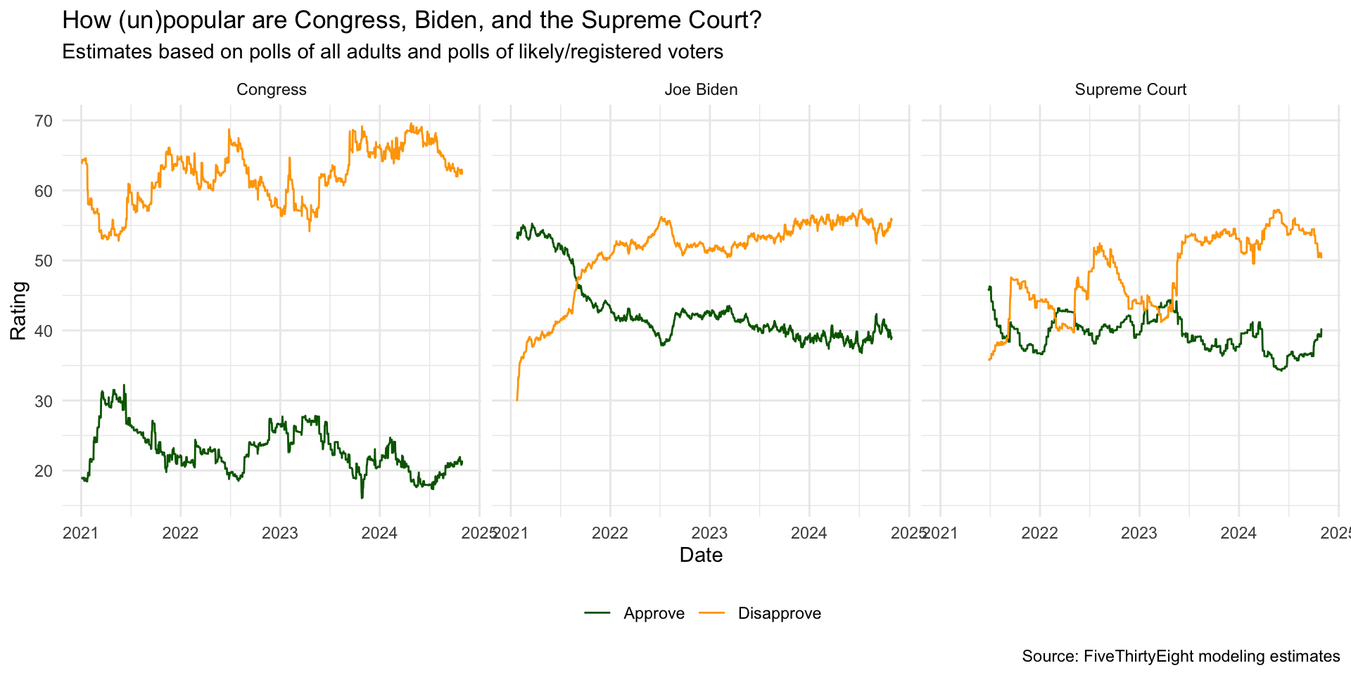
ggplot(approval_longer,
       aes(x = date, y = rating_value, color = rating_type, group = rating_type)) +
  geom_line() +
facet_wrap(~ `politician/institution`) +
scale_color_manual(values = c("darkgreen", "orange")) +
labs(
x = "Date", y = "Rating",
color = NULL,
title = "How (un)popular are Congress, Biden, and the Supreme Court?",
subtitle = "Estimates based on polls of all adults and polls of likely/registered voters",
caption = "Source: FiveThirtyEight modeling estimates"
) +
theme_minimal() +
theme(legend.position = "bottom")