# Your code hereBrexit activity: bar plots and wrangling
In September 2019, YouGov survey asked 1,639 GB adults the following question:
In hindsight, do you think Britain was right/wrong to vote to leave EU?
- Right to leave
- Wrong to leave
- Don’t know
Note
The data from the survey is in data/brexit.csv.
In class we made the following visualization.
brexit <- brexit %>%
  mutate(
    region = fct_relevel(region, "london", "rest_of_south", "midlands_wales", "north", "scot"),
    region = fct_recode(region, London = "london", `Rest of South` = "rest_of_south", `Midlands / Wales` = "midlands_wales", North = "north", Scotland = "scot")
  )

ggplot(brexit, aes(y = opinion, fill = opinion)) +
  geom_bar() +
  facet_wrap(~region,
             nrow = 1,
             labeller = label_wrap_gen(width = 12)) +
  guides(fill = "none") +
  labs(
    title = "Was Britain right/wrong to vote to leave EU?",
    subtitle = "YouGov Survey Results, 2-3 September 2019",
    caption = "Source: bit.ly/2lCJZVg",
    x = NULL, y = NULL
  ) +
  scale_fill_manual(values = c(
    "Wrong" = "#ef8a62",
    "Right" = "#67a9cf",
    "Don't know" = "gray"
  )) +
  theme_minimal()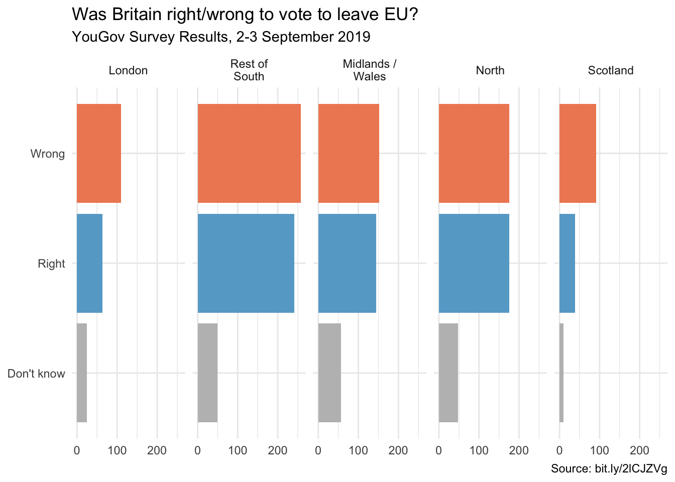
The goal of these exercises is to tell different stories with the same data.
Step 1 Free scales
Add scales = "free_x" as an argument to the facet_wrap() function. Then explain how the visualization changes.
- Discuss how the story this visualization tells differs from the story the original plot tells. (You can read more about the scales argument here).
# Your code hereThe x-axis scale in each facet is based on the number of observations in the largest category for that facet. This makes the Wrong count look the same size visually for each location, which does make it seem a bit easier to gauge how the Wrong and Right votes differ across the facets.
Step 2a Wrangling proportions
For this next part we need the proportion of Wrong, Right, and Don’t Know answers in each region. Use your wrangling skills to construct a data frame that will have 3 rows for each region (one for each opinion), a column for the count of observations in each combination of region and opinion, and a column for the proportion of the total in that region (you may also want a column for the total responses for that region).
# Your code hereStep 2b Comparing proportions across facets
Next, plot these proportions (rather than the counts) and improve axis labeling. How is the story this visualization tells different than the story the original plot tells? Hint: You’ll need the scales package (which is different than the scales argument you used in Exercise 1) to improve axis labeling. It should be available because your render loads tidyverse, but if there’s any problem then you’ll need to load it up at the top of your document. You can dig into the scales package here and here.
# Your code hereStep 3 Comparing proportions across bars
For this next visualization, first you should try out dodging. Dodging makes it possible to overlap bars in the chart which makes it an interesting alternative to faceting. For example, try out this code and play around with the width value to see how the resulting plot changes.
cat1 <- c(19, 18, 21, 19)
cat2 <- c(17, 16, 18, 19)
name <- c("a", "b", "c", "d")

df <- melt(data.frame (cat1,cat2,name))
Using name as id variablesggplot(df, aes(x=name, y=value, fill=variable)) +
geom_bar (stat="identity", position = position_dodge(width = 0.5))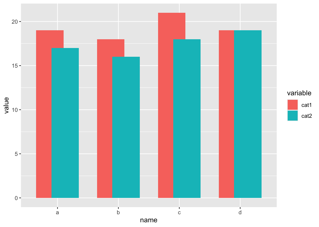
Now recreate the visualization from the previous exercise, this time dodging the bars for opinion proportions for each region, rather than faceting by region. Then improve the legend. Explain how the story this visualization tells differs from the story the previous plot tells.
# Your code here