install.packages(c("tidyverse",
                   "sf", #popular package for working with spatial data
                   "tmap", #popular package for mapping
                   "geojsonsf",
                   "ggspatial", #to add annotations to maps (scale bar, north arrow)
                   "RColorBrewer", #color schemes
                   "viridis",
"prettymapr")) #color schemesAn Introduction to Exploratory Spatial Data Analysis
In this activity, you will explore environmental justice in the Muhheakunnuk or Hudson Valley county where we are now, Dutchess County, NY. This activity will introduce you to the functions needed complete Lab 8 and generate several of the datasets which you will need to complete Lab 8.
Goals
Load tabular and spatial data in R.
Practice data wrangling
Create spatial
sfobjects.Plot and summarize spatial data objects using tidyverse packages.
Create maps of Dutchess County, NY using vector data (points, lines, polygons) using
tmapandggplotR packages.Create thematic, choropleth maps of social indicators.
Install packages
Load the required packages
library(tidyverse)
library(sf)
library(tmap)
library(geojsonsf)
library(ggspatial)
library(viridis)
library(RColorBrewer)
library(prettymapr)
options(scipen=999)
Important
Data
Download a folder containing all of the data here. Unzip the file in your working directory for this activity.
First, let’s use the read_sf function from the sf package to read in an open source spatial data file called a .geojson.
dutchess_indicators <- read_sf("data/dutchess_indicators.geojson")U.S. Census Bureau Geographies
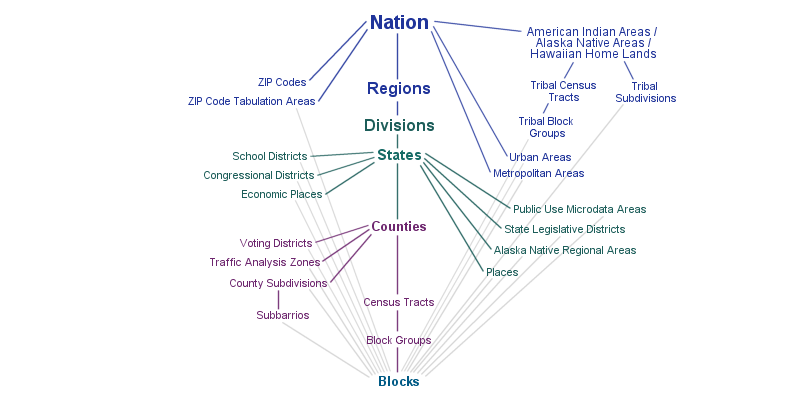
For this activity and Lab 8, we’ll use the Census Tract geography, which are roughly neighborhood-sized areal units.
Each observation represents a Census Tract “neighborhood” and contains various social, economic, and built environment attributes for that neighborhood.The primary purpose of census geographies is to provide a stable set of geographic units for the presentation of statistical data. Census tracts generally have a population size between 1,200 and 8,000 people, with an optimum size of 4,000 people.
Our indicators
Note
In the context of spatial data science, we often use the terms indicators for variables.
Join identifier for each Census Tract:
join_IDCounty name:
countyState:
stateTotal population:
total_popArea in square miles:
area_sqmilesMedian Household Income:
median_hh_incomoePercent of the population that is under age 18 (children):
percent_childrenPercent of the population that identifies as white alone (non-Hispanic):
percent_whitePercent of the population that identifies as Black or African American:
percent_blackPercent of the population that identifies as Hispanic/Latine:
percent_latineAsthma prevalence among adults:
asthma_rateNumber of people with without access to healthy food within 1/2 mile (divide by total population to learn the percentage of the population with low access to healthy food):
low_food_accessUnemployment rate:
unemployment_rateTraffic proximity and volume proximity to traffic-related pollutants:
prox_traffic_pollution
Display the names of the variables in the dutchess_indicators dataset.
# Your code hereGet to know the data
Your turn
Create simple ggplot charts to summarize the data.
First, explore the numerical distribution of some of our numerical variables: total population, asthma prevalence, and percentage of the population under age 18.
Choose a race/ethnicity variable and create a histogram of the percent of the population that identifies with that group.
# Your code hereSelect another numerical variable and create a chart of it’s distribution.
# Your code hereSummary statistics of neighborhood indicators
Summary statistics like mean, median, and standard deviation can be useful for creating class breaks when binning and symbolizing an indicator as a map layer.
First, summarize all numerical indicator values. Here we use the across() function to summarize all numerical variables.
summary <- dutchess_indicators %>%
  st_drop_geometry() %>% #remove the geometry column
  select_if(is.numeric) %>%
  summarise(across(where(is.numeric),list(mean=mean,std=sd,med = median)))
summary
# A tibble: 1 × 33
total_pop_mean total_pop_std total_pop_med area_sqmiles_mean area_sqmiles_std
<dbl> <dbl> <dbl> <dbl> <dbl>
1 3609. 1357. 3502 11.1 12.6
# ℹ 28 more variables: area_sqmiles_med <dbl>, median_hh_income_mean <dbl>,
# median_hh_income_std <dbl>, median_hh_income_med <dbl>,
# percent_children_mean <dbl>, percent_children_std <dbl>,
# percent_children_med <dbl>, percent_white_mean <dbl>,
# percent_white_std <dbl>, percent_white_med <dbl>, percent_black_mean <dbl>,
# percent_black_std <dbl>, percent_black_med <dbl>,
# percent_latine_mean <dbl>, percent_latine_std <dbl>, …Next, using the data wrangling functions you have learned create a table with all variable names in one column statistic and statistic values in a variable called value.
#Your code hereBasic map using the tmap package
Let’s map the percentage of the population under age 18, contained in the percent_children variable.
Since we rely on code from tmap version 3 which is closer to the tidyverse, you will see the message “tmap v3 code detected” when you run this code.
#Mapping using tmap package
map_children_layout <-
  tm_shape(dutchess_indicators) +
    tm_polygons("percent_children", # Specify the variable being mapped
                title = "% Children", # Provide a legend title
                border.col = "white") # Specify the color of area borders
map_children_layout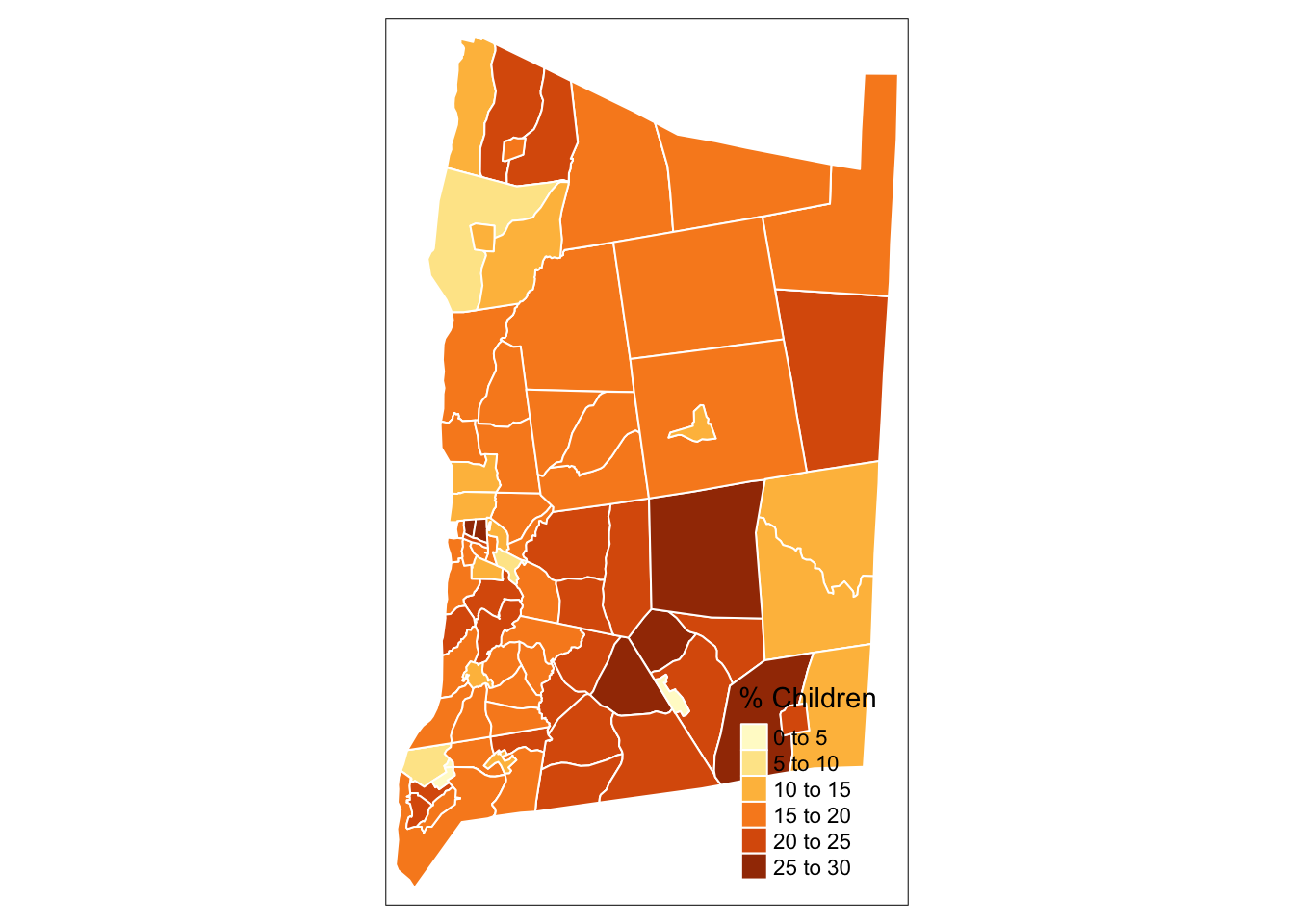
#tmap_save(map_children_layout, filename = "dutchess_children_with_layout.png") # Code to save the static tmap mapInteractive map with tmap
Use the tmap_mode() to specify that the map is static “plot” or interactive “view.”
tmap_mode("plot") #The default mode for tmap, makes static mapstmap mode set to plottingtmap_mode("view") #Mode that creates interactive maps using leaflettmap mode set to interactive viewingtm_shape(dutchess_indicators) +
tm_polygons("median_hh_income")#Add a different color palette for the indicator layer
tm_shape(dutchess_indicators) +
tm_polygons("percent_children",
palette = "PuBuGn", # Specify the color palette for the choropleth map
title = "Percentage Children",
border.col = "white")Creating a map layout with tmap
Map layouts contain the map extent (visible part of the earth displayed), and annotations to orient the viewer to the map scale and layer symbology.
In the code chunk below we:
Use tmap in plot mode.
Add north arrow and scale bar elements.
Specify natural breaks “jenks” classification of our chosen indicator.
Note
Before we run the plot code below, we set tmap to static “plot” mode.
tmap_mode("plot") #Map the percentage of children by tract in Dutchess County, NY
map_children_layout <- tm_shape(dutchess_indicators) +
tm_polygons("percent_children",
title = "% Children",
palette = "viridis",
style = "jenks",
border.col = "white",
id = "percent_children", # Specify the variable displayed when hovering over the interactive map
popup.vars = "percent_children") + # Specify the variable shown when an areal unit is selected
tm_compass()+ #Add a north arrow to your map layout (only in plot mode for static maps)
tm_scale_bar(position = c("left", "bottom")) + #Add a scale bar to your map layout
tm_layout("Children in Dutchess County, NY", compass.type = "arrow") #Set the map title and type of north arrow
map_children_layout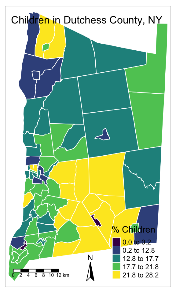
Explore exposure to pollutants from toxic release facilities
Explore and compare the location of the U.S. Environmental Protection Agency’s list of facility location producing or working with toxic chemicals, the Toxic Release Inventory (TRI). In the following steps you will load and explore TRI facilities.
Note
There are several geospatial data types. So far, we’ve relied on the open source .geojson format. In the following steps, we load in the proprietary shapefile (.shp) from ESRI ArcGIS.
Learn more about spatial data file types here.
Read in the TRI facilities in Dutchess County, NY.
#Load data on TRI facilities
tri_facilities <- st_read("data/toxic_release_inventory_epa.shp")
Filter the data to only contain TRI facilities in Dutchess County, NY. Name the new object tri_dutchess.
#Your code hereMap TRI facility locations alongside social indicators
Map TRI facility point locations alongside the percentage of the population under age 18.
map_children_layout_withTRI <- tm_shape(dutchess_indicators) +
  tm_polygons("percent_children",
              title = "% Children",
              palette = "BuGn",
              style = "jenks") +
  tm_compass() +
  tm_scale_bar(position = c("left", "bottom")) +
tm_layout("TRI Facilities and Children in Dutchess County, NY",
          compass.type = "arrow") +
  tm_shape(tri_dutchess) +
  tm_dots("red", size = .05)
map_children_layout_withTRI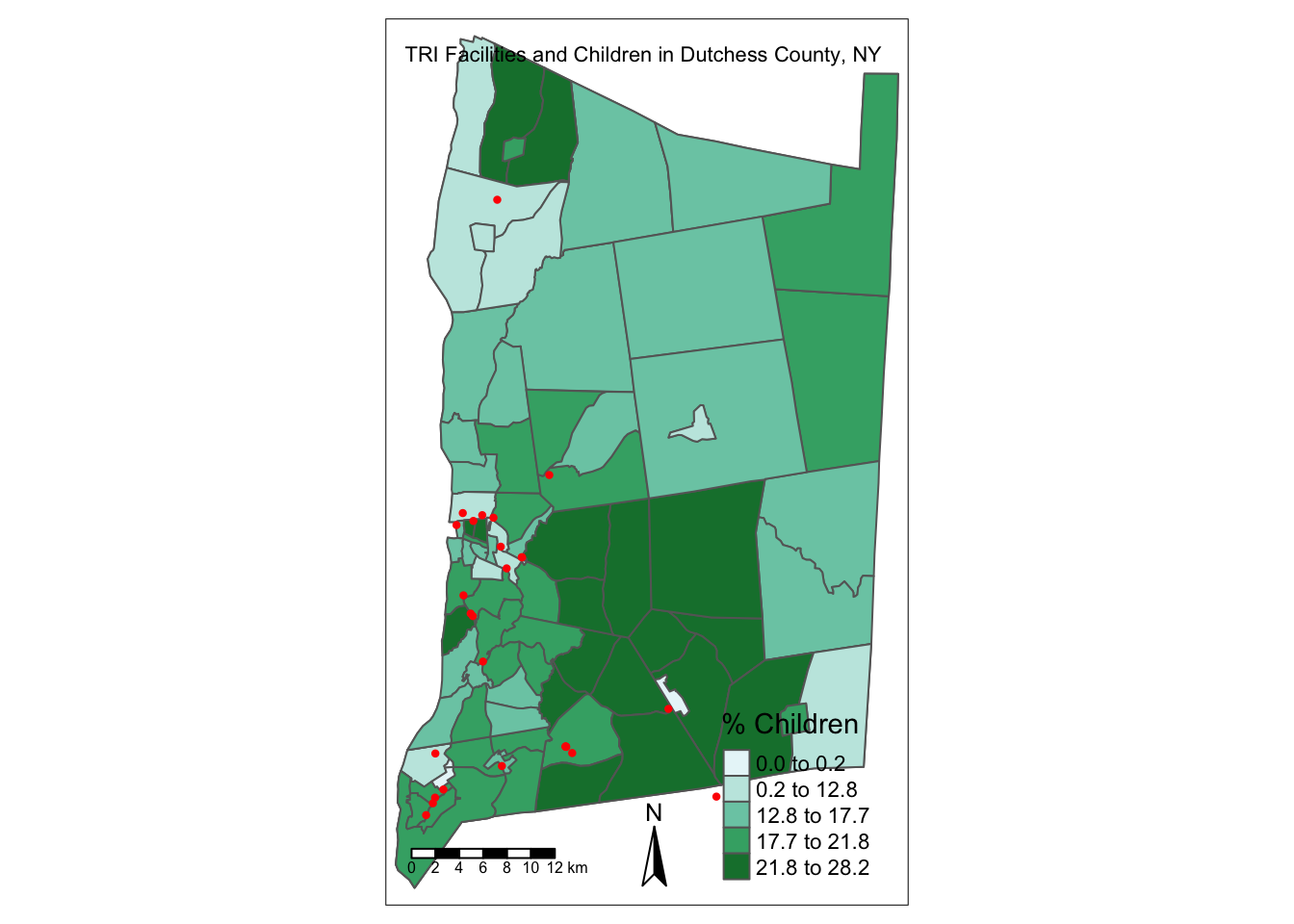
Your turn
Create a new map using the tmap maps we created above as a template, copy-and-paste is OK!
Select a new variable from
dutchess_indicators.Include the map elements: north arrow, scale bar, and title.
Finally, include the TRI facilities inventory layer.
#Your code hereMapping with ggplot
Our old friend, the ggplot2 package allows us to create maps using geom_sf(). We’ll create static maps using ggplot, but ggplot also works well with the interactive map package leaflet.
First, let’s recreate the map of children and TRI sites using ggplot.
dutchess_with_indicator <- ggplot() +
  annotation_map_tile(zoom = 10) + # Add a basemap with an appropriate zoom level for the map. Here we set zoom = 10 for a higher resolution basemap for the area surrounding Dutchess County, NY.
  geom_sf(data = dutchess_indicators, aes(fill = percent_children)) +
  scale_fill_viridis(limits = c(0, 30), #set min and max of the variable distributions (so that it contains all of the distribution for each indicator you will compare using the same class breaks)
                          breaks  = c(0, 10, 20, 30), # Specify the class breaks used to bin percent_children
                          labels = c("0", "10", "20", "30"),
                      name = "% Children") +
  labs(x = NULL,    # no label on the x-axis
       y = NULL,    # no label on the y-axis
       title = "Environmental Exposure in Dutchess County",
       subtitle = "Children (%)",
       caption = "Source: U.S Census Bureau ACS 5-year Estimates") + #Caption to add data source
  annotation_scale(location = "bl", width_hint = 0.4) + #scale bar added in bottom left corner
  annotation_north_arrow(location = "br", which_north = "true", # North arrow added in bottom right corner
        pad_x = unit(0.0, "in"), pad_y = unit(0.2, "in"), # format arrow placement
        style = north_arrow_minimal) +      # select north arrow style
    theme_minimal()    #set overall map layout theme, blank white background
dutchess_with_indicator
Zoom: 10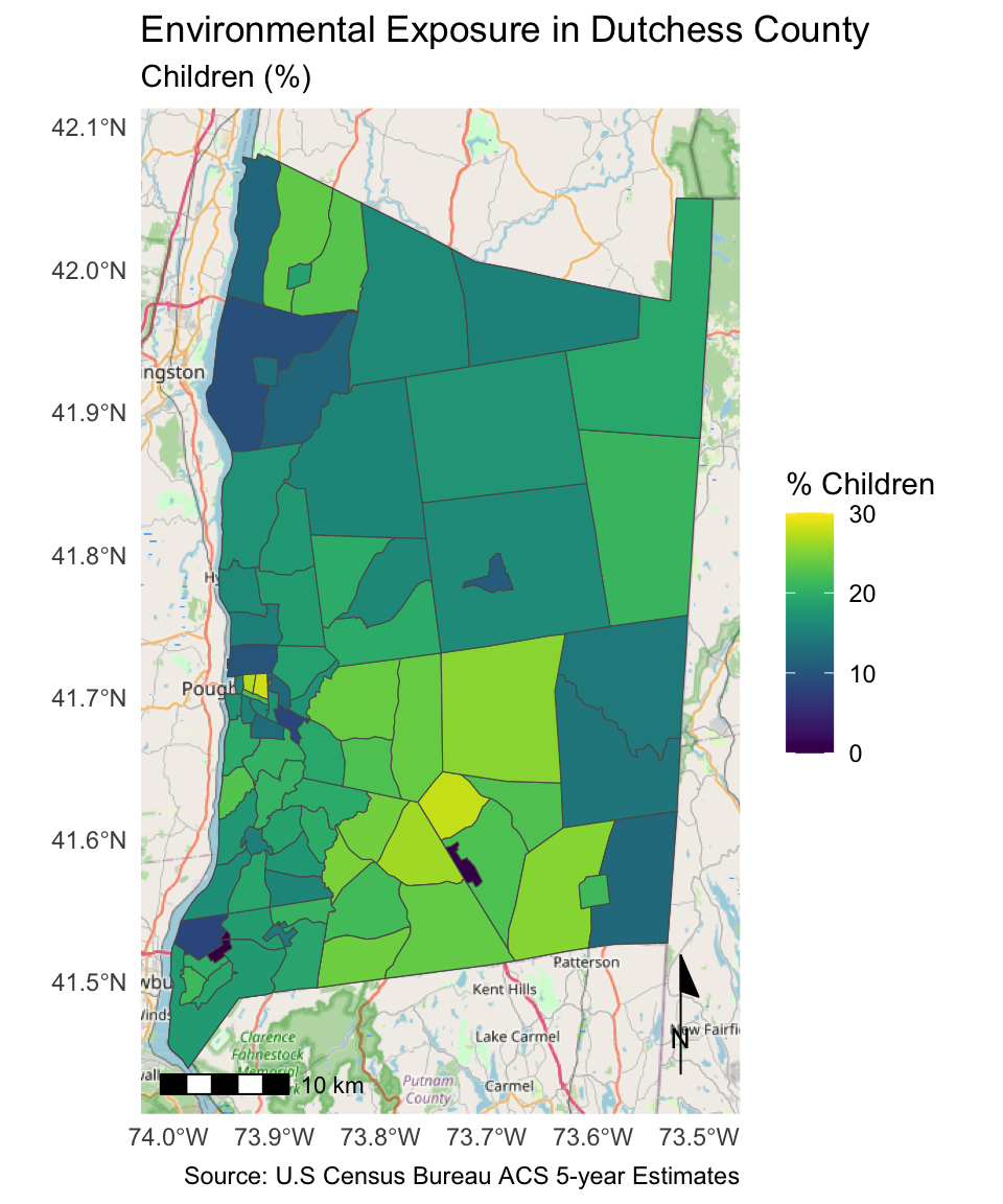
#ggsave("dutchess_with_indicator.png", width = 15, height = 18, units = "cm", bg = "white") #Save the map as a .pngLet’s make some more maps!
Create a better base map
These map are helpful, but let’s add some layers to create a better base map. When we communicate the results of a geospatial analysis, we often create our own base map to provide geographic context to help the audience interpret the visualization. Existing base maps, which depict the surface of the earth with a satellite image or what you see in your default GPS app on your phone, can obscure the message we are trying to convey.
First, let’s load some new layers.
Create a new map that displays the two new layers we just loaded into our environment.
#Dutchess basemap
dutchess_basemap <- ggplot() +
  geom_sf(data = parks, color = "#38a269", fill = "#38a269") +
  geom_sf(data = cities, color = "black", fill = NA, linewidth = 0.35) +
  geom_sf_text(data = cities, aes(label = NAME), colour = "black", size = 2) + # Add labels for cities
  labs(x = NULL,
       y = NULL,
       title = "Dutchess County, NY",
       subtitle = "Municipalities & Parks",
       caption = "Source: Dutchess County Open Data") +
  annotation_scale(location = "bl", width_hint = 0.4) +
  annotation_north_arrow(location = "br", which_north = "true",
        pad_x = unit(0.0, "in"), pad_y = unit(0.2, "in"),
        style = north_arrow_minimal) +
    theme_minimal()
dutchess_basemap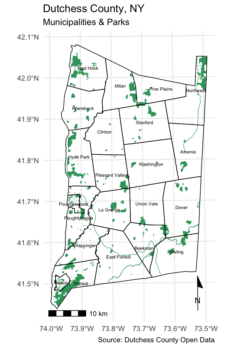
Explore additional indicators
Here is the base map we just created, with some changes:
Remove the parks layer.
Add the population density of each neighborhood.
Change the aesthetics of the cities layer and labels.
Changed the plot theme to
theme_bw.
We’ll use information about the distribution to configure the layer symbology.
# Create population density variable
dutchess_indicators <- dutchess_indicators %>%
  mutate(pop_density = total_pop/area_sqmiles)

# Use the distribution to inform your choice of class breaks
hist(dutchess_indicators$pop_density) 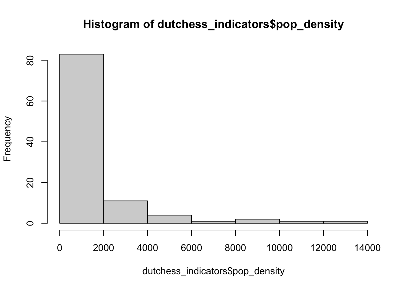
max(dutchess_indicators$pop_density) # Max is just below 60, so we use this as or upper limit inside the scale_fill_viridis function[1] 12197.65# Map of population density (population per square mile)
ggplot() +
geom_sf(data = dutchess_indicators, aes(fill = pop_density)) +
scale_fill_viridis(limits = c(0, 12200),
breaks = c(0, 2000, 4000, 6000,8000,10000),
labels = c("0", "2,000", "4,000", "6,000","8,000","10,000"),
name = "Pop Density (%)"
) +
geom_sf(data = cities, color = "white", fill = NA, linewidth = 0.35) +
geom_sf_text(data = cities, aes(label = NAME), colour = "white", size = 2) +
labs(x = NULL,
y = NULL,
title = "Dutchess County, NY",
subtitle = "Population Density (population per sq mile",
caption = "Source: U.S Census Bureau ACS 5-year Estimates") +
annotation_scale(location = "bl", width_hint = 0.4) +
annotation_north_arrow(location = "br", which_north = "true",
pad_x = unit(0.0, "in"), pad_y = unit(0.2, "in"),
style = north_arrow_minimal) +
theme_bw()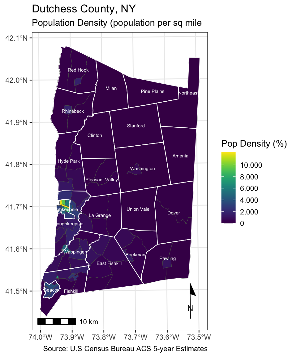
Your turn
Select another variable from the list at the beginning of this activity. Let’s map this layer alongside the base map layers we just added. Use the final ggplot map we created above as a template, copy-and-paste is OK!
# Your code hereWhich areas are at-risk of flooding?
The Hudson Valley is increasingly experiencing flooding, both along the Hudson estuary and within our cities and towns. The historical dumping of toxic materials into the Hudson estuary by General Electric—making it the largest superfund site in the country— and the location of industrial activity, including TRI sites, in flood zones poses additional risks for residents of the area.
Load a the new flood hazard layer from your data folder: floodzones.shp
# Your code hereAdd the flood zones to your “dutchess_basemap” map.
# Your code hereNow you are ready to complete Lab 8. Remember, you will need to load the datasets from this activity in order to complete the steps in Lab 8. You are encouraged, but not required to add the read_sf calls for these datasets in your Lab 8 Quarto environment.