library(dplyr)
library(dslabs)
murders <- murders %>%
mutate(population_in_millions = population/10^6)Lab: Tidyverse and Visualization
Lab 5
Why are we here?
The purpose of this lab is to become more familiar with Tidyverse functions, basics of data visualization, and working in Quarto documents. You will submit two Quarto document .qmd files, and one .html.
Part 1: Tidyverse review
Part 2: Exploratory data analysis (EDA) of global plastic waste
Supplemental resources for review and practice
Tidyverse cheat sheet https://rstudio.github.io/cheatsheets/html/tidyr.html?_gl=1
Tidyverse packages https://www.tidyverse.org/packages/
R for Data Science https://r4ds.had.co.nz/tidy-data.html
Lab instructions
Important
When you use more than one function in your code to answer a question, use annotations as comments # in the code block to briefly describe what each function is doing.
Part 1: Tidyverse review
Preparation
- In RStudio, create a new Quarto document called
lab5_part1.qmd - Read IDS Chapter 4, Chapter 7, and Chapter 8.
Tidyverse review
This part of the assignment includes exercises from Chapter 4.
dslabs is used for exercises 1-3.
- (2 points) based on IDS Chapter 4 Question 5
Use pipe to add another step to the code below so that you use mutate() again to add a rate column with the per 100,000 murder rate.
- (2 points) based on IDS Chapter 4 Question 7
Use the select function to show the state names and abbreviations in murders.
- (4 points) based on IDS Chapter 4 Question 22
Use the group_by function to convert murders into a tibble that is grouped by region.
- (4 points) Dplyr practice with
presidentialdata.
Remember the presidential data frame from Lab 4? We’ll get access to that by loading tidyverse, and the ability to compute some things, by adding a few libraries, and then we’ll add one column to the presidential data frame.
library(mdsr)
library(ggplot2)
library(lubridate)
my_presidents <- presidential |>
  mutate(term_length = interval(start, end) / dyears(1))
Write code that will arrange the presidents in descending order by their term length, variable named term_length.
- (5 points) More Dplyr practice with
presidentialdata.
We can do a bunch of summarizing of the Democratic presidents with the following code:
my_presidents %>%
  summarize(
    N = n(),
    first_year = min(year(start)),
    last_year = max(year(end)),
    num_dems = sum(party == "Democratic"),
    years = sum(term_length),
    avg_term_length = mean(term_length)
  )
Modify this code so that it will give us the summary values again, but this time grouped by the party of the presidents (note that we no longer need the num_dems summary for this).
- (8 points) Grading an exam using conditionals and the
case_when()function. Note: this question is related to the tidyverse activity 2 slides and IDS Intro Ch. 4 Section 4.10.
Create a data frame with 8 observations and 2 variables that represent student numeric scores on an exam, scores out of 100 points total. The data frame should include the numeric variable score with values representing eight scores on an exam, and student with entries representing the first name of eight students.
Create a new variable grades with the letter grade that should be assigned to each student. Use the Bard grading criteria to create your grade ranges (e.g., A, A-, B+, B, etc.). An A is defined as a score of 93 or greater, A- is 90 to 92, B+ 87 to 89, B 83 to 86, B- 80 to 82, C+ 77 to 79, C 73 to 76, C- 70 to 72, D+ 67 to 69, D 63 to 66, D- 60 to 62, and F is a score of 59 or lower.
Part 2 Global Plastic Waste Exploratory Data Analysis
75 points
Plastic pollution is a major and growing problem, negatively affecting oceans and wildlife health. Our World in Data has a lot of great data at various levels including globally, per country, and over time. For this exercise we’ll focus on data from 2010.
Additionally, National Geographic ran a data visualization communication contest on plastic waste as seen here.
Preparation
- In RStudio, create a new Quarto document called
lab5_part2.qmd - You will submit your part 2 Quarto doc
lab5_part2.qmdand rendered as an .html filelab5_part2.html.
Part 2
- Visualizing numerical and categorical data and interpreting visualizations
- Recreating visualizations
Note
These exercises will have you use some functions that you have not yet seen. For each one, use the results to try to understand what it’s actually doing. Follow the links for information about various visualizations you are asked to try.
Packages
We’ll use the tidyverse package for this analysis. It’s already loaded into the Quarto environment, but you should also run the following code in the Console to load the package into your local working environment so that you can run commands directly in the Console if you’d like. Remember that if the library doesn’t load, you should go to the Packages pane (lower right in R Studio), click Install, and list tidyverse as the package you want to install).
library(tidyverse)Data
The dataset for this assignment can be found as a .csv file in the data folder of the project. Read it into a dataframe in the Console using the following.
plastic_waste <- read_csv("data/plastic-waste.csv")This may require that you set the working directory properly.
The descriptions for variables in the file are as follows:
code: 3 Letter country codeentity: Country namecontinent: Continent nameyear: Yeargdp_per_cap: GDP per capita constant 2011 international ($), ratioplastic_waste_per_cap: Amount of plastic waste per capita in kg/daymismanaged_plastic_waste_per_cap: Amount of mismanaged plastic waste per capita in kg/daymismanaged_plastic_waste: Tonnes of mismanaged plastic wastecoastal_pop: Number of individuals living on/near coasttotal_pop: Total population according to Gapminder
Instructions
You should put the answer to each Exercise in the Quarto file for Part 2.
Get to know the Data
Start by taking a look at the distribution of plastic waste per capita in 2010, done by using ggplot to generate a histogram and box plot. Remember that you can learn more about this function by typing ?geom_histogram in the Console.
Exercise 1 summarizing a variable
Write code to calculate and display the mean, median, min, and max of the plastic_waste_per_cap variable.
# Your code hereExercise 2 histogram
Create a histogram to show the distribution of the plastic_waste_per_cap variable. Put your code in the answer document.
# Your code here
# Use a binwidth of 0.2
Exercise 3 boxplot
Create a boxplot to show the distribution of the plastic_waste_per_cap variable. Interpret the box plot, include what the various components of the plot represent. Put your code and explanation in the answer document.
# Your code hereExercise 4 learn more about the outlier
One country stands out as an unusual observation at the right side of the distribution. One way of identifying this country is to subset the data for countries where plastic waste per capita is greater than 3.5 kg/person.
Write code to display the the country that is an outlier. Add the result as a comment in your code chunk.
# Your code hereNote how we use the visualization to help drive our exploratory data analysis, and then use filter to give us information about the data.
Did you expect the result filter gave? You might consider doing some research on Trinidad and Tobago to see whether plastic waste per capita is realy high there and why, or whether this is a data error.
Exercise 5 bar plot
Create bar plot of the continent variable for all countries below the median plastic_waste_per_cap. Briefly interpret the plot. Put your code and explanation in the answer document.
# Your code hereExercise 6 scatter plot
Write code to create a scatterplot of plastic_waste_per_cap versus gdp_per_cap. Make all points pink. Interpret the result. Put your code and explanation in the answer document.
# Your code hereExercise 7
Plot, using histograms, the distribution of plastic waste per capita faceted by continent. What can you say about how the continents compare to each other in terms of their plastic waste per capita? Put your code and explanation in the answer document.
# Your code hereMore Info
Another way of visualizing numerical distribution data is using density plots.
ggplot(data = plastic_waste,
       aes(x = plastic_waste_per_cap)) +
  geom_density()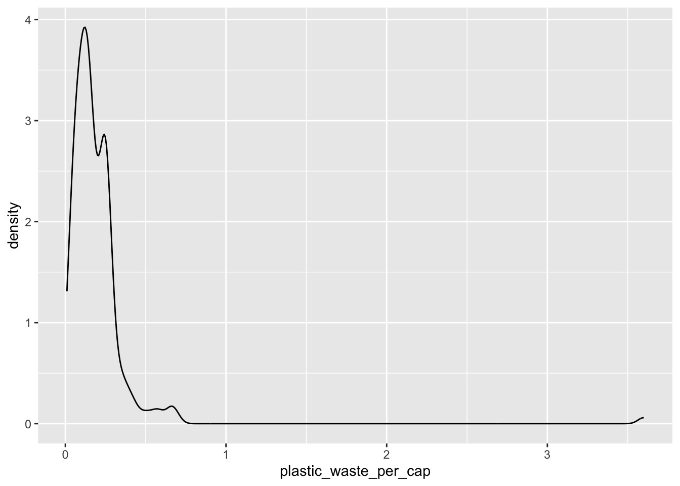
We can compare distributions across continents by coloring density curves by continent.
ggplot(data = plastic_waste,
       mapping = aes(x = plastic_waste_per_cap,
                     color = continent)) +
  geom_density()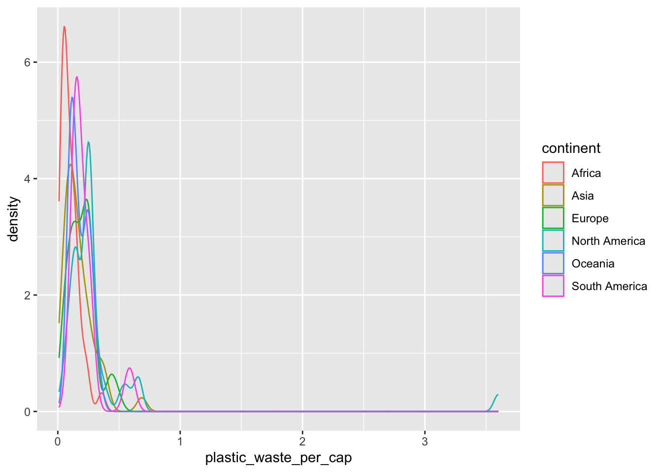
The resulting plot may be a little difficult to read, so we can also fill in the curves with colors.
ggplot(data = plastic_waste,
       mapping = aes(x = plastic_waste_per_cap,
                     color = continent,
                     fill = continent)) +
  geom_density()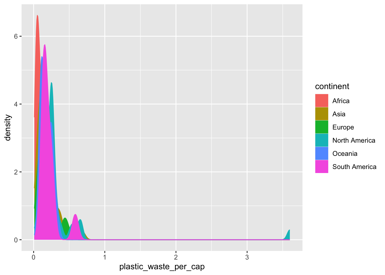
The overlapping colors make it difficult to tell what’s happening with the distributions in the continents that are plotted first and end up being covered by continents plotted over them. We can change the transparency level of the fill color to help with this. The alpha argument takes values between 0 and 1: 0 is completely transparent and 1 is completely opaque. There is no way to tell what value will work best, so you just need to try a few.
ggplot(data = plastic_waste,
       mapping = aes(x = plastic_waste_per_cap,
                     color = continent,
                     fill = continent)) +
  geom_density(alpha = 0.7)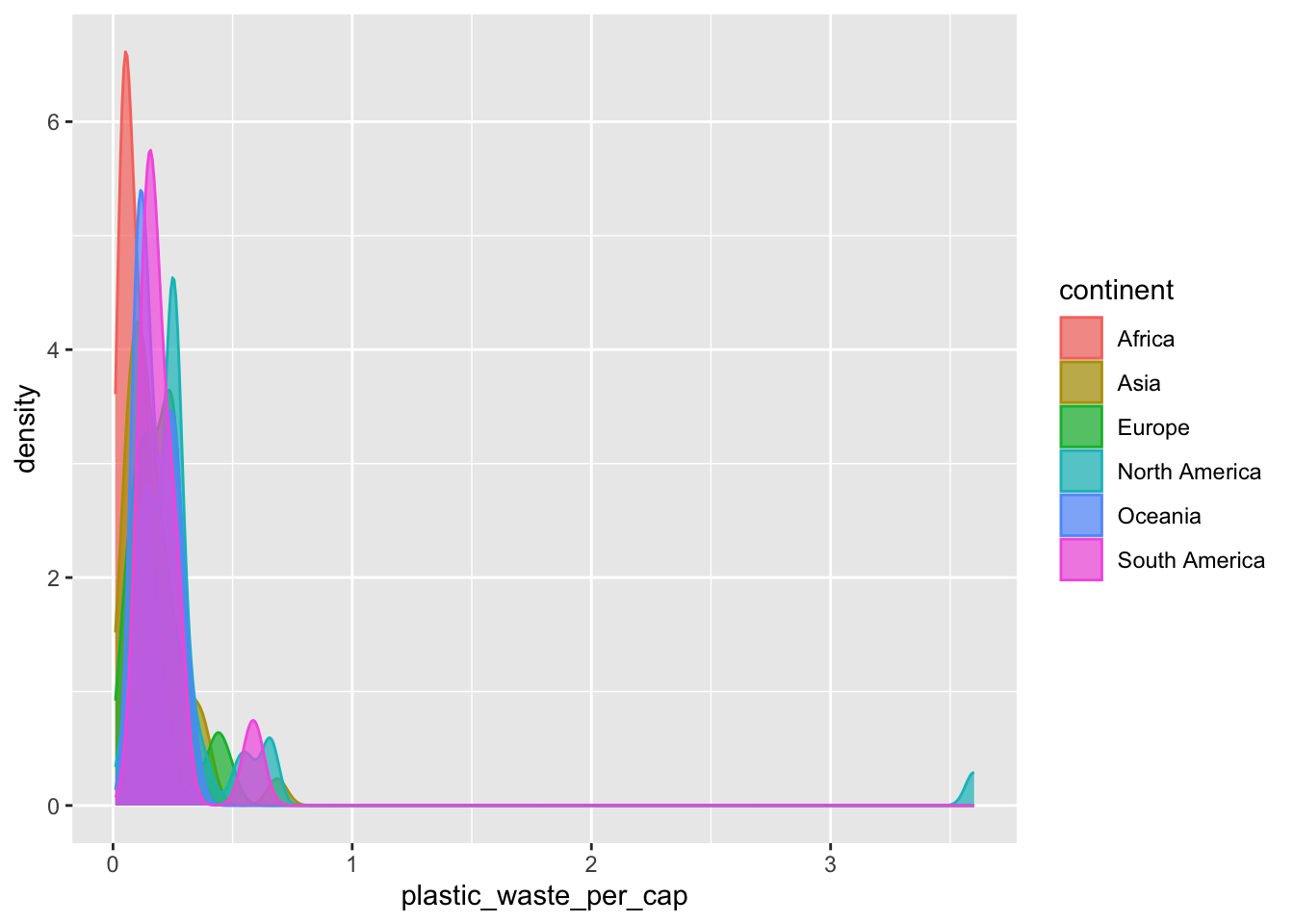
This still doesn’t look great…
Exercise 8
Recreate the density plot above using a different (lower) alpha level that works better for displaying the density curves for all continents, and set the range of the x-axis displayed in the plot to be values from 0 to 1. Put your code in the answer document.
# Your code hereExercise 9
In the answer document, explain why we defined the color and fill of the curves by mapping aesthetics of the plot, but we defined the alpha level as a characteristic of the plotting geom.
More Info
Yet another way to visualize this relationship is using side-by-side box plots.
ggplot(data = plastic_waste,
       mapping = aes(x = continent,
                     y = plastic_waste_per_cap)) +
  geom_boxplot()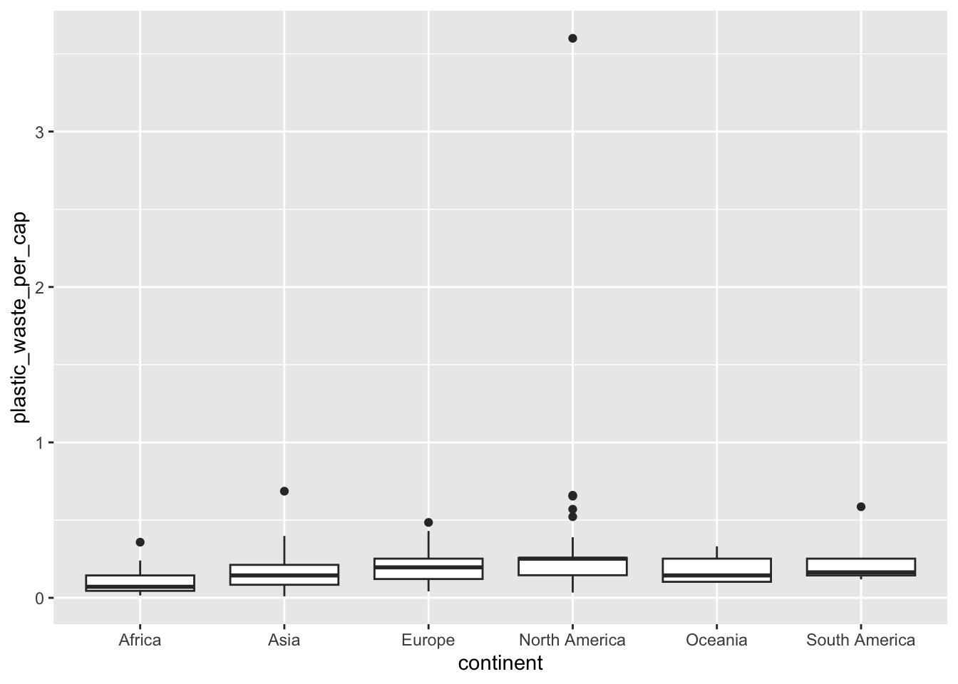
Exercise 10
Write code to visualize the relationship between plastic waste per capita and mismanaged plastic waste per capita using a scatterplot. Then describe the relationship. Put your code and explanation in the answer document.
# Your code hereExercise 11
Copy, paste, and modify your code from the previous exercise to color the points in the scatterplot by continent, and add a title, x-axis label, and y-axis label.
Explain: does there seem to be any clear distinction between continents with respect to how plastic waste per capita and mismanaged plastic waste per capita are associated? Put your code and explanation in the answer document.
# Your code hereExercise 12
Write code to create two plots. One should show the relationship between plastic waste per capita and total population. The other should show the relationship between plastic waste per capita and coastal population. Explain: which of these pairs of variables appear to be more strongly linearly associated? Is the relationship positive or negative? Put your code and explanation in the answer document.
# Your code hereExtra Credit (10 points)
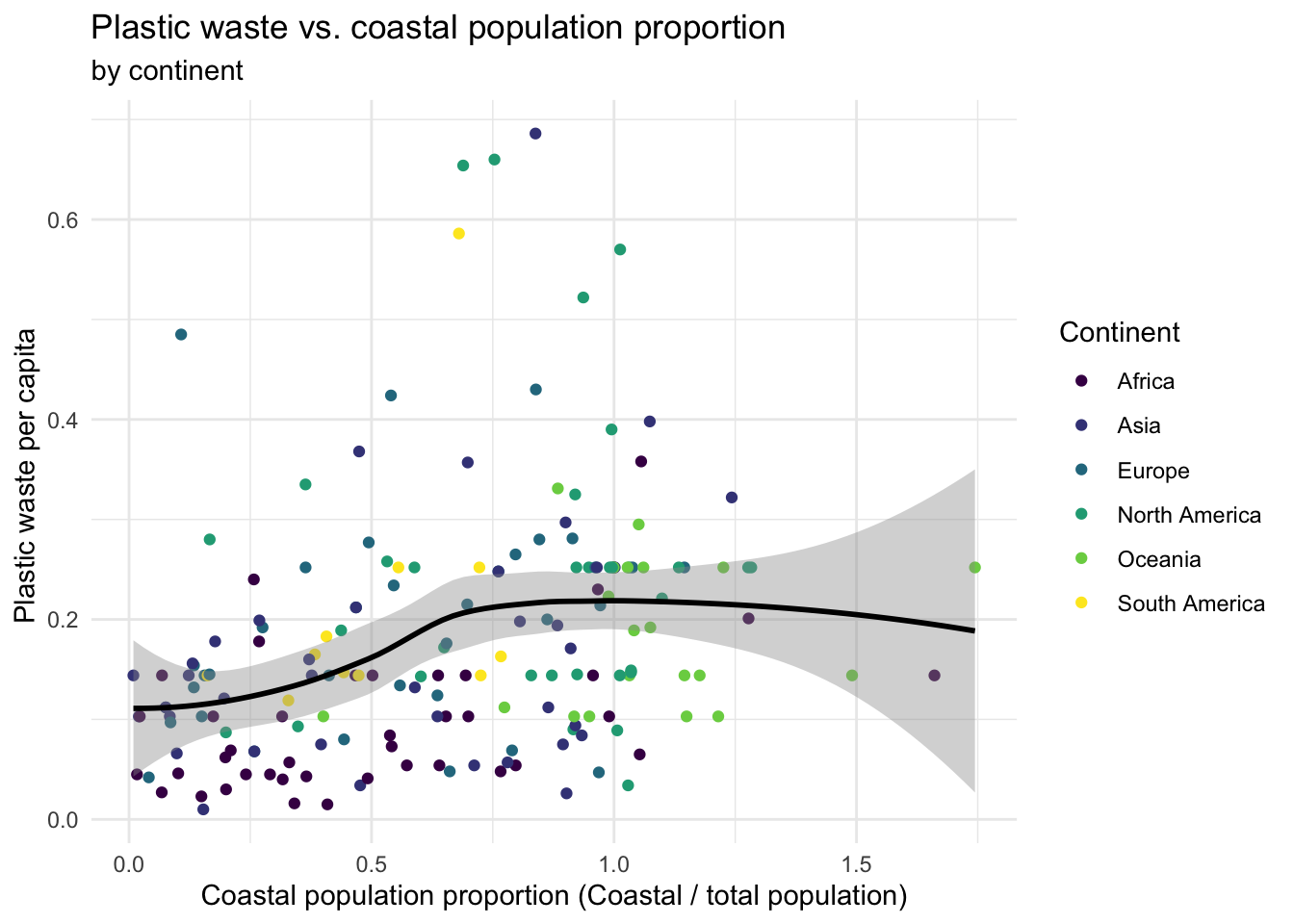
If you can bear to spend more time on this and want to stretch yourself some more, move on to the remaining exercise below.
Hint: The x-axis is a calculated variable. One country with plastic waste per capita over 3 kg/day has been filtered out. And the data are not only represented with points on the plot but also a smooth curve. The term “smooth” should help you pick which geom to use.
See if you can recreate the following plot. Whether you recreate it or just look at this one, give an interpretation of what you see given the context of the data.
Submit on Brightspace
- Submit your
lab5_part1.qmdQuarto file. - Submit your
lab5_part2.qmdQuarto file. - Submit your rendered
lab5_part2.htmlfile.- Before you render set all of your code chunks to display the visualization output but not the plot code. Use
echo=FALSEinside the code chunk. The top line of code chunk for all plots should read:{r echo=FALSE, eval=TRUE}.
- Before you render set all of your code chunks to display the visualization output but not the plot code. Use