devtools::install_github("tidyverse/dsbox")Lab 6 Effective visualization
Instructions
In this assignment you’ll use a dataset based on traffic accidents in Edinburgh. The data are made available online by the UK Government. It covers all recorded accidents in Edinburgh in 2018 and some of the variables were modified for the purposes of this assignment.
The data, called accidents, can be found in the dsbox package.
Since the dataset is distributed with the package, we don’t need to load it separately; it becomes available to us when we load the package. You can find out more about the dataset by inspecting its documentation, which you can access by running ?accidents or using the Help menu in RStudio to search for accidents. You may need to use the devtools command given below to install the package.
In addition to creating your Quarto document and loading the required packages, run the following code to prevent R from using scientific notation to display numeric values.
options(scipen=999)
Important
When you use more than one function in your code to answer a question, use annotations as comments # in the code block to briefly describe what each function is doing.
Exercise 1 (6 points)
Create a new object that contains a subset of the accidents dataset which excludes the following variables: easting, northing, longitude, latitude, police_force, district, highway, second_road_class, and second_road_number.
Exercise 2 (5 points)
How many observations (rows) does the accidents dataset have? Use code to display the number.
Exercise 3 (6 points)
Explain what each row in the dataset represents.
Exercise 4 (10 points)
Write code to create a tibble with the mean, median, and standard deviation of the vehicles and casualties numerical variables in the accidents data frame. In a comment in your code chunk, describe the summary statistics in complete sentences.
Exercise 5 (10 points)
Create a distribution plot for both of the variables from the previous exercise. Your answer should include two separate ggplot charts.
Exercise 6 (12 points)
Create a bar plot to summarize a categorical variable in the dataset. Categorical variables are stored as factor fct or character chr data types in the accidents data frame.
Exercise 7 (17 points)
Write code to recreate the following plot, and interpret it. For this you may find the case_when or if_else function to be helpful.
Add brief annotations using comments in your code chunk for each line of code.
Interpret the visualization in a brief paragraph, i.e., use complete sentences.
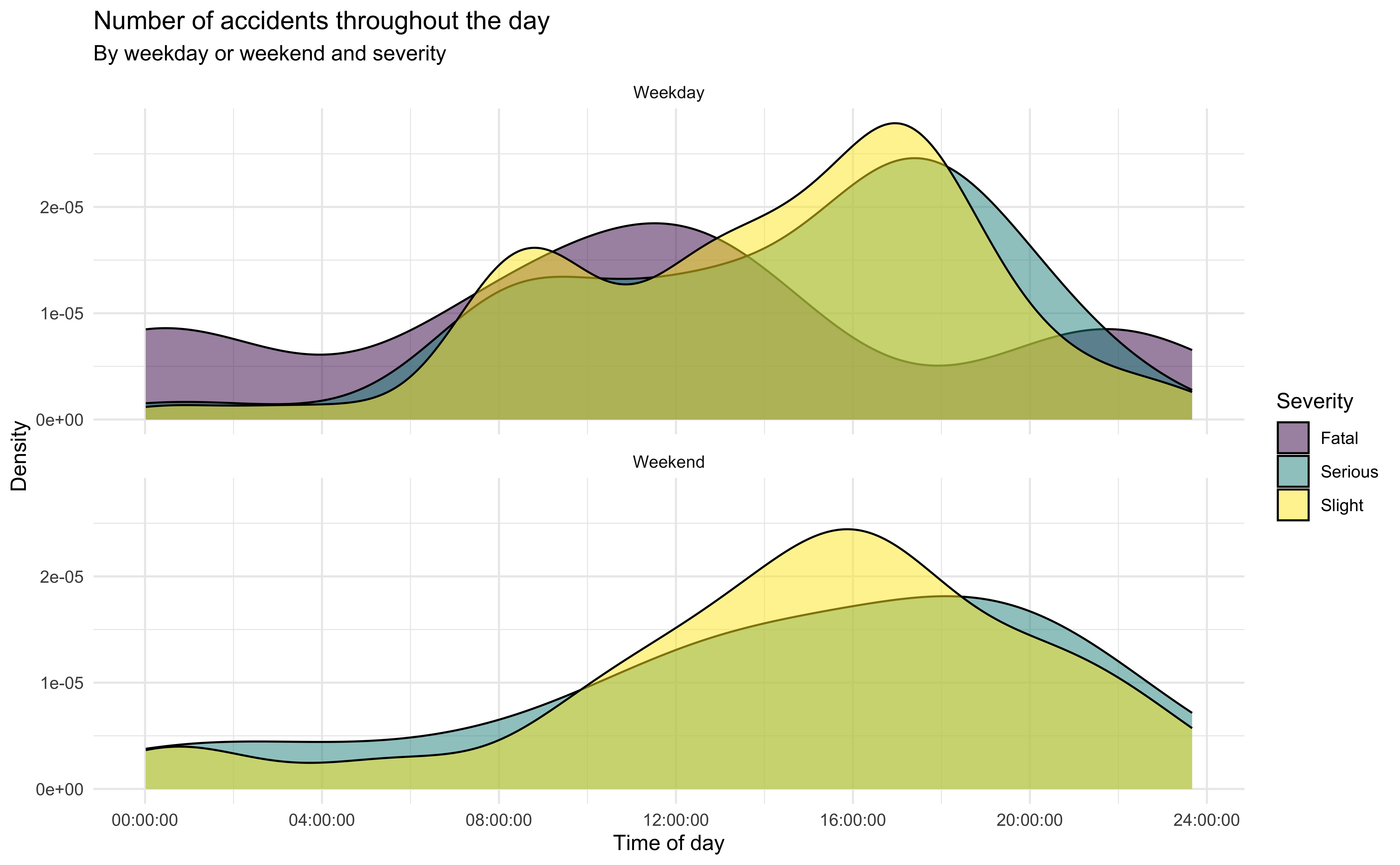
Tip
You can create an image file of a ggplot chart using the ggsave function. Try running the code below to see how it works.
ggsave("accidents_weekday_vs_weekend.jpg", width = 6, height = 4, units = "in")
ggsave("accidents_weekday_vs_weekend.pdf", width = 20, height = 20, units = "cm")
Exercise 8 (12 points)
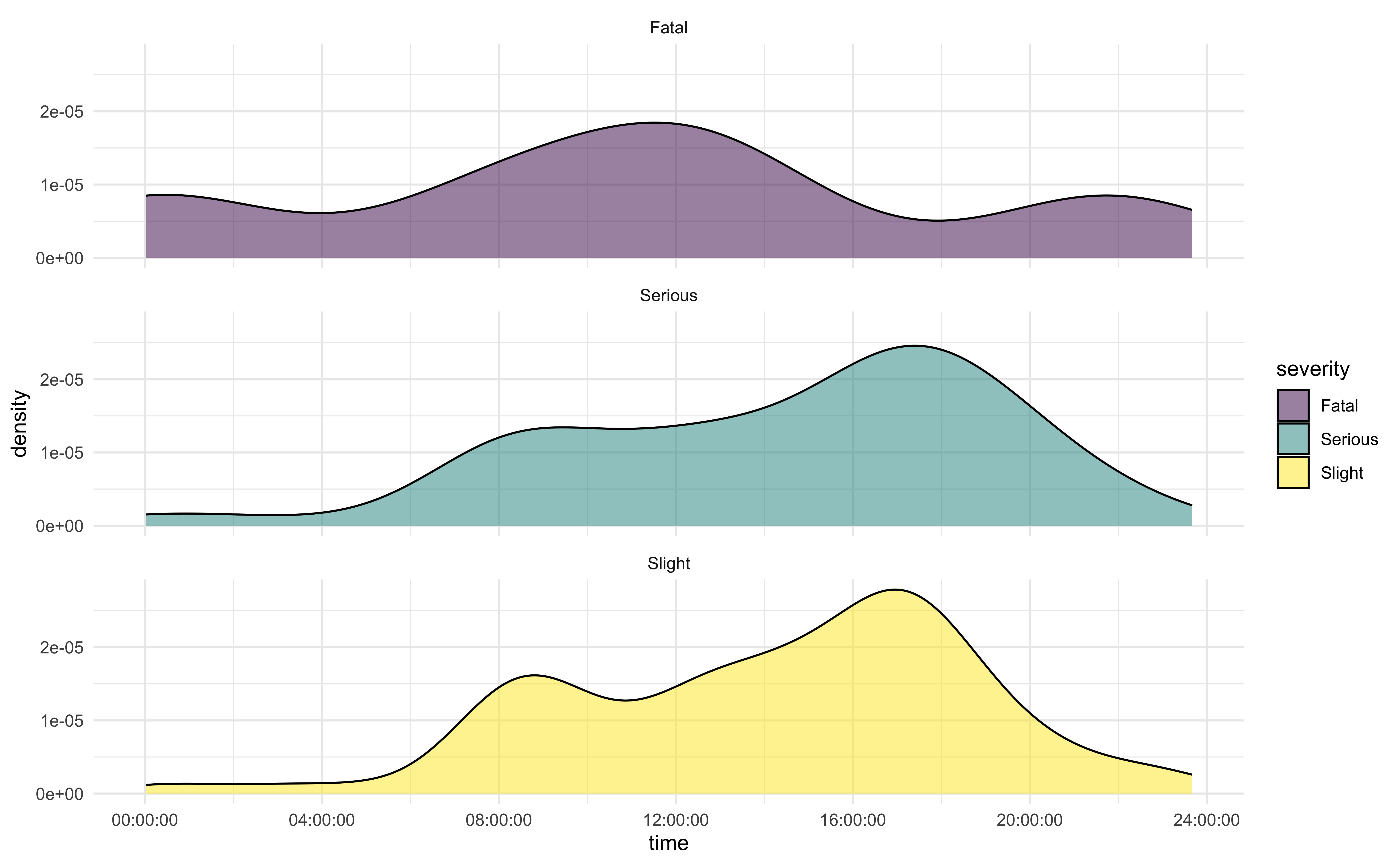
For all weekday observations, create a faceted plot with one column to show the same variable distributions from the previous exercise. Provide a chart title, subtitle, x-axis label, y-axis label, and legend title.
Exercise 9 (14 points)
Create another data visualization based on the accidents data and interpret it. You can choose any variables and any type of visualization you like, but it must have at least three variables, e.g. a scatterplot of x vs. y isn’t enough, but if points are colored by z, that’s fine.
Use colorbrewer2.org to select a color scheme.
Select a theme from the ggplot complete themes guide.
Add brief annotations using comments in your code chunk.
Interpret the visualization in a brief paragraph, i.e., use complete sentences.
Use
ggsaveto export an image file with your chart.
Exercise 10 (8 points)
Now that you have finished this activity, review your work with the dataset and suggest an additional chart that would help you answer a question you have about the data. Specify the question and describe the plot you would create to help answer it. You do not need to write code to answer this question.
When you are done upload your .qmd file to Brightspace.