Designing effective visualizations
Intro to Data Analytics
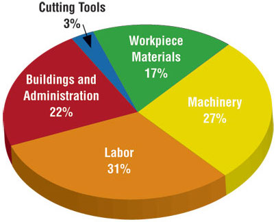
Keep it simple
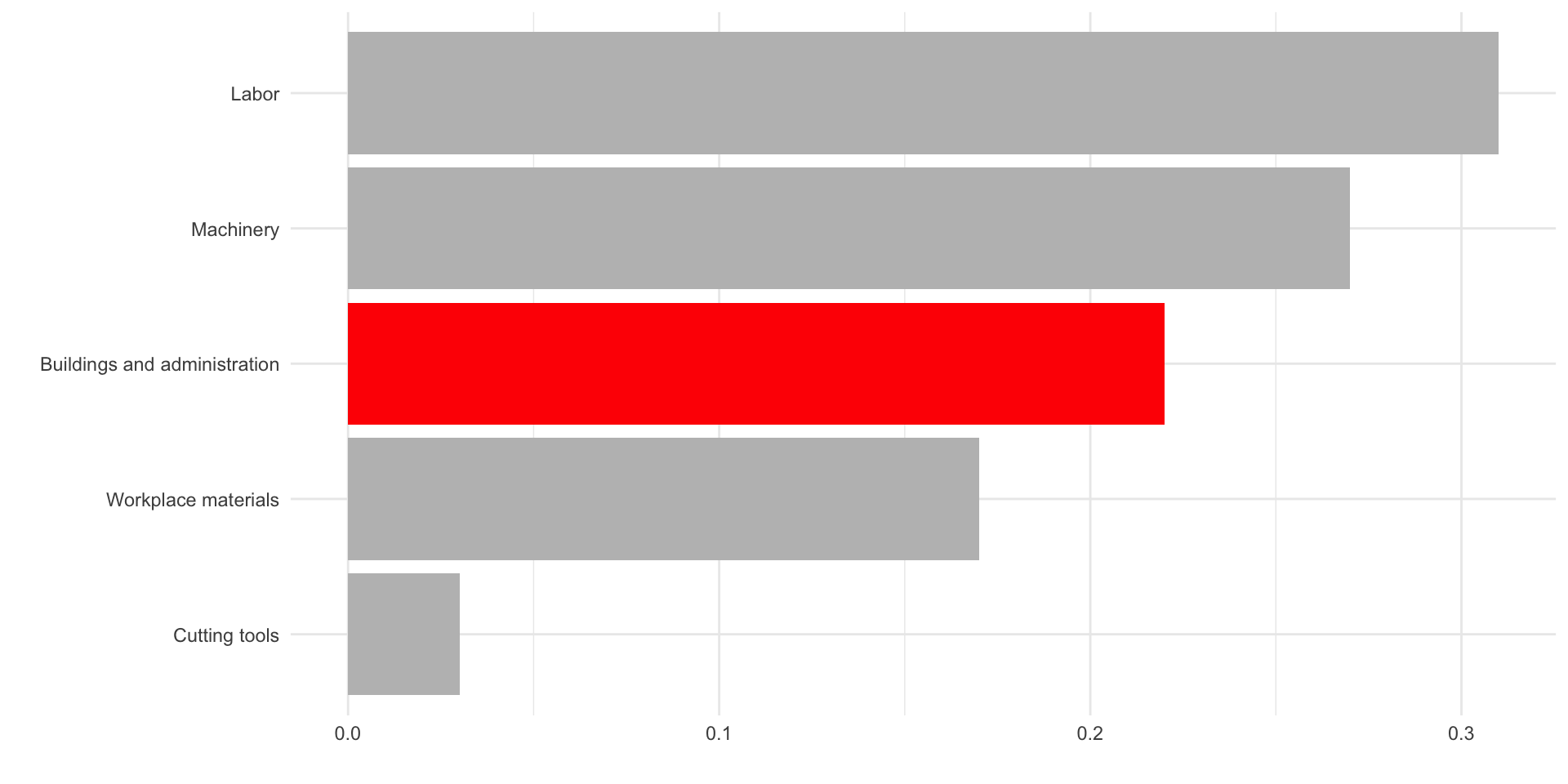
Use color to draw attention

Use color to draw attention

Tell a story
Data
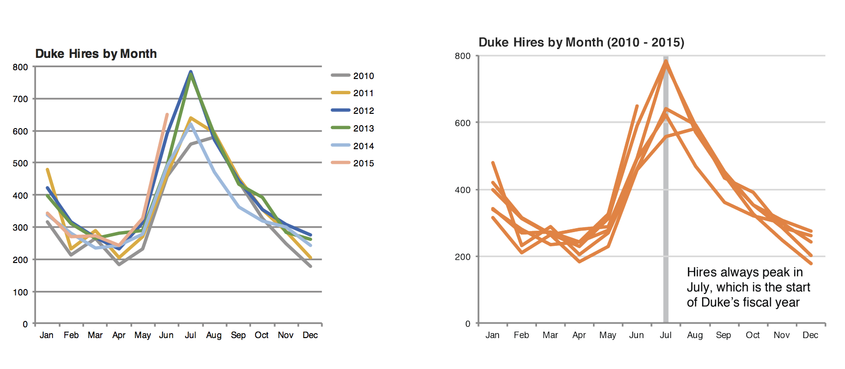
In September 2019, YouGov survey asked 1,639 GB adults the following question:
In hindsight, do you think Britain was right/wrong to vote to leave EU?
- Right to leave
- Wrong to leave
- Don’t know

Source: YouGov Survey Results, retrieved Oct 7, 2019
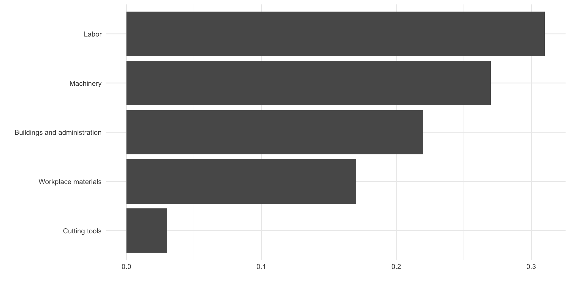
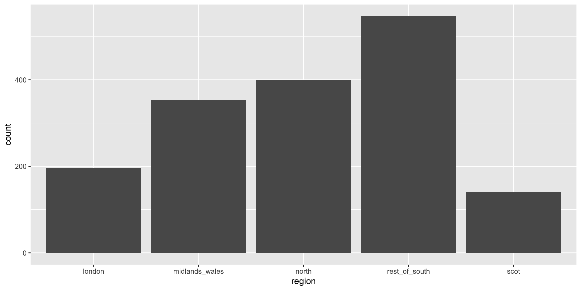
Alphabetical order is rarely ideal
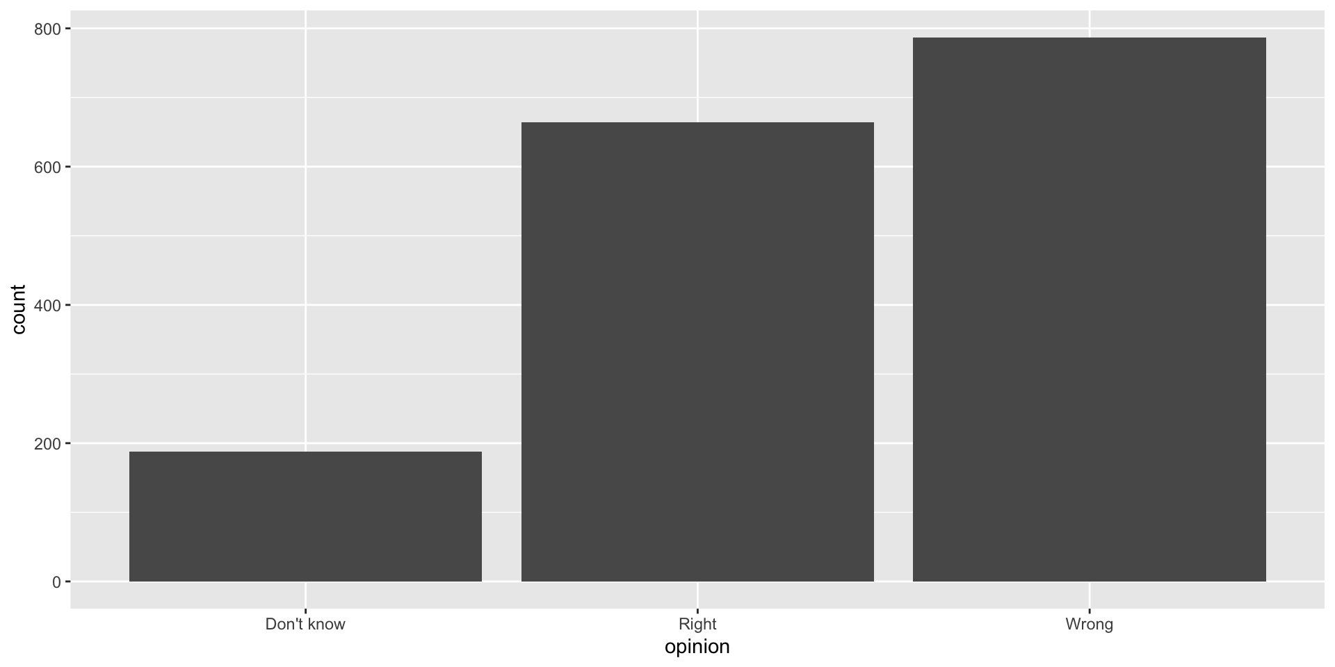
Order by frequency
Wrap the opinion variable inside the fct_infreq function and reorder the categories by frequency
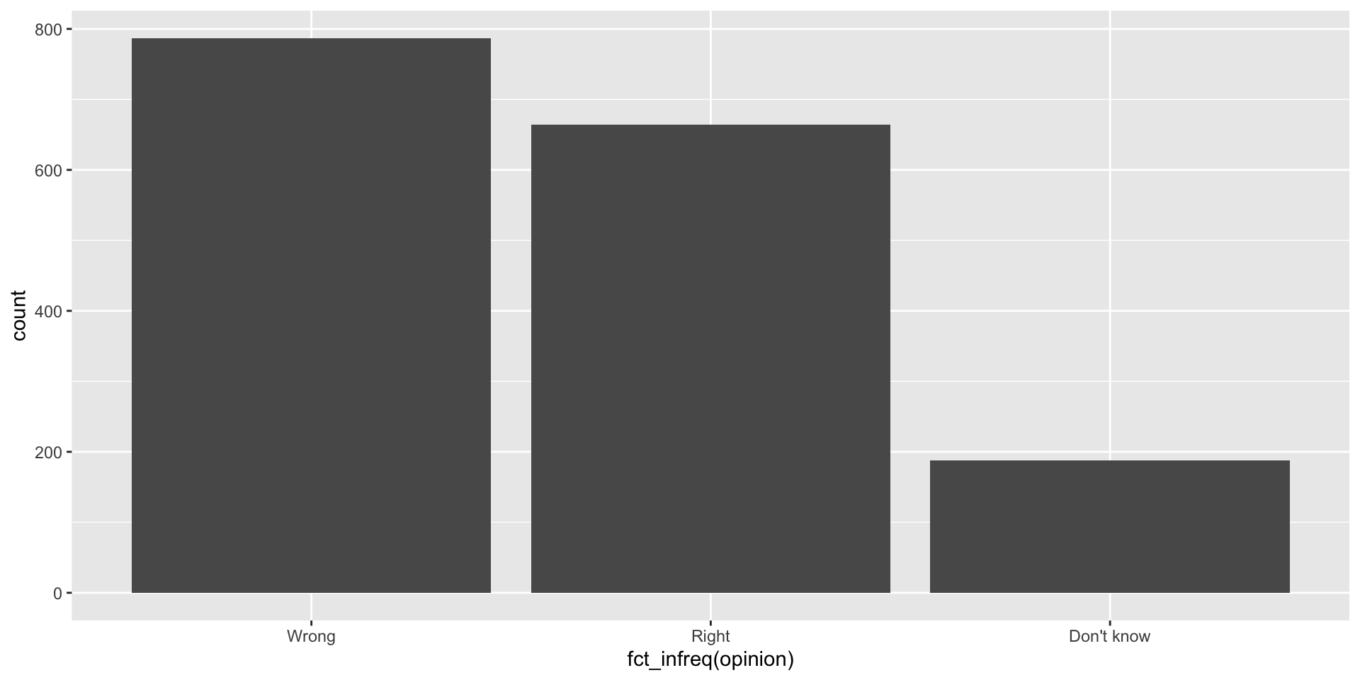
Clean up labels
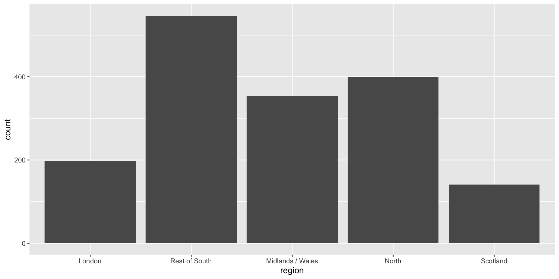
Alphabetical order is rarely ideal
Use inherent level order

Clean up labels
Long categories can be hard to read

Move them to the y-axis
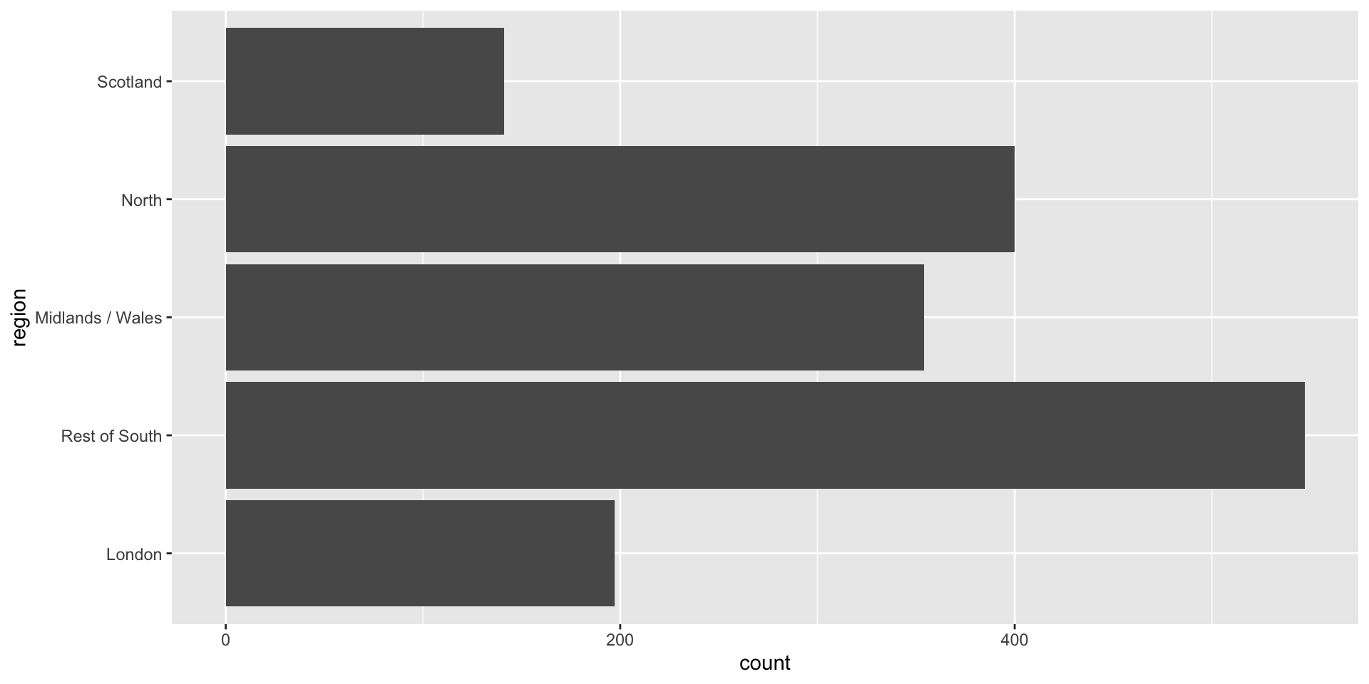
And reverse the order of levels
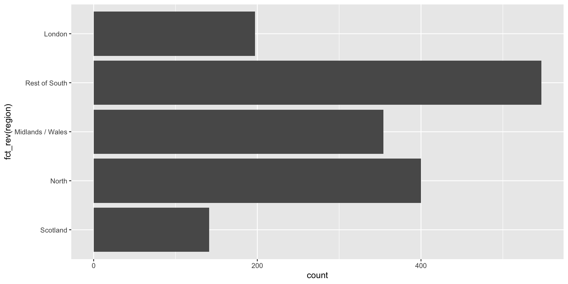
Clean up labels

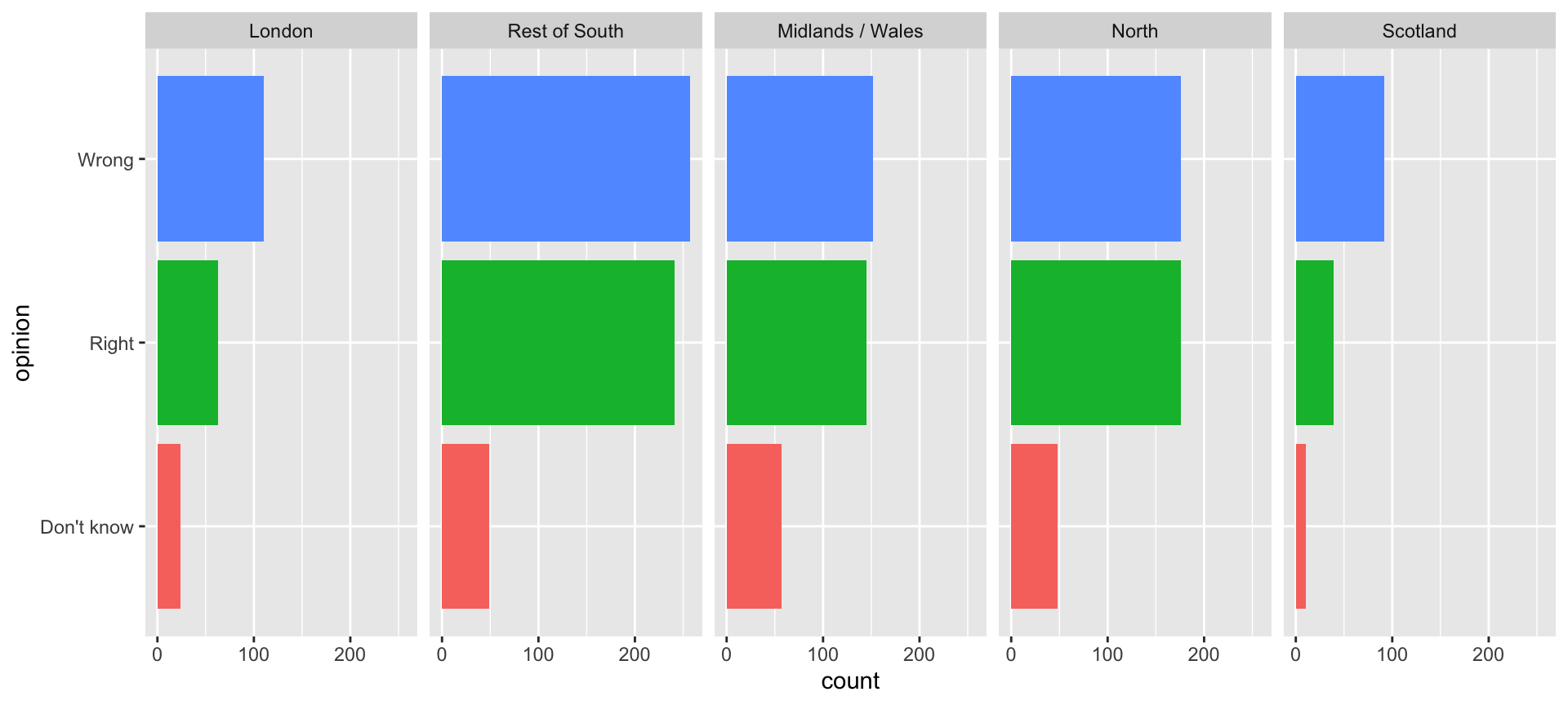
Segmented bar plots can be hard to read
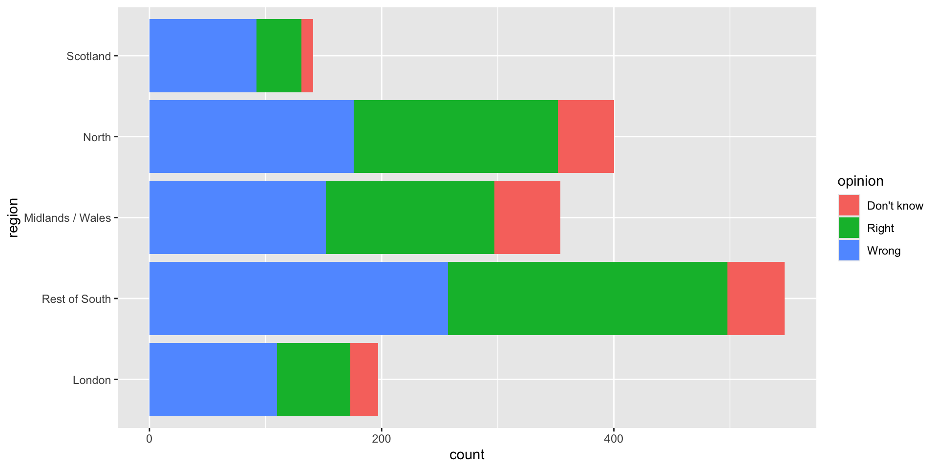
Use facets
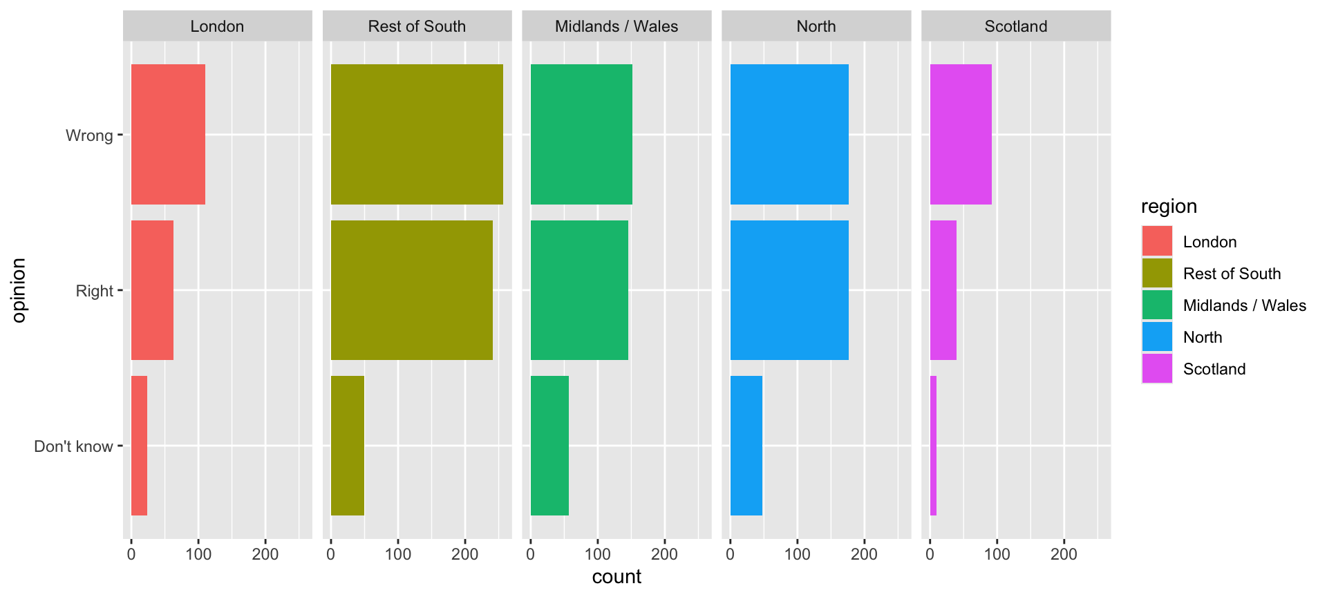
Avoid redundancy?
Redundancy can help tell a story
Be selective with redundancy
Use informative labels
A bit more info
ggplot(brexit, aes(y = opinion, fill = opinion)) +
  geom_bar() +
facet_wrap(~region, nrow = 1) +
guides(fill = "none") +
labs(
title = "Was Britain right/wrong to vote to leave EU?",
subtitle = "YouGov Survey Results, 2-3 September 2019",
caption = "Source: https://d25d2506sfb94s.cloudfront.net/cumulus_uploads/document/x0msmggx08/YouGov%20-%20Brexit%20and%202019%20election.pdf",
x = NULL, y = NULL
)Add a source for our visualization
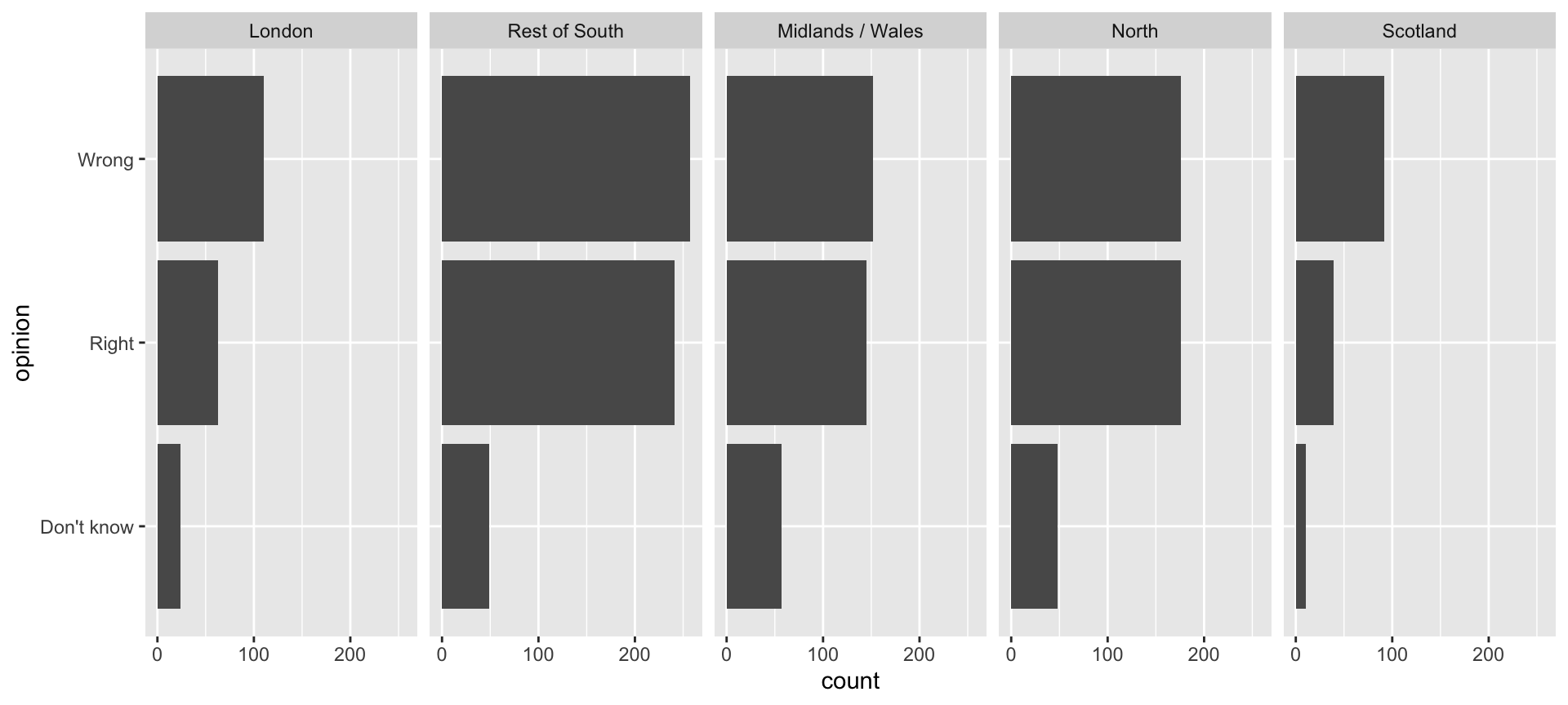
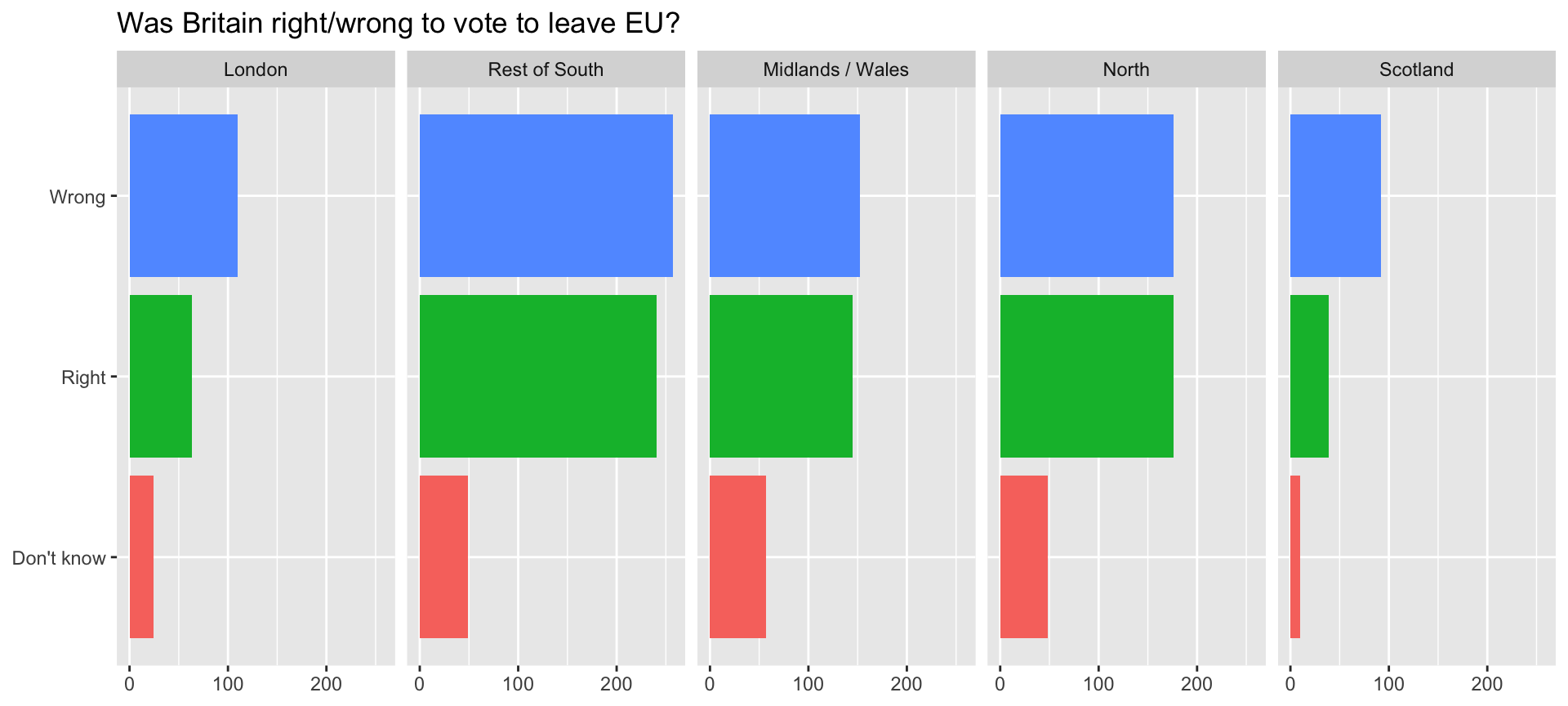
Let’s do better
Shorten the URL using bit.ly
Fix up facet labels

ggplot(brexit, aes(y = opinion, fill = opinion)) +
  geom_bar() +
  facet_wrap(~region,
    nrow = 1,
    labeller = label_wrap_gen(width = 12)
  ) +
  guides(fill = "none") +
  labs(
    title = "Was Britain right/wrong to vote to leave EU?",
    subtitle = "YouGov Survey Results, 2-3 September 2019",
    caption = "Source: bit.ly/2lCJZVg",
    x = NULL, y = NULL
  )
Add the labeller argument to the facet_wrap function
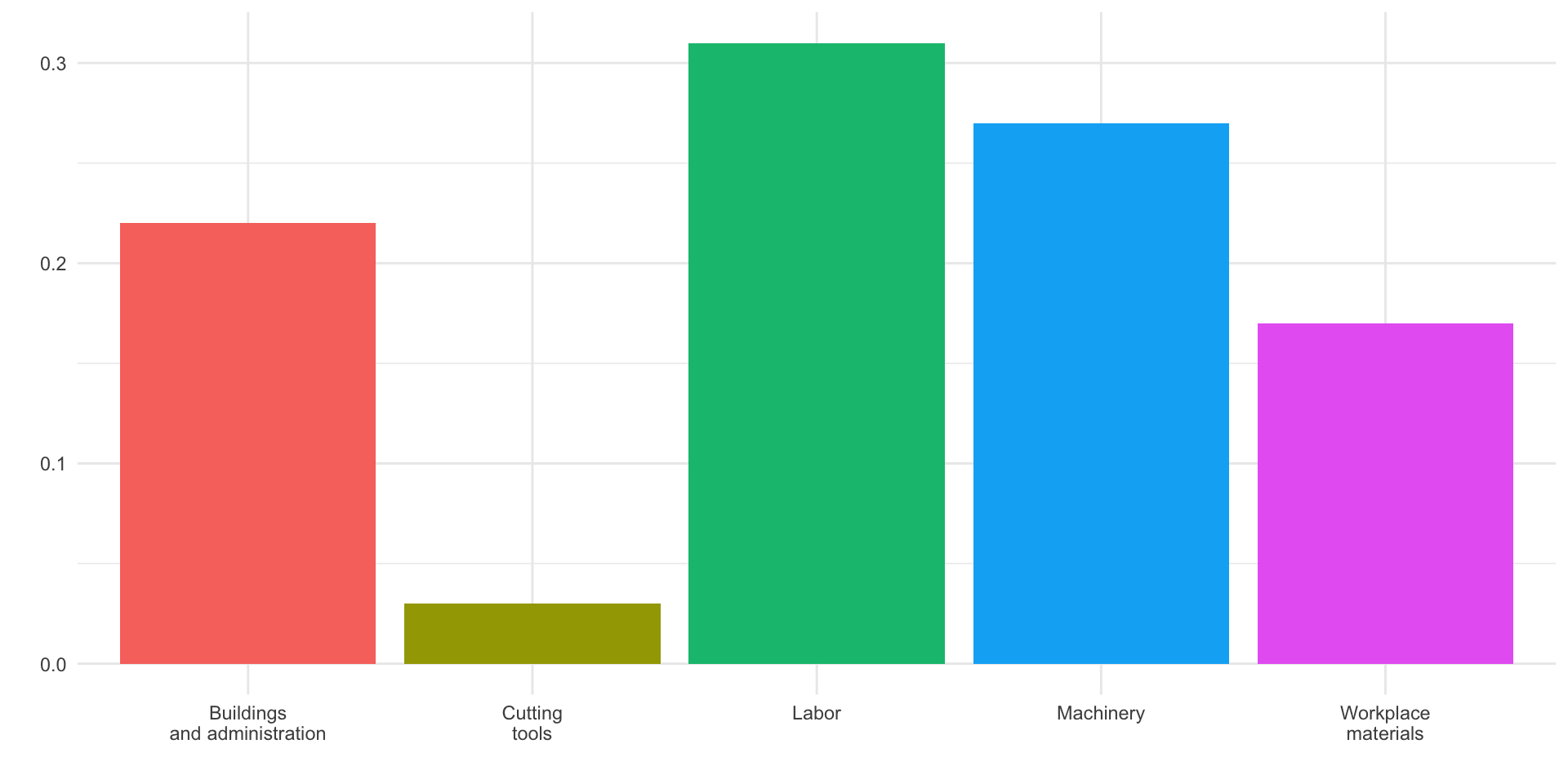
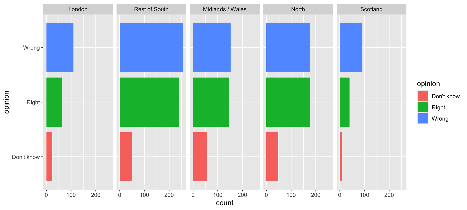
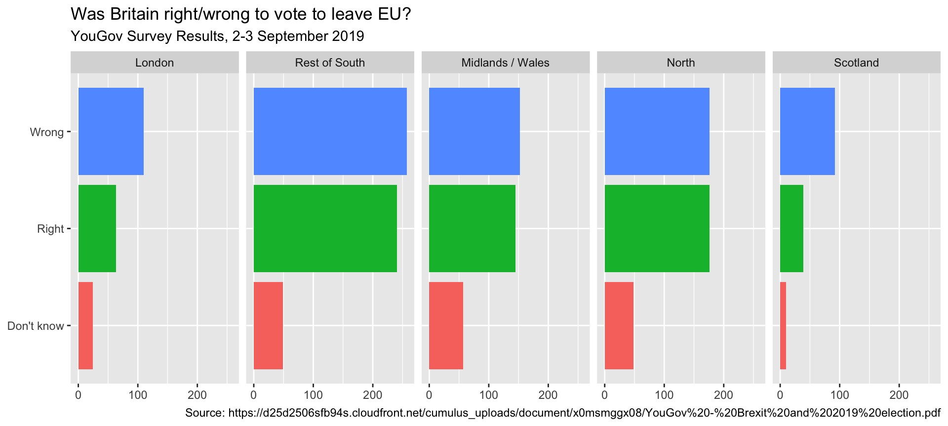
Rainbow colors not always the right choice
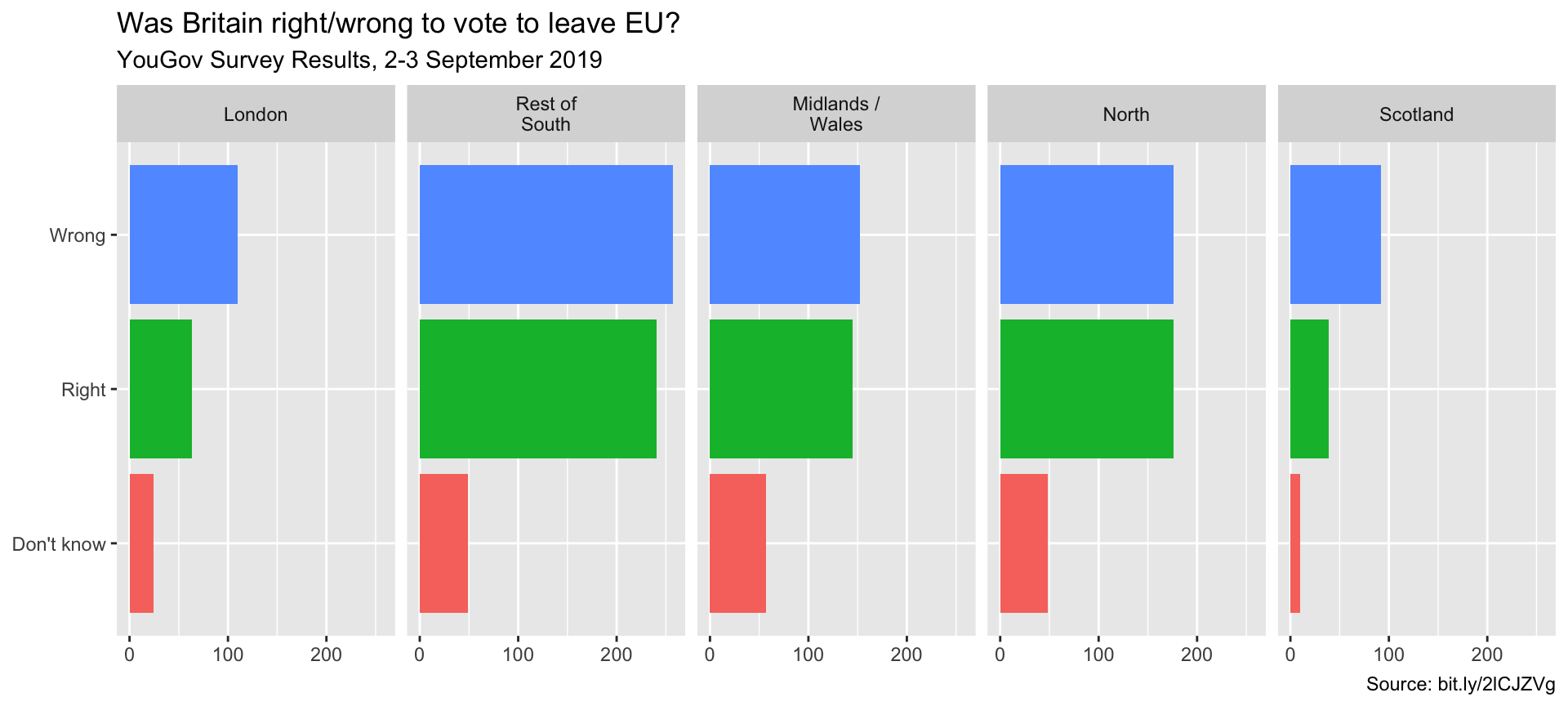
Manually choose colors when needed
ggplot(brexit, aes(y = opinion, fill = opinion)) +
  geom_bar() +
  facet_wrap(~region, nrow = 1, labeller = label_wrap_gen(width = 12)) +
  guides(fill = "none") +
  labs(title = "Was Britain right/wrong to vote to leave EU?",
       subtitle = "YouGov Survey Results, 2-3 September 2019",
       caption = "Source: bit.ly/2lCJZVg",
       x = NULL, y = NULL) +
  scale_fill_manual(values = c(
    "Wrong" = "red",
    "Right" = "green",
    "Don't know" = "gray"
  ))
Choosing better colors
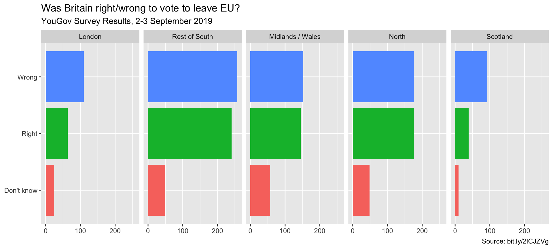
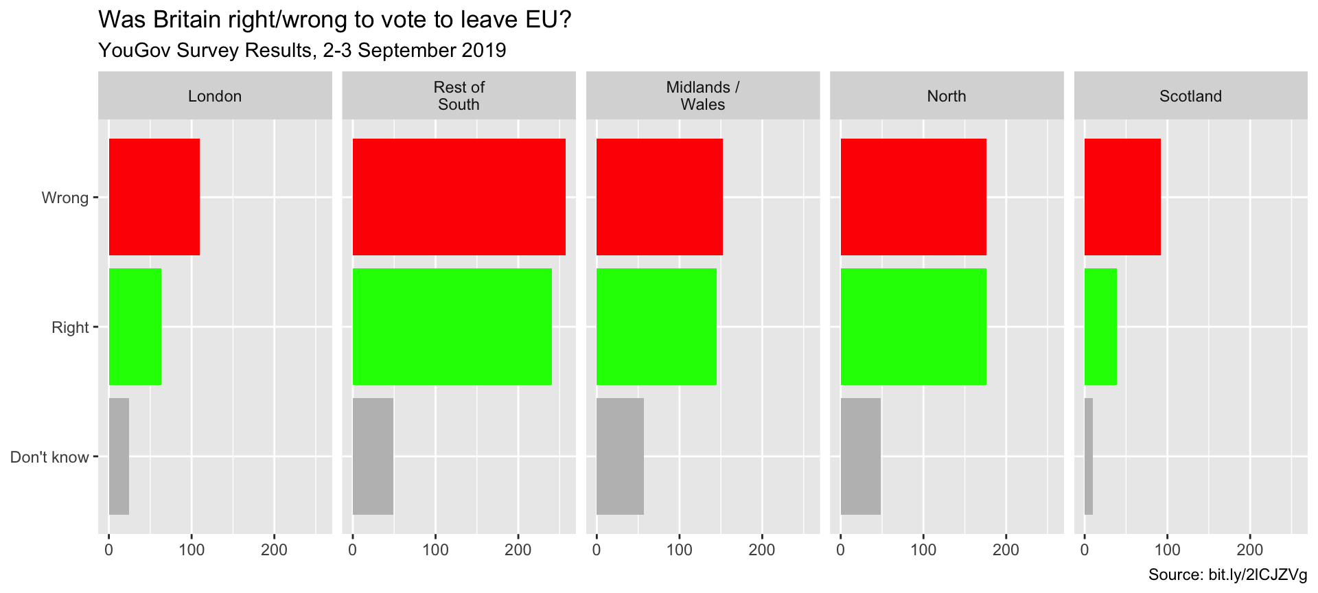
Use better colors
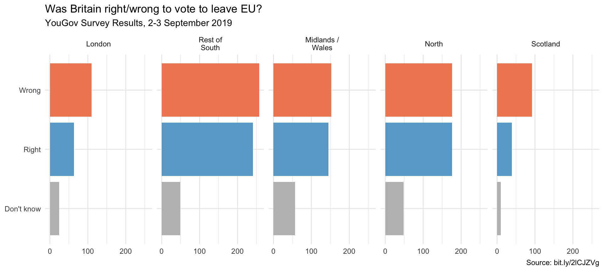
ggplot(brexit, aes(y = opinion, fill = opinion)) +
geom_bar() +
facet_wrap(~region, nrow = 1, labeller = label_wrap_gen(width = 12)) +
guides(fill = "none") +
labs(title = "Was Britain right/wrong to vote to leave EU?",
subtitle = "YouGov Survey Results, 2-3 September 2019",
caption = "Source: bit.ly/2lCJZVg",
x = NULL, y = NULL) +
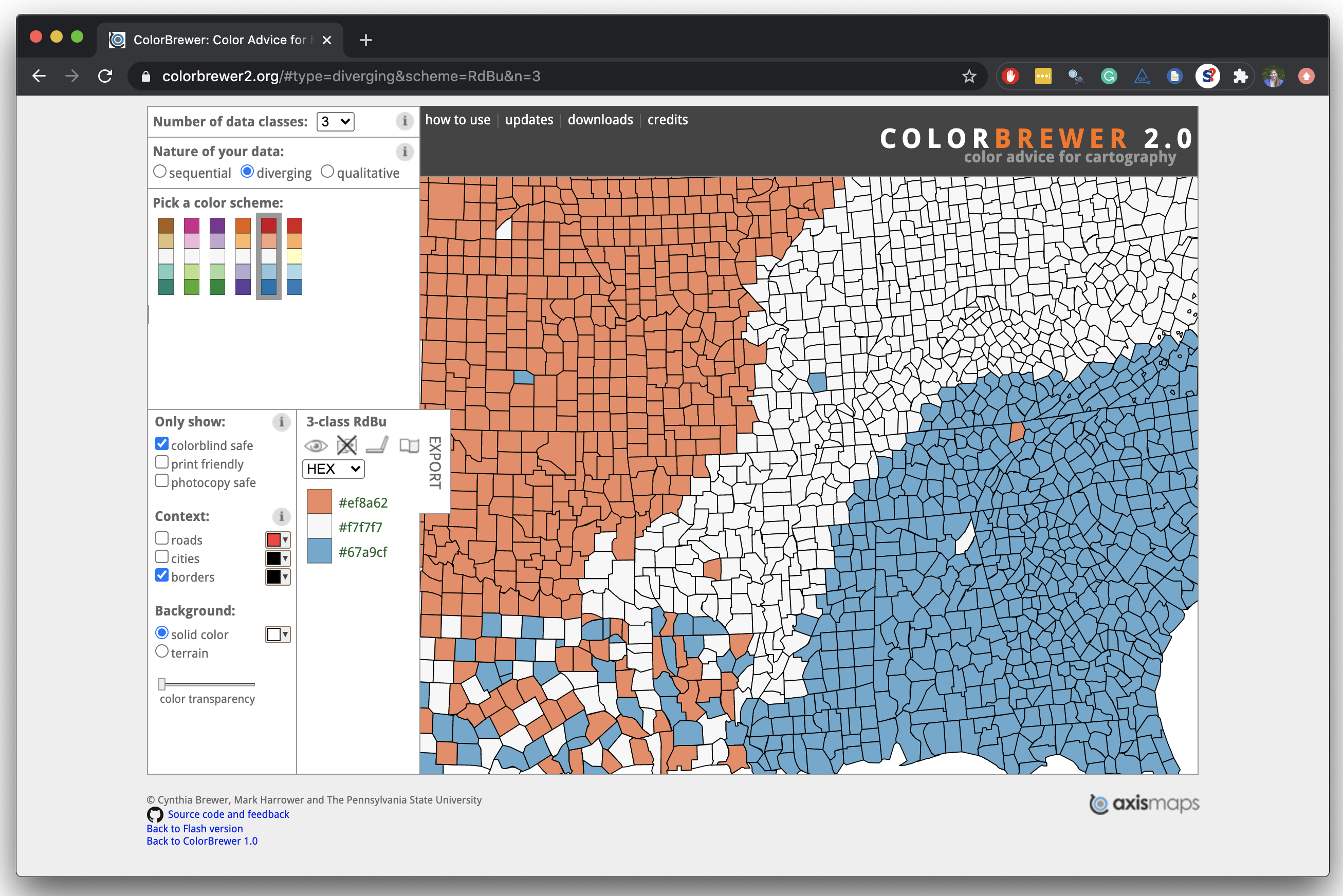
scale_fill_manual(values = c(
"Wrong" = "#ef8a62",
"Right" = "#67a9cf",
"Don't know" = "gray"
))Select theme
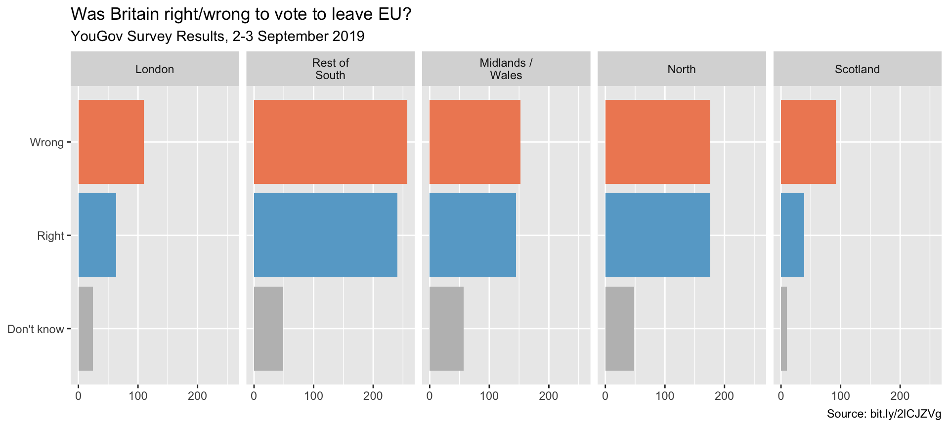
ggplot complete themes guide
ggplot(brexit, aes(y = opinion, fill = opinion)) +
  geom_bar() +
  facet_wrap(~region, nrow = 1, labeller = label_wrap_gen(width = 12)) +
  guides(fill = "none") +
  labs(title = "Was Britain right/wrong to vote to leave EU?",
       subtitle = "YouGov Survey Results, 2-3 September 2019",
       caption = "Source: bit.ly/2lCJZVg",
       x = NULL, y = NULL) +
  scale_fill_manual(values = c("Wrong" = "#ef8a62",
                               "Right" = "#67a9cf",
                               "Don't know" = "gray")) +
  theme_minimal()