Exploring Relationships and Bivariate Analysis
Bard College | Introduction to Data Analytics
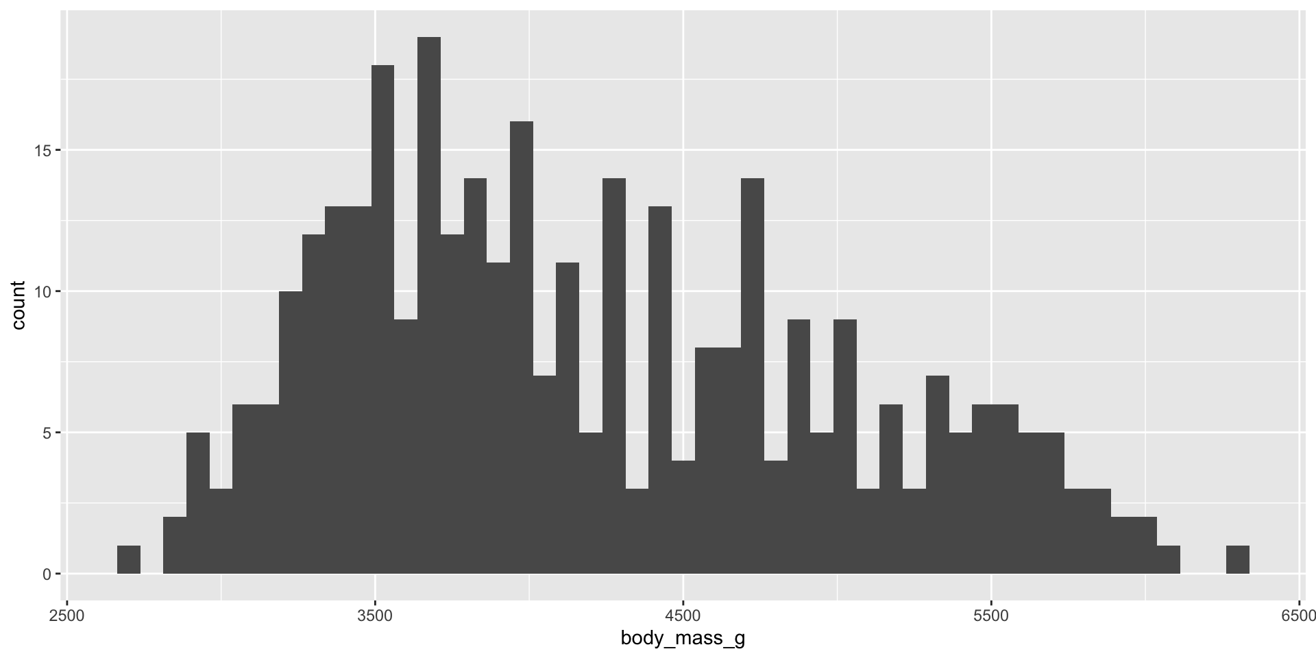
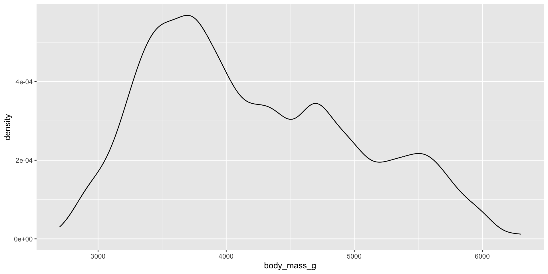
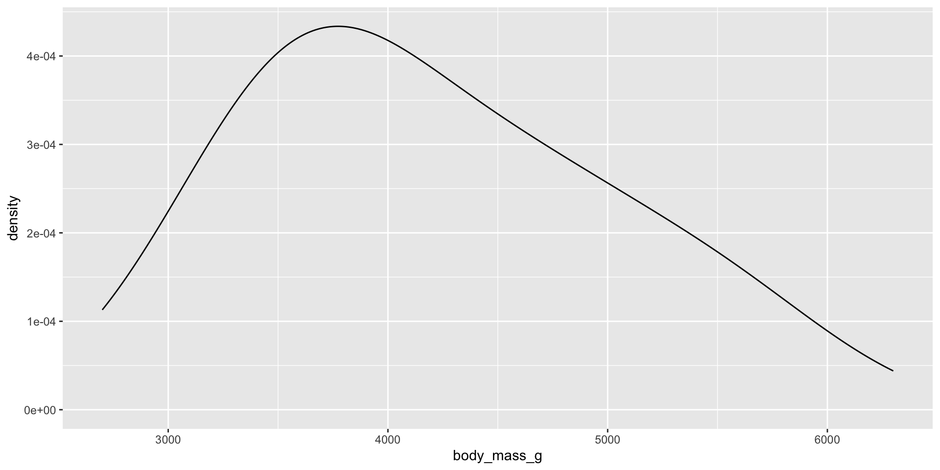
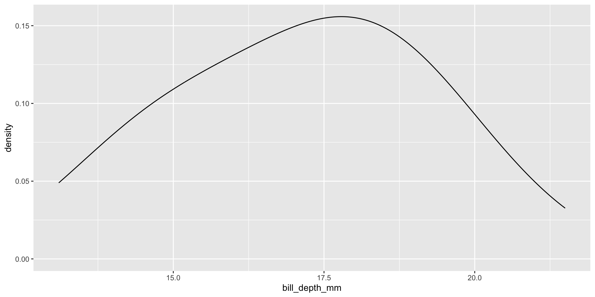
Histograms, density plots, and box plots
Reminders: Skew
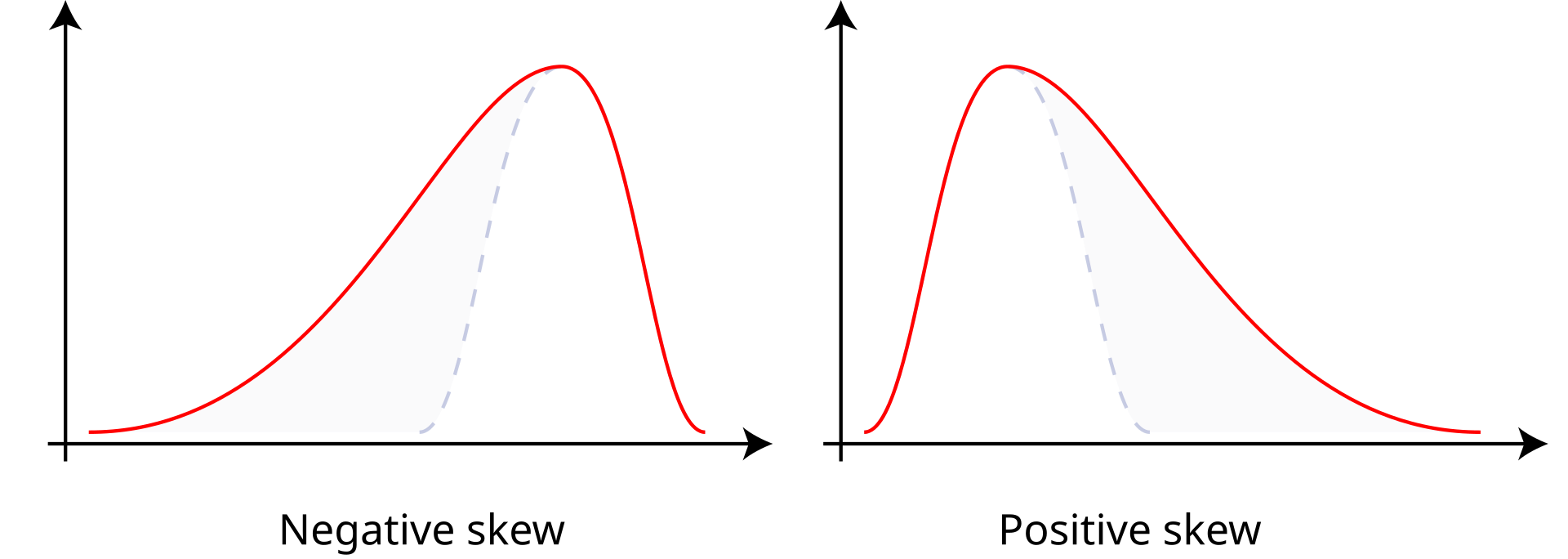
- Positive skew: The right tail is longer; the mass of the distribution is concentrated on the left of the figure. Right or positive skew refers to the right tail being drawn out and, often, the mean being skewed to the right of a typical center (median) of the data.
- Negative skew: The left tail is longer; the mass of the distribution is concentrated on the right of the figure. Left or negative skew refers to the left tail being drawn out and, often, the mean being skewed to the left of a typical center of the data.
Which central tendency measure is most appropriate?
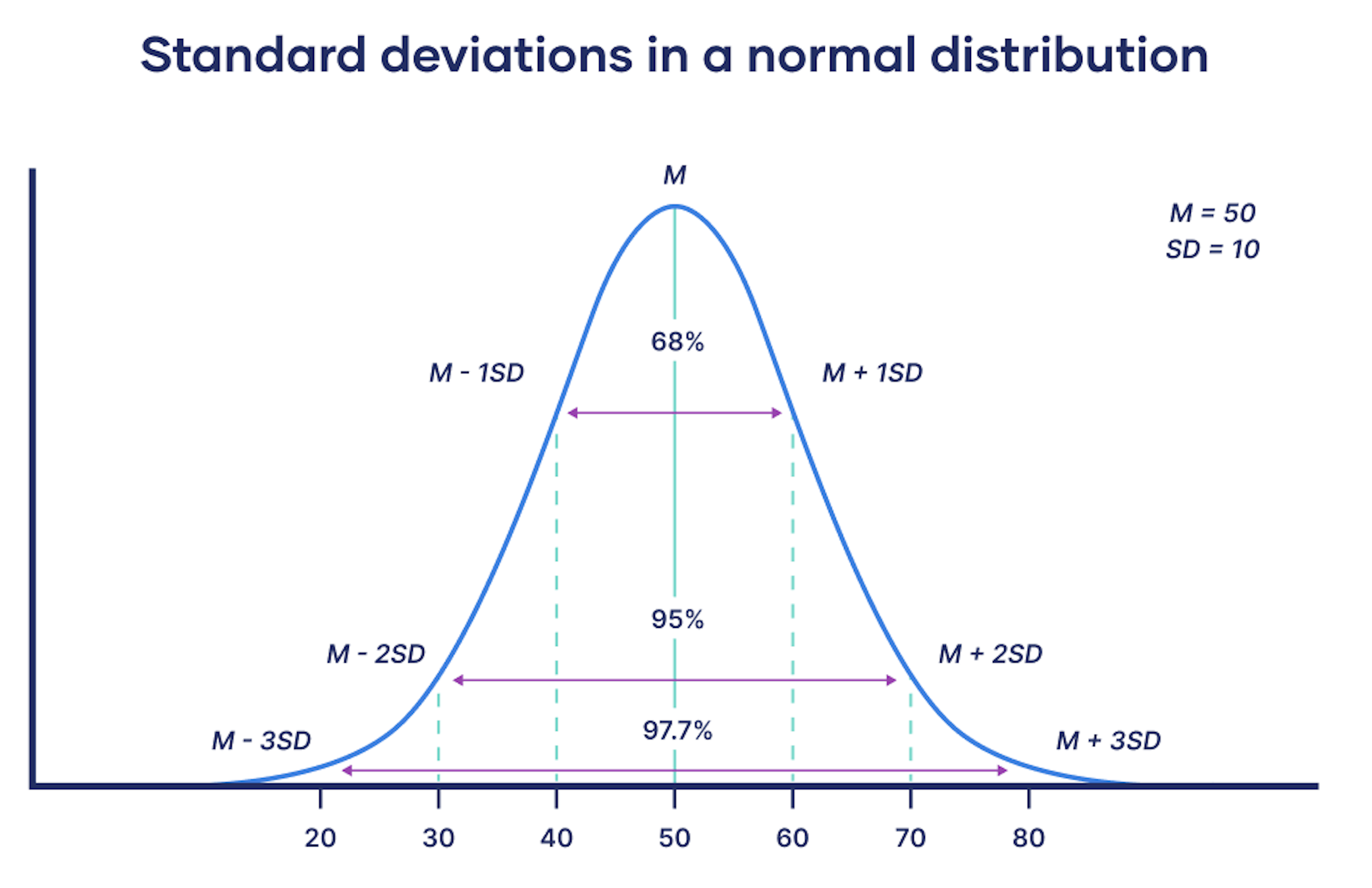
Standard deviation
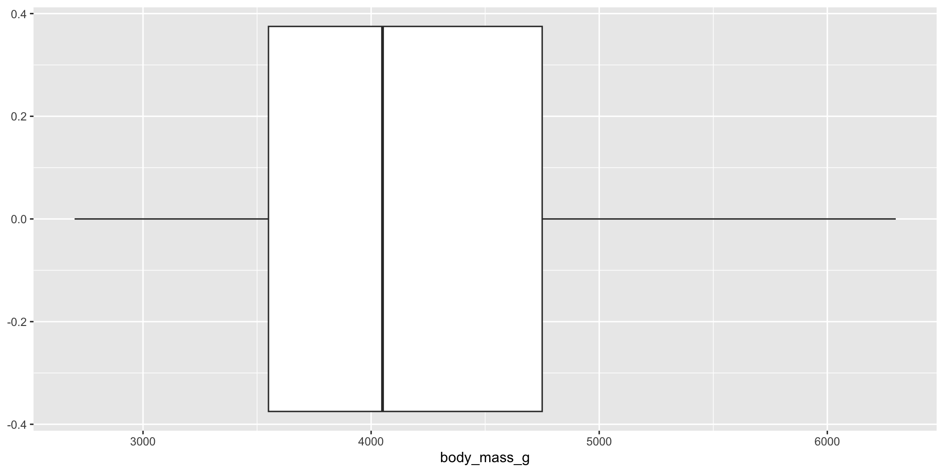
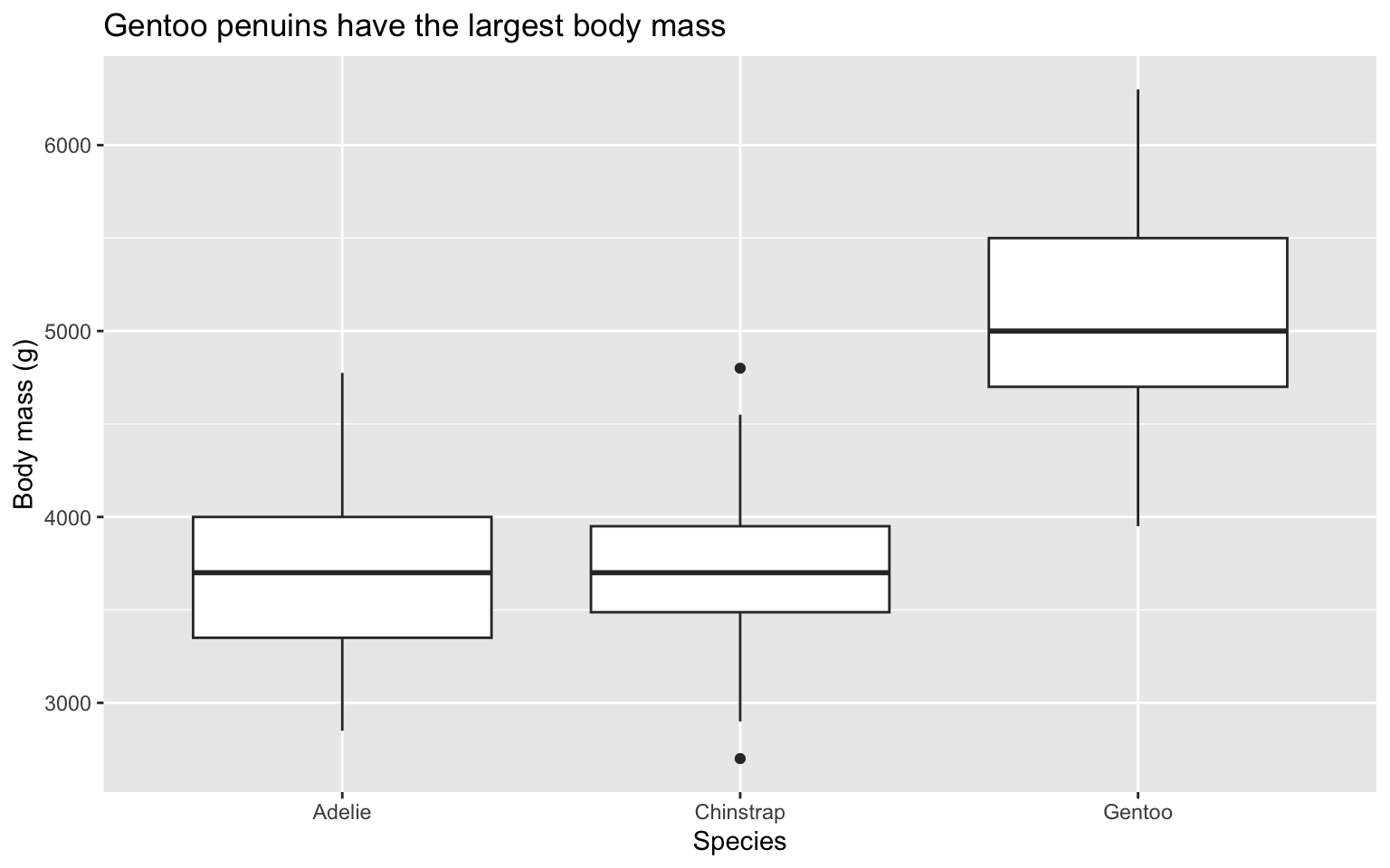
Side-by-side box plots
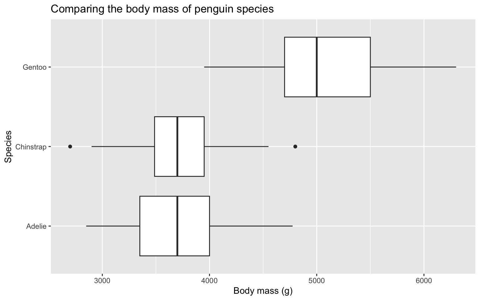
Side-by-side box plots
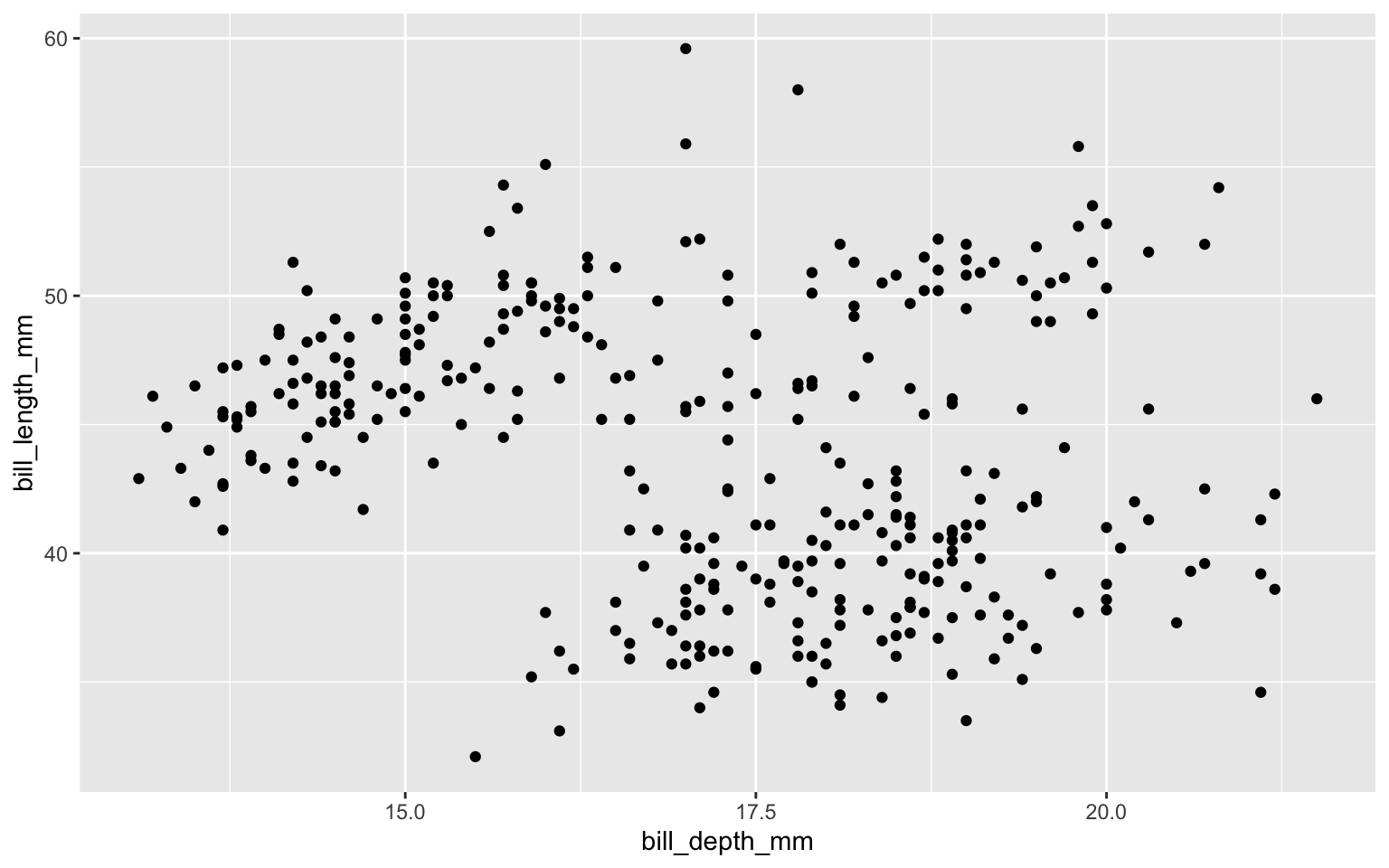
Show relationships between variables with scatter plots
Scatter plots
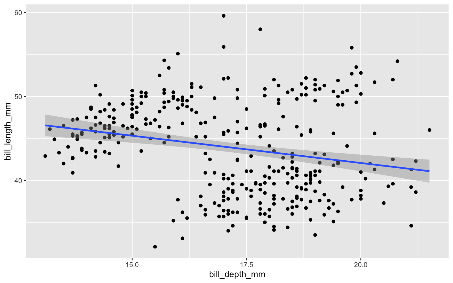
Scatter plots: add linear regression line
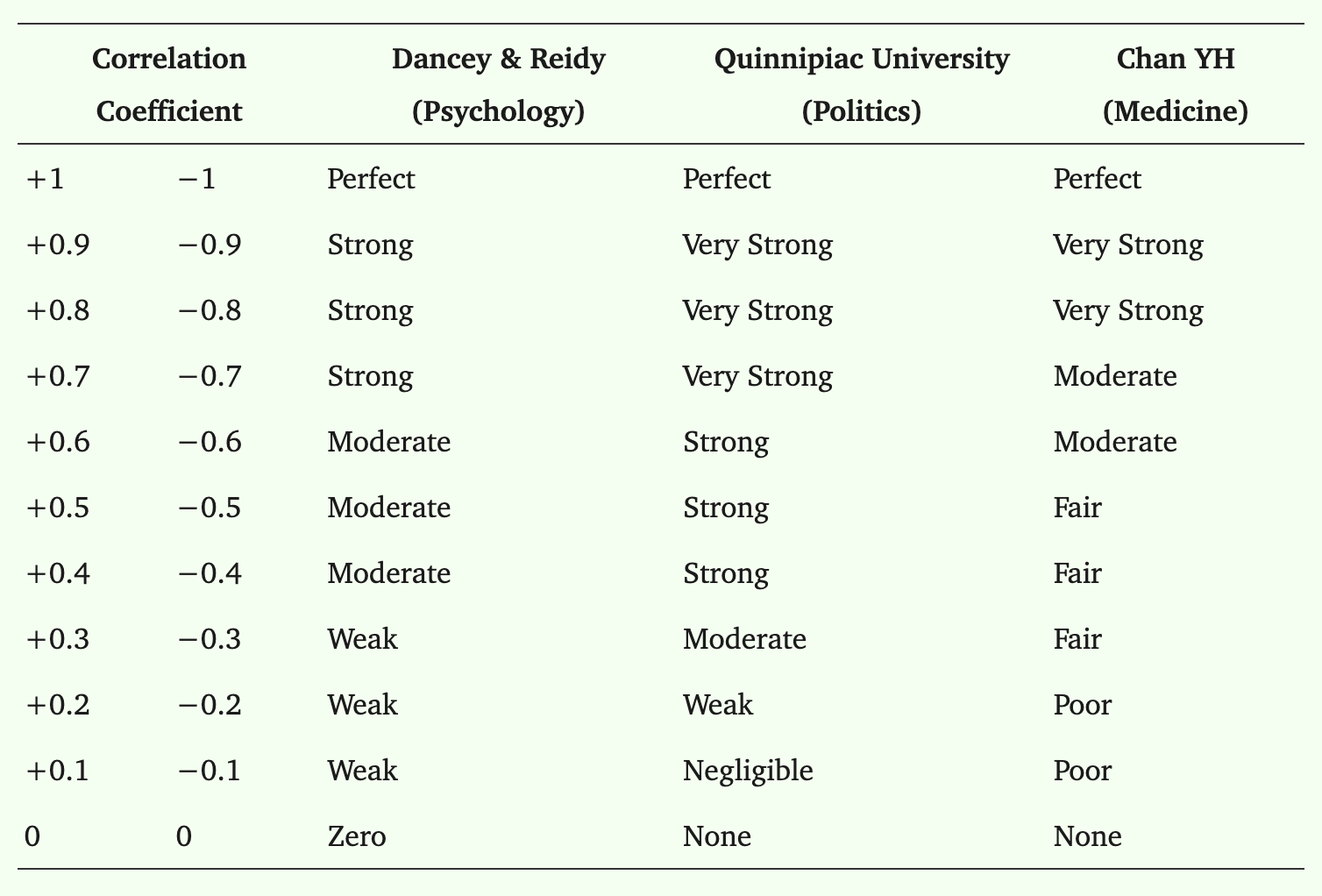
Correlation coefficients
Use the
cor()function to calculate a Pearson’s R correlation coefficient (the default correlation coefficient type).Pearson R is used for linear relationships between two continuous, normally distributed variables.
-
The
cor()function comes from thestatspackage, which contains functions for statistical calculations and random number generation.- For a complete list of functions, use
library(help = "stats").
- For a complete list of functions, use
Scatter plots: add linear regression line and correlation coefficient
corr <- penguins |>
summarize(pearson_r = cor(bill_depth_mm, bill_length_mm, use = "complete.obs")) |>
pull(pearson_r) # pull() is similar to $ from base R. It's mostly useful because it works better in tidyverse pipes.
ggplot(penguins,
       aes(x = bill_depth_mm,
           y = bill_length_mm)) +
  geom_point() +
geom_smooth(method = "lm") +
annotate("text",
x = Inf, y = Inf, # This puts the text in the top-right corner of the plot.
label = paste0("Pearson R = ", # paste0() Combines (aka concatenates) pieces into one string (a string is one line of text or numeric values)
round(corr, 2)), # Add the correlation coefficient. Use round() to specify how many decimal places you want to show.
hjust = 1.1, vjust = 1.5)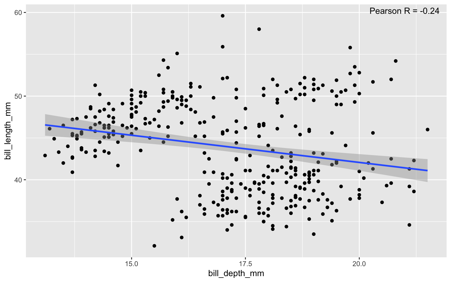
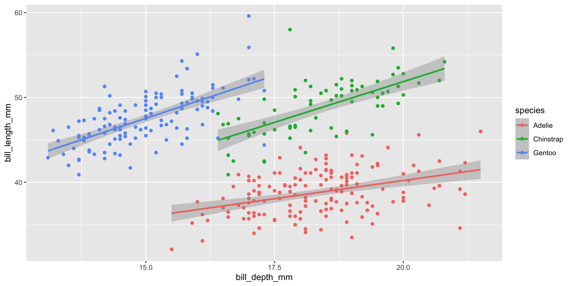
Scatter plots: add linear regression line and correlation coefficient
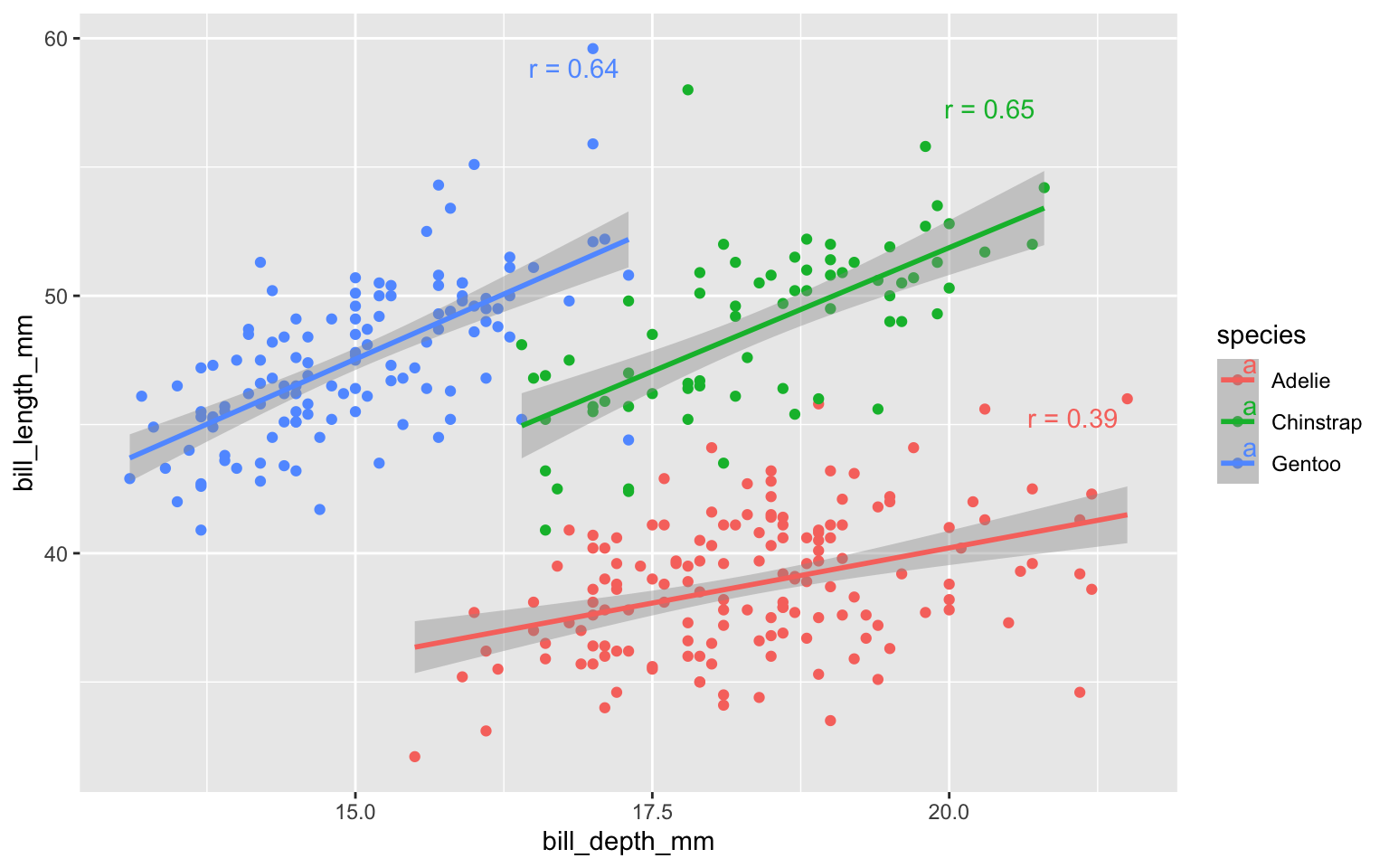
corr_by_species <- penguins |>
  group_by(species) |>
  summarize(
    pearson_r = cor(bill_depth_mm, bill_length_mm, use = "complete.obs"),
    x = max(bill_depth_mm, na.rm = TRUE),
    y = max(bill_length_mm, na.rm = TRUE)
  )

ggplot(penguins,
       aes(x = bill_depth_mm,
           y = bill_length_mm,
           color = species)) +
  geom_point() +
  geom_smooth(method = "lm") +
  geom_text(data = corr_by_species,
            aes(x = x,
                y = y,
                label = paste0("r = ", round(pearson_r, 2))),
            hjust = 1.1, vjust = 1.5)